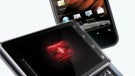
Motorola DROID 2 vs. Motorola DROID


Introduction:
When you've got a good thing going, there's no doubt that you want to capitalize on that in order to take advantage of all the positive attention you're garnering. In the mobile world, handsets generally have a shelf life of approximately one year before they are given their last rites – thus handing the torch over to a successor (we hope). Just a little over 9 months ago, the industry was shaken up with the advent of the Motorola DROID which threw Android into new horizons as being a force that shouldn't be disregarded. Backed by a fantastic advertising campaign with Verizon, the handset was able to showcase all of the things possible with DROID DOES, while at the same time, being able to attract customers and command a whole new movement. Since there are probably many people still holding dearly to a Motorola DROID, especially when it's being treated to some of the latest Android updates, some are probably torn with the feeling of possibly moving up to its successor – the Motorola DROID 2. Naturally, it was only going to be inevitable before these two smartphones were going to be compared to one another in a classic breakdown of whether the new hardware has the guts to warrant an upgrade.
Design:
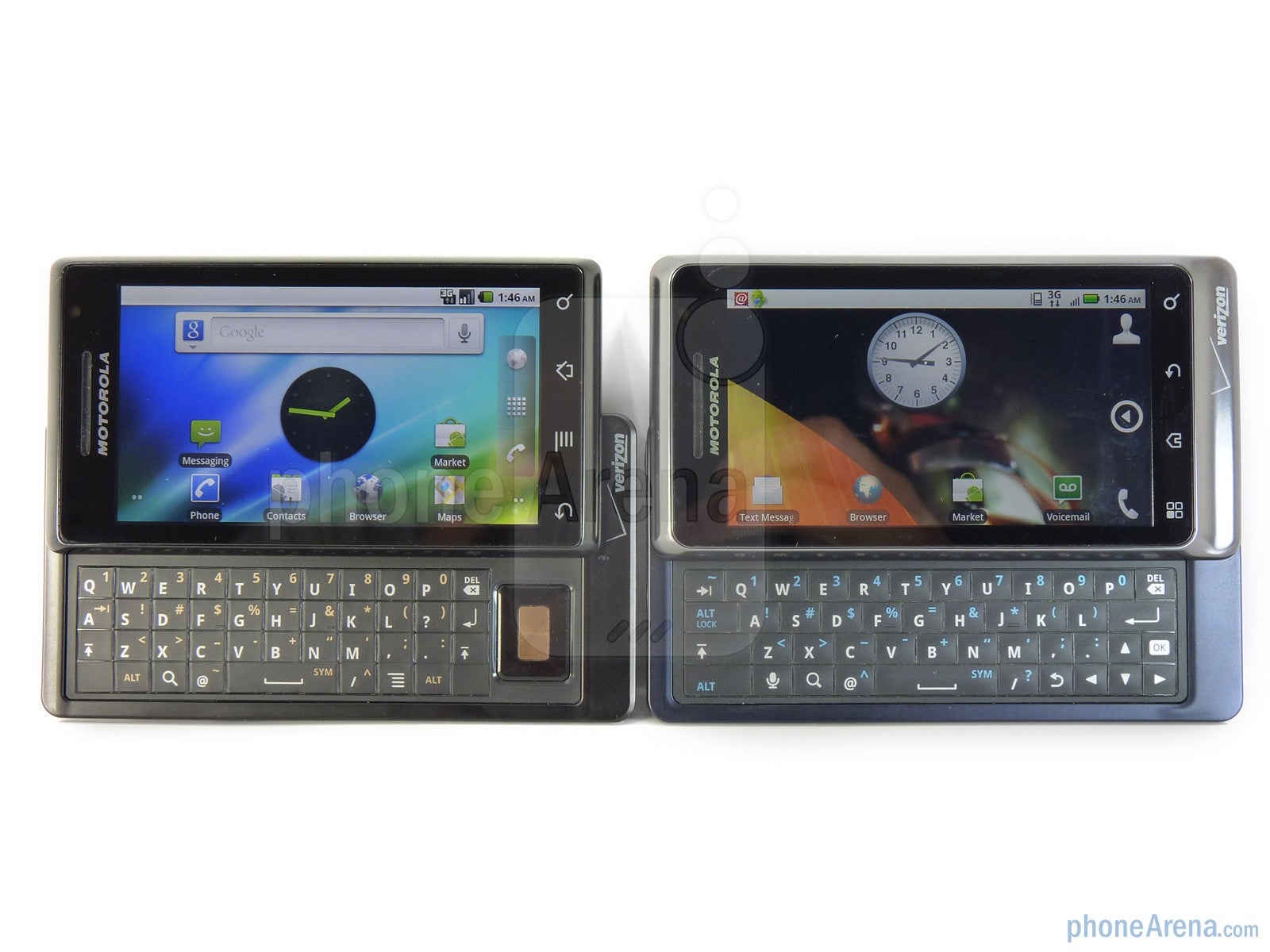
If it ain't broke, don't fix it – right? The classic saying proves to be true with the Motorola DROID 2 since it basically employs the same design of its predecessor – that streamlined landscape sliding QWERTY form factor. Both handsets exude a premium industrial design that doesn't dissuade from the fact that Motorola spent a lot of time and love in creating these devices; even more when they're literally built like tanks. On the Motorola DROID, its design is more angular and leaves us to believe that it was created by some kind of robot. While on the DROID 2, it decides to smooth things out with slightly more curved edges that show the refinement of its design. We're happy to say that both are constructed the same way with that metal-like material used for its exterior which is accented on the rear with a soft touch coating to make it easy to grip – plus repelling dirt and scratches. Although the DROID has a single color scheme in play with its looks, the DROID 2 opts to employ a chrome bezel for the front with a dark bluish hue for its rear. On paper, both handsets tally in at an impressive 0.54” thick which make them extremely slim, but the DROID 2 is slightly larger – though, it's not terribly noticeable at all. In the end, there isn't anything drastically different between the two that would make one better than the other. Instead, the DROID 2 tastefully embodies an elegant design style that perfectly stays faithful to the original without being overly different.
Although it could be seen either as a good or bad thing, Motorola decided to keep everything exact with the Motorola DROID 2's display – from its size to its resolution, there is nothing different about it. Still sporting a 3.7” TFT display that dishes up a resolution of 480 x 854 with support for 16.7 million colors, it still manages to enthrall some with its high pixel density; making it extremely detailed to the naked eye. Sure it didn't receive any upgrade over its predecessor, but when you compare it to other existing Android smartphones, it still boasts the highest display resolution out there. In addition, we found it to be responsive to the touch without any inaccuracies – all the while sporting some good viewing angles that make it usable outdoors in everyday situations. Is it bad that they decided to stick with the same display? No, that's because it's still one good looking one. But would've have it been better if they upgraded it in a way? Of course! Nonetheless, both handsets offer a detailed display that has yet to be tested by any of its Android powered brothers and sisters.
As much as we adored seeing physical buttons on the Motorola DROID X, we were hoping to see the DROID 2 opt for the same thing – but instead, it sticks true to what we see used on the original DROID. Granted though, the touch sensitive buttons found on both devices make for a completely flush looking surface which is obviously more appealing to look at. However, we're still finding ourselves accidentally pressing them when we use the on-screen keyboard since there is barely any space separating them from the bottom of the touchscreen. The location for the physical buttons on both handsets are identical – the volume rocker and shutter keys are found on the right side while the dedicated power buttons are located on the top edge. We actually preferred the size and responsive buttons used on the original DROID since the ones on the DROID 2 are slightly smaller and difficult to press. Thankfully, we still find a microUSB port and 3.5mm headset jack favorably in use with both handsets. To the rear, we find the grill for the speakerphone in the same location on both handsets as well as the 5-megapixel camera with dual-LED flash. However, it seems apparent that Motorola addressed the issue found on some DROID units when the rear cover would easily slip off because it requires more force to remove the back cover on the DROID 2. As much as we were hoping to see the placement of the microSD card slot located elsewhere, we were still saddened to find it in the same spot – which requires you to remove the battery completely to gain access to it.
If there were complaints for the DROID, it clearly could be found with its landscape sliding QWERTY keyboard. Although it will require some time and practice to get situated with any keyboard, the one used on the DROID didn't provide for the most optimal response when pressed. In addition, buttons were flat and flush to the surface – which made it rather difficult to distinguish each key. Luckily Motorola heard all of the complaints as the DROID 2 offers an improved keyboard that clearly warrants some attention. Even though some gamers will miss the dedicated 5-way directional pad on the DROID, the overall size on the DROID 2 is more conducive to the needs of the casual text messenger. We like the fact that buttons are bubbled in the center to provide that distinguishable feel from one another – plus they felt a bit more responsive when pressed. However, Motorola decided to keep the same manual sliding mechanism to reveal the keyboard on the DROID 2 – which is safe to say keeps for the handset's streamlined looks.
When you've got a good thing going, there's no doubt that you want to capitalize on that in order to take advantage of all the positive attention you're garnering. In the mobile world, handsets generally have a shelf life of approximately one year before they are given their last rites – thus handing the torch over to a successor (we hope). Just a little over 9 months ago, the industry was shaken up with the advent of the Motorola DROID which threw Android into new horizons as being a force that shouldn't be disregarded. Backed by a fantastic advertising campaign with Verizon, the handset was able to showcase all of the things possible with DROID DOES, while at the same time, being able to attract customers and command a whole new movement. Since there are probably many people still holding dearly to a Motorola DROID, especially when it's being treated to some of the latest Android updates, some are probably torn with the feeling of possibly moving up to its successor – the Motorola DROID 2. Naturally, it was only going to be inevitable before these two smartphones were going to be compared to one another in a classic breakdown of whether the new hardware has the guts to warrant an upgrade.
Design:
If it ain't broke, don't fix it – right? The classic saying proves to be true with the Motorola DROID 2 since it basically employs the same design of its predecessor – that streamlined landscape sliding QWERTY form factor. Both handsets exude a premium industrial design that doesn't dissuade from the fact that Motorola spent a lot of time and love in creating these devices; even more when they're literally built like tanks. On the Motorola DROID, its design is more angular and leaves us to believe that it was created by some kind of robot. While on the DROID 2, it decides to smooth things out with slightly more curved edges that show the refinement of its design. We're happy to say that both are constructed the same way with that metal-like material used for its exterior which is accented on the rear with a soft touch coating to make it easy to grip – plus repelling dirt and scratches. Although the DROID has a single color scheme in play with its looks, the DROID 2 opts to employ a chrome bezel for the front with a dark bluish hue for its rear. On paper, both handsets tally in at an impressive 0.54” thick which make them extremely slim, but the DROID 2 is slightly larger – though, it's not terribly noticeable at all. In the end, there isn't anything drastically different between the two that would make one better than the other. Instead, the DROID 2 tastefully embodies an elegant design style that perfectly stays faithful to the original without being overly different.
Although it could be seen either as a good or bad thing, Motorola decided to keep everything exact with the Motorola DROID 2's display – from its size to its resolution, there is nothing different about it. Still sporting a 3.7” TFT display that dishes up a resolution of 480 x 854 with support for 16.7 million colors, it still manages to enthrall some with its high pixel density; making it extremely detailed to the naked eye. Sure it didn't receive any upgrade over its predecessor, but when you compare it to other existing Android smartphones, it still boasts the highest display resolution out there. In addition, we found it to be responsive to the touch without any inaccuracies – all the while sporting some good viewing angles that make it usable outdoors in everyday situations. Is it bad that they decided to stick with the same display? No, that's because it's still one good looking one. But would've have it been better if they upgraded it in a way? Of course! Nonetheless, both handsets offer a detailed display that has yet to be tested by any of its Android powered brothers and sisters.
As much as we adored seeing physical buttons on the Motorola DROID X, we were hoping to see the DROID 2 opt for the same thing – but instead, it sticks true to what we see used on the original DROID. Granted though, the touch sensitive buttons found on both devices make for a completely flush looking surface which is obviously more appealing to look at. However, we're still finding ourselves accidentally pressing them when we use the on-screen keyboard since there is barely any space separating them from the bottom of the touchscreen. The location for the physical buttons on both handsets are identical – the volume rocker and shutter keys are found on the right side while the dedicated power buttons are located on the top edge. We actually preferred the size and responsive buttons used on the original DROID since the ones on the DROID 2 are slightly smaller and difficult to press. Thankfully, we still find a microUSB port and 3.5mm headset jack favorably in use with both handsets. To the rear, we find the grill for the speakerphone in the same location on both handsets as well as the 5-megapixel camera with dual-LED flash. However, it seems apparent that Motorola addressed the issue found on some DROID units when the rear cover would easily slip off because it requires more force to remove the back cover on the DROID 2. As much as we were hoping to see the placement of the microSD card slot located elsewhere, we were still saddened to find it in the same spot – which requires you to remove the battery completely to gain access to it.
If there were complaints for the DROID, it clearly could be found with its landscape sliding QWERTY keyboard. Although it will require some time and practice to get situated with any keyboard, the one used on the DROID didn't provide for the most optimal response when pressed. In addition, buttons were flat and flush to the surface – which made it rather difficult to distinguish each key. Luckily Motorola heard all of the complaints as the DROID 2 offers an improved keyboard that clearly warrants some attention. Even though some gamers will miss the dedicated 5-way directional pad on the DROID, the overall size on the DROID 2 is more conducive to the needs of the casual text messenger. We like the fact that buttons are bubbled in the center to provide that distinguishable feel from one another – plus they felt a bit more responsive when pressed. However, Motorola decided to keep the same manual sliding mechanism to reveal the keyboard on the DROID 2 – which is safe to say keeps for the handset's streamlined looks.
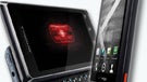
Motorola DROID 2 360 Degrees View:
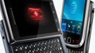
Motorola DROID 360 Degrees View:
Software:
Being a Motorola DROID handset definitely has it advantages over other devices since its treated to some of the latest updates first – all without much wait too! Even though both sport Android 2.2 Froyo, there are some key features omitted on the Motorola DROID that can substantially sell the DROID 2's offerings to customers. For starters, the DROID 2 has support for Flash 10.1 out of the box, however, this is something that's expected to grace the DROID as well with its second Android 2.2 Froyo update. In addition, the DROID is also lacking Mobile HotSpot support which essentially turns the device into a mini Mi-Fi that will share its 3G connectivity to other nearby devices via Wi-Fi. Fortunately, the first omission for the original DROID will be fixed shortly thanks to an upcoming update, but it is unclear if Mobile HotSpot will ever officially make its way – but then again, there's always that rooting process...
Despite sporting Froyo, the experience is completely different since you're greeted to the stock Froyo experience on the DROID while its successors opts to utilize the same custom experience found on the DROID X. However, there is a slight speed improvement found on the DROID 2 when navigating around the homescreen since it's powered by a 1GHz TI OMAP processor as opposed to the 600MHz one employed on the DROID. But when we launched apps at the same time, like the camera, there wasn't anything substantially better in performance found on the DROID 2. To tell you the truth, the experience found on the DROID should suffice most people since Froyo provides for some swift performance. Since the DROID 2 has some MOTOBLUR elements in use with its interface, it could either be seen as a good or bad thing for users, but in any event, it provides for specific widgets that are not found with the DROID's stock experience.
If you're more comfortable using the on-screen keyboard as opposed to the physical one, we were happy to see the DROID 2 to offer two input methods as opposed to the DROID's single one. Obviously both come packed with the stock Android keyboard which can feel rather cramped with the portrait one – which can become more frustrating when you accidentally press one of the touch sensitive buttons. However, we did like that the DROID 2 is supplemented with the Swype keyboard which can come in handy once you've mastered its unique method. Surprisingly, we found it quite usable and we noticed that we didn't have a tendency to activate any of the touch sensitive buttons.
Thanks to the Android market, both devices can ultimately provide for the same experience – from productivity apps to social networking ones, they'll both fit the bill for anyone. And if you happen to take up the task of rooting a Motorola DROID, you'll basically unlock a myriad of features not offered on the existing Android 2.2 Froyo experience that should make it feel as complete as the DROID 2.
Data and Connectivity:
When it was launched, the Motorola DROID provided for the best web browsing experience on any Android smartphone at that time – bar none! However, there isn't a major compelling reason to find the web browsing experience on the DROID 2 to be superior to the original since it's expected that the DROID will also see support for Flash 10.1. Granted though, the DROID 2 adds some graphical elements to its bookmarks interface to make it look more appealing to the eye, its functionality is no different from the DROID. Honestly, the web browsing performance is almost identical as they both offered smooth scrolling, correct rendering, and multi-touch support to zoom in/out. Aside from being able to load Flash content on the DROID 2, which should be coming soon to the DROID, the entire experience on both handsets are on par to one another – so you won't be disappointed with either.
The radios inside both smartphones are the same – so basically you'll find dual-band (800/1900 MHz) connectivity with 3G speeds thanks to EV-DO revision A connectivity. Bluetooth 2.1 can be found on both handsets which will allow you to connect a handful of wireless devices to them plus the ability to transfer files. With the DROID, it's fitted with 802.11 b/g Wi-Fi while an 802.11 b/g/n Wi-Fi is found with the DROID 2. Like we said earlier, the DROID 2 has the ability to act as a Mobile HotSpot device which can prove to be useful and eliminate the need to carry on additional devices with you.
Storing content on either devices won't become an issue seeing that they both offer a total of 16GB of memory. However, it's broken up differently as the DROID comes preloaded with a 16GB microSD card while the DROID 2 has it broken down with an 8GB microSD card and another 8GB of internal storage.
Multimedia:
Since it sports a more powerful processor, the DROID 2 is able to offer some 3D graphical effects in its gallery app – which of course looks more appealing to the eye. Albeit, the DROID's simple interface will display photos and videos in the usual grid-like format and functions as it should without all of the glitzy looks with the DROID 2. Naturally, one would expect for the newer device to boast improved visuals – which is the theme we see throughout the DROID 2's interface.
The music players on both devices are actually the same in presentation and functionality – although there are some minor design elements, such as the color and look of icons, that are different. Undoubtedly one would expect the DROID 2 to produce stronger tones with its speaker, however, we actually found the original DROID to emit slightly stronger ones – even though it sounded strained at the loudest volume. The DROID's music player lacks any equalizer settings, so when we turned it off on the DROID 2, we still noticed the DROID to produce slightly stronger tunes. However, we actually prefer the the DROID 2 due to the fact that its speaker produced sounds that were more pleasant to the ear.
When you combine a nice sized display with an equally appealing high resolution, you're not going to find too many flaws with its performance. Yeah we know that the DROID 2 won't have any problems playing any videos thanks to its 1GHz processor, but the 600MHz one on the DROID is equipped in outputting the same experience. Videos managed to play smoothly without any evidence of lag or slowdown – which is naturally the kind of experience you expect to see out of some flagship devices.
Just because there is no numerical upgrade in the camera found on the DROID 2 over the DROID doesn't mean it's a bad thing – especially when they both produce good images. However, there are some subtle differences between the 5-megapixel cameras employed on the both handsets that make one better than the other in certain situations. Outdoor scenery images look exactly the same on both handsets as they produced the same color tones and detail with each shot. When using the handsets indoors, we actually found the original DROID outperforming its successor in situations where lighting was low. There was more noise in the shots taken with the DROID 2 compared to those with the DROID in low lit areas. As for using the dual-LED flash on both phones, we found the DROID to also produce better images since colors captured with the DROID 2 looked a little bit more washed out. However, the DROID 2 was able to handle macro or closeup shots better than the DROID.
Without a doubt, the Motorola DROID 2 was able to capture better looking videos than the DROID – even when they both shoot them at the same resolution. Obviously neither handset offers HD video recording, but instead, we're treated to DVD-like quality (720x480) for both smartphones. The one area that the DROID 2 improves upon is its capture rate of 30fps as opposed to the 24fps found with the DROID. Even though there is plenty of detail captured by both phones, you can blatantly see at how smoother the DROID 2 is able to operate than the DROID.
Motorola DROID 2 sample video at 720x480 pixels resolution
Motorola DROID sample video at 720x480 pixels resolution
Since it sports a more powerful processor, the DROID 2 is able to offer some 3D graphical effects in its gallery app – which of course looks more appealing to the eye. Albeit, the DROID's simple interface will display photos and videos in the usual grid-like format and functions as it should without all of the glitzy looks with the DROID 2. Naturally, one would expect for the newer device to boast improved visuals – which is the theme we see throughout the DROID 2's interface.
The music players on both devices are actually the same in presentation and functionality – although there are some minor design elements, such as the color and look of icons, that are different. Undoubtedly one would expect the DROID 2 to produce stronger tones with its speaker, however, we actually found the original DROID to emit slightly stronger ones – even though it sounded strained at the loudest volume. The DROID's music player lacks any equalizer settings, so when we turned it off on the DROID 2, we still noticed the DROID to produce slightly stronger tunes. However, we actually prefer the the DROID 2 due to the fact that its speaker produced sounds that were more pleasant to the ear.
When you combine a nice sized display with an equally appealing high resolution, you're not going to find too many flaws with its performance. Yeah we know that the DROID 2 won't have any problems playing any videos thanks to its 1GHz processor, but the 600MHz one on the DROID is equipped in outputting the same experience. Videos managed to play smoothly without any evidence of lag or slowdown – which is naturally the kind of experience you expect to see out of some flagship devices.
Just because there is no numerical upgrade in the camera found on the DROID 2 over the DROID doesn't mean it's a bad thing – especially when they both produce good images. However, there are some subtle differences between the 5-megapixel cameras employed on the both handsets that make one better than the other in certain situations. Outdoor scenery images look exactly the same on both handsets as they produced the same color tones and detail with each shot. When using the handsets indoors, we actually found the original DROID outperforming its successor in situations where lighting was low. There was more noise in the shots taken with the DROID 2 compared to those with the DROID in low lit areas. As for using the dual-LED flash on both phones, we found the DROID to also produce better images since colors captured with the DROID 2 looked a little bit more washed out. However, the DROID 2 was able to handle macro or closeup shots better than the DROID.
Motorola DROID 2
Motorola DROID<br>Indoor samples
Without a doubt, the Motorola DROID 2 was able to capture better looking videos than the DROID – even when they both shoot them at the same resolution. Obviously neither handset offers HD video recording, but instead, we're treated to DVD-like quality (720x480) for both smartphones. The one area that the DROID 2 improves upon is its capture rate of 30fps as opposed to the 24fps found with the DROID. Even though there is plenty of detail captured by both phones, you can blatantly see at how smoother the DROID 2 is able to operate than the DROID.
Motorola DROID 2 sample video at 720x480 pixels resolution
Motorola DROID sample video at 720x480 pixels resolution
The handsets actually compliment one another in calling quality since the performance was nearly the same; except for some choppy sounding voices heard from our callers when we used the DROID 2. Aside from that, there was a slight static sound that can be heard on our end using both handsets, but it's nothing too detrimental to make the experience unusable. When switching to the speakerphone, they both produced some loud tones that made it very audible for us to hear our callers, but setting it to the highest volume made it sound strained on both phones. So naturally setting it down a couple of notches provides for the most optimal calling experience with the speaker phone.
Just like their recent advertising campaigns, both DROID handsets are phenomenal in retaining a solid connection to the network. During our testing, we did not experience any sudden drop in bars when using the handsets in the greater Philadelphia region.
The battery life on each handset couldn't have been any different even though they both offer 1400 mAh batteries inside their casing. With the Motorola DROID 2, we actually saw it dish out more battery life since we were able to achieve a talk time of 9.5 hours of talk time on a single charge. As for the Motorola DROID, we had Android 2.2 Froyo running for this comparison and it was able to produce 7 hours of talk time in high coverage areas after a full charge. Naturally this would make sense since the 1GHz TI OMAP processor inside of the DROID 2 optimizes battery consumption better than the DROID – thus providing more juice with the same battery. However, both handsets will actually provide for a day of normal usage before the need of a recharge – but expect to constantly charge both handsets if you're a heavy user.
Conclusion:
Now that we've gotten quite comfy with both DROID devices, we'll have to look at some other numbers for non-DROID owners who are wondering which one to side with for their next purchase, to better gauge whether or not it's worth choosing the DROID in favor to its successor. As for right now, and we mean right now, Verizon Wireless is currently selling the Motorola DROID for $149.99 with a contract while the DROID 2 is now found at the customary $199.99 price. Honestly, the price difference is so miniscule that it would be a better decision to choose the Motorola DROID 2 – especially with the $50 price difference. However, there are indirect resellers who are selling the original DROID for as low as free with a contract – which at that point, should warrant a purchase since both handsets provide for a good experience.
Conversely, there are current Motorola DROID owners who are contemplating on bailing with their handset for the DROID 2. Undoubtedly, the only compelling reason to make the jump with the newer hardware is to experience the customized Android experience combined with the faster 1GHz processor. Of course you're treated to an even better physical QWERTY that offers more prominent buttons that are accompanied with a better response when pressed over its predecessor. In addition, there are some amenities found on the DROID 2 that are missing on the DROID – such as Flash 10.1 support (for now) and Mobile HotSpot. Design wise, there is nothing considerably different between the two since they both boast a fantastic industrial design that's able to tuck away a physical keyboard. Ultimately, there are a handful of justifications to jump up to the DROID 2 since it's looking like Froyo will be the last major build of Android that the original DROID will receive. In addition, the faster processor will allow it to easily handle some of the most grueling games and apps out there in the Android Market. On the opposite end of the spectrum, the Motorola DROID ultimately executes the same functions that are found with the DROID 2 – although it might not be as fast, it definitely can get the job done too. In the end, both handsets can continue to spread the word of DROID DOES.
Motorola DROID 2 vs. Motorola DROID Video Comparison:
Popular stories


Latest News


Things that are NOT allowed:
To help keep our community safe and free from spam, we apply temporary limits to newly created accounts: