The newly released Android Style Guide is not only a great new tool for developers as well as a tool for Google in its fight against problems of inconsistent UI design in apps, but it actually says quite a lot about how Google has traditionally done things, how it is changing, and points to where Google still needs to keep working. Oddly, the way forward for Google has always been hidden in the Android logo itself. No brand logo has ever been remixed, altered and changed as much as the Android logo, and that parallels the platform itself. However, no matter how much the Android logo is remixed, it is always instantly recognizable as the Android logo, and that is the aim of Matias Duarte and the new Android Style Guide - to give the Android platform an underlying identity and consistency while still allowing the differentiation that has become the hallmark of the platform.
If you're looking to pick nits with Google and Android, the first thing you'll notice about the new style guide is that it is completely optional. There is nothing mandated, just suggestions on how to best make your app fit into the Android platform. Anyone who knows Android (and more importantly Google) know that this is nothing new, and it's nothing that is likely to change any time soon. Google has always preferred to lead by example rather than by rules, to use the carrot not the stick. As we've mentioned before, asking Google to change this behavior is like asking for Google to be Apple, which simply isn't going to happen. There are fundamental personality differences between the two companies which are in opposition and will not allow Google to close in with too many rules nor allow Apple to open up with too many options. However, just because the two companies do create products in very different ways doesn't mean that they can't hold the same values, or at least that's what Matias Duarte believes.
Recommended For You
Matias is on a crusade to stop design from being an afterthought at Google. He firmly believes that just because a platform is open doesn't mean that it has to look bad or have inconsistent UI. He is right, of course, but he is also a dreamer. The road is a difficult one, but Matias also seems to understand that changing the culture at Google needs some basic building blocks in place.
Building block #1: Explanations
The new Android Style Guide doesn't just show the problem Android has had with inconsistent UI in apps, it shows the problem that Google has had and continues to have with getting people to understand its products. Android has been on the market for just over 3 years and this is the first time that the company decided it was necessary to give developers a style guide. This is a fundamental problem with Google. Google just expects people to either understand its products, or be willing to take the time to figure out its products.
In a way, this is great, and it's a reason why so many people love Google products. There are a lot of people in the world who love to dig into things and learn how they work, find the hidden features, and the best ways to do things. Unfortunately, those people are the minority. Most people need guides, or manuals, or even just someone to teach them how to use a product. This extends from consumers picking up a new phone to experienced developers.
Apple understands this idea and has taken it to the extreme. Apple may not include manuals with its products, but that's because it works extremely hard to make its products as intuitive as possible, so people can just pick it up and use it without a manual. And, for those who still don't understand, Apple has employees waiting in each Apple store to teach you how to use any one of its products. Right from the start, Apple has given extensive guides (and rules) to developers on how to best design apps to fit into the iOS UI concepts. And, for those who don't follow the rules, Apple has a review process that has been known to reject apps for not looking right.
Google wouldn't go that far, but giving explanations of its design philosophies seems like it should be part of the "openness" that Google loves to talk about so much. Of course, before Matias Duarte showed up, one could argue that Google didn't really have design philosophies to explain. However, that doesn't forgive the fact that many people still find Android to be too complicated or not intuitive enough. Ice Cream Sandwich is a big step in the right direction though. Rather than hidden options like the recent apps menu mapped to the long-press of the home button, which casual users may never find without help, there is a dedicated button. Rather than things hidden in menus and submenus, Google added the Action Bar which changes contextually to give you the options you're likely to need.
Google has never been good at explaining its products to people, hence the untimely demise of many of its products, and that has even come through in some of its marketing campaigns, like the Muppets Google+ ad, which doesn't help anyone find or figure out Google+ at all. ICS is making Android more accessible, and the Style Guide will help make the UI across apps more consistent, which will help users, but building a proper Android guide would be a pretty big help as well. None of the changes and additions are going to help people who pick up an Android 2.x device and have trouble getting into it, nor will some of the new features help Android 4.0 users if developers don't implement the new option, but that's what brings us to the second building block in this process:
Building block #2: Consistency & Norms
This is the whole name of the game for Google these days. Google products across the web have gotten redesigns to make the UI more consistent. Android 4.0 got a complete UI overhaul to make it more consistent with the Roboto font, side-to-side swiping gestures throughout the system, the Action Bar, and multiple pane views; but, the biggest piece for consistency has been the Holo theme. There has been big news surrounding the Holo theme, and it has been relatively misunderstood.
Yes, Google has actually set down one mandate, which is that the Holo theme must exist on any device running Android 4.0, but that is all. Manufacturers are not required to use it in custom UIs, and app developers are not required to use it in apps either. However, just like the new Style Guide, app developers are encouraged to use it, and if they do, the requirement will mean that apps will look and behave consistently across devices.
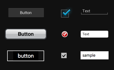
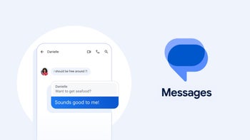
The question is whether or not all of these carrots that Google keeps dangling in front of manufacturers and developers will pay off. With its web products, there are no troubles, because Google controls the entire experience, but that's not possible with Android. It seems that Google's plan is to not just lead by example in this case, but create something akin to societal norms or market pressures within Android. Norms can be far more effective than rules in society. For example, there are no laws against acting like a jerk or being rude to people all the time, but most people are nice to each other because it makes society run better (of course this societal norm has yet to translate to Internet forums and comment sections...) The same theory could end up working with Android. One of the most interesting sections of the new Style Guide is the "Pure Android" section, which reminds developers that Android has a specific look to it, and UI should not copy that of other platforms. The section shows the difference between Android-styled buttons (as you can see on the right), text boxes, buttons and layout, and urges developers to not carry-over styles from other platforms.
There are no rules saying you can't copy the style of other platforms, that you must follow any of the the suggestions in the Style Guide, employ any of the built-in consistency features in Android, or that you have to use the Holo theme. But, if enough developers do employ those tools, it will make apps stick out when they don't follow the suit, and not in a good way. Imagine you were using a newspaper app with multiple sections, but instead of using the swipe gestures to navigate the different sections, that navigation was buried in a menu. Users wouldn't like that. Or, if apps all began to move the menu button to the top right of the screen, where Google would prefer it to be placed, users would be put off and slightly annoyed when an app didn't. Creating those norms eventually creates a self-propagating system of consistency. Matias himself is hopeful that this Style Guide will even help manufacturers to build better custom UI overlays that fit better in the Android ecosystem, but we'll have to wait and see how that works out.
Of course, Google itself needs to be more consistent before the rest of the ecosystem can follow. For example, the menu button that we just mentioned isn't even found in the same spot in all Google apps. Some, like Google Voice, Talk, Plus, and YouTube have it in the top right. Gmail and Maps have it on the Action Bar at the bottom. Goggles, Blogger, Music and Shopper have it next to the recent apps button (which actually means that it is still coded to be tied to a capacitive menu button from an Android 2.x device). And, oddest of all, the Google Docs app has it both in the top right and next to the recent apps button. In terms of leading by example, Google is not doing so well in this regard.
A big hurdle for creating this culture of consistency within Android is for Google to employ some big name developers to help take the lead. This is another place where Apple has a big lead. Any time there is an iOS announcement, Apple has a slew of developers from all different app categories to help show off the way Apple wants things done. This helps to reinforce the rules set out for consistency in the OS, but it also adds value to the ecosystem. There may be about an equal number of apps on iOS compared to Android, and the apps at the top level may be pretty much equal as far as design, but it's the lower levels where we find the biggest differences. Of course, Apple mandates consistency, but Google needs to have partners to help enforce its norms. Not to mention, having big name developers on board will make people more excited about any platform.
Building block #3: Advocacy & Identity
Having better and more public relationships with developers doesn't just add value by giving the platform better software, and reinforcing the platform norms, it gives Google more visibility in the market. Google is beginning to learn that it needs to have a face, and can't just be this monolithic company filled with anti-social engineers. Google+ has gone a long way to helping give a face to the company with people getting to know Vic Gundotra (SVP engineering) who has an odd love of pop music, Matt Cutts (head of web spam team), Bradley Horowitz (VP product management for G+), Natalie Villalobos (community manager G+), and many other Googlers.
As far as Android design advocacy, quite naturally it seems that job is squarely on Matias Duarte, as he is the head of Android design. At least, the job falls to Matias as far as getting the word out to media outlets that Google is putting these suggestions and tools in place, but Google still needs to leverage whatever relationships it has with developers to actually see the the tools and guidelines put into regular use.
To that point, it seems like it would have been better for Google to have had this Style Guide ready to be part of the Ice Cream Sandwich unveiling back in October. Matias Duarte even said in the recent interview about the new Style Guide with The Verge that he didn't consider the OS to be complete until the Style Guide was out, and that even now the guide isn't really complete with all of the information that designers would like. But, this goes beyond just creating guidelines, because while this is explaining the framework for the Android style and how to easily implement UI choices so your app will better adapt to the variety of screen sizes, resolutions and aspect ratios, this also pushes towards creating a more complete Android identity.
Until now, Google hasn't had a design or style identity, and neither has Android. Because of that, UI has been haphazard and inconsistent. The company is finally making a concerted effort to change that, but it still needs to get the word out to the community that this is what Google expects Android to look like, and more importantly, the community has to buy into that design.
In a way, it's almost better that Google waited until now to put out a Style Guide for Android, because a guide for earlier versions of Android may have helped developers to format apps better, but it wouldn't have really held much as far as style and identity. Android has always been something of a blank slate upon which manufacturers put custom UIs, and users put launcher alternatives and themes. Ice Cream Sandwich is the first time Android has felt cohesive. It's the first time the platform has felt like it has an identity of its own that also connects to the Google mothership. Matias has said that he believes designers adamantly want this Style Guide, and we hope that's true, because a more cohesive and consistent Android experience can only be a good thing for users.
Conclusion
Ultimately, this push by Google is about not accepting the norm. For a number of reasons, the norm for Android had been to ignore design, style and consistency in favor of functionality and options. The biggest trouble in this is that when you start to accept somethng as a norm, you may stop seeing how to make it better. It had become commonplace for users and developers to just take it as the status quo that Android apps didn't really have an underlying consistency. Many chalked it up to the uniqueness of the platform, but really, although we don't agree with the semantics, the lack of a Style Guide was one of the biggest causes of "fragmentation" on the platform. Apps can exist on multiple platforms and be true to their brands while still feeling like an integrated piece of each platform. As our Androidified version of Matias as the article image - and the Android logo in general - shows, brand identity doesn't have to preclude uniqueness. If nothing else, Windows Phone has proven that, because it has a unique visual style, and has many multiplatform apps that look unique while still retaining the brand identity.
It will be nice to see if the the Android ecosystem can finally achieve that brand identity. We're not sure how successful brand identity can be when the lockscreen and homescreen for each manufacturer's device looks different, but if Matias has his way, this Style Guide will influence even those custom manufacturer UIs. It's a pretty dream that Matias has of differentiated Android devices, which still retain an essential Android brand identity, but it remains to be seen whether manufacturers share that vision. It is in the best interest of manufacturers to adjust their custom UIs to fit Matias's vision, because an Android identity would mean that consumers can learn what to expect when handling an Android device, making each device easier to pick up and use regardless of the manufacturer skin. Who knows, maybe it'll lead to the day when a relatively non-tech savvy consumer can walk into a store and not have Android described to them as "like an iPhone."
Get Visible as low as $20/mo for 1 year. Limited time offer with code: FRESHSTART
$20
/mo
$25
$5 off (20%)
Offer Ends 6.1.2026 at 11.59pm ET. New members get $5/mo off the $25/mg Visible plan, $35/mo Visible+ plan, or $45/mo Visible+ Pro plan for the first 12 months. Promo code FRESHSTART required at checkout.
Michael Heller is known for his clear and informative articles on mobile technology. He explores important topics such as the rollouts of 5G networks and the advancements in mobile payments, offering readers insights into the evolving tech landscape.
Recommended For You
COMMENTS (27)
COMMENTS (27)
All comments need to comply with our
Community Guidelines
PhoneArena Community Rules
A discussion is a place, where people can voice their opinion, no matter if it
is positive, neutral or negative. However, when posting, one must stay true to the topic, and not just share some
random thoughts, which are not directly related to the matter.
Things that are NOT allowed:
Off-topic talk - you must stick to the subject of discussion
Offensive, hate speech - if you want to say something, say it politely
Spam/Advertisements - these posts are deleted
Multiple accounts - one person can have only one account
Impersonations and offensive nicknames - these accounts get banned
To help keep our community safe and free from spam, we apply temporary limits to newly created accounts:
New accounts created within the last 24 hours may experience restrictions on how frequently they can
post or comment.
These limits are in place as a precaution and will automatically lift.
Moderation is done by humans. We try to be as objective as possible and moderate with zero bias. If you think a
post should be moderated - please, report it.
Have a question about the rules or why you have been moderated/limited/banned? Please,
contact us.


Things that are NOT allowed:
To help keep our community safe and free from spam, we apply temporary limits to newly created accounts: