Just recently we saw more images of the Samsung Galaxy Note 8.0 and while there is nothing that striking about the upcoming tablet at first glance, look at it closer and you’d realize it looks just like the Galaxy S III and Galaxy Note smartphones. No, it’s not just the rounded edges and glazed plastic, we are talking about the physical keys!
Yes, the on-screen buttons taking out tons of screen estate are finally gone. For us, that is a huge relief - it seems such a waste of screen space to have those on-screen buttons on the display at all times! We could forgive this in a phone (and even then it seems like a huge waste), but in a tablet you end up with an abysmal waste of space.
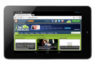
Losses of screen space due to system bar
Just look at the Nexus 10 or Nexus 7 in portrait or landscape mode, you’d see a large black strip at all times (in all fairness it at least disappears in videos).
Now, all of this confusion started with Honeycomb and then transferred to Ice Cream Sandwich.
Here is how much screen real estate is wasted on some of the most popular Nexus devices because of on-screen buttons:
7.5% of the vertical resolution (1,280 pixels), or 96 pixels, (48 device independent pixels) are occupied by on-screen buttons on a Nexus 4/Galaxy Nexus. That space is wasted for real content.
4.4% of the vertical resolution (1,280 pixels)), or 56 pixels, on a Nexus 7 in portrait mode
8% of the vertical resolution (in this case, 800 pixels), or 64 pixels, on a Nexus 7 in landscape mode
3.75% of the vertical resolution (2,560 pixels), or 96 pixels, (48 device independent pixels) on a Nexus 10 in portrait mode
6% of the vertical resolution (1,600 pixels), or 96 pixels on Nexus 10 in landscape mode
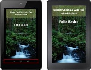
With and without on-screen buttons
Rounding it all up, we have big losses of screen space that Google is trying to push as the de facto standard for Android devices. Luckily, Android is open and no one is forced into this model.
Recommended For You
Sadly, while you can choose between high-end devices with on-screen buttons (Sony Xperia Z, Nexus 4 most recently) and without on-screen buttons (Samsung Galaxy S III, HTC One X), you didn’t have that choice in recent tablets as virtually all of them came with on-screen keys.
The Galaxy Note 8.0 brings that choice of having all the screen up for use by real content and not just buttons.
We don’t know whether it was Apple’s iPad mini that showed just how big of a difference a form factor makes with its full-screen 7.9-inch tablet, or what was it that caused the change, but we’re glad Samsung listened and decided to right that wrong. And we’d be looking forward to the Galaxy Note 8.0 launch because of that.
How about you - how do you feel about on-screen buttons? Did you realize how much of a screen space they eat up? Or do you think the uniformity of experience they deliver is worth that loss? Sound off in the comments below.
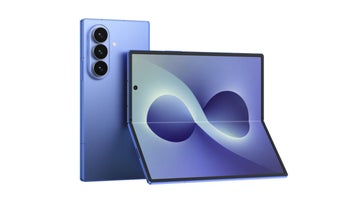
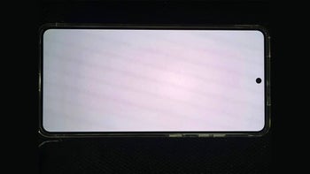
Samsung Galaxy Note 8.0 images
Six-month unlimited plan is now 57% off
$90
$210
$120 off (57%)
Mint Mobile is now allowing you to get whichever plan you like for either three, six, or 12 months for just $15/mo. If you go for the six-month unlimited service, for instance, you'll now have to pay just $90 upfront instead of $210.
Victor, a seasoned mobile technology expert, has spent over a decade at PhoneArena, exploring the depths of mobile photography and reviewing hundreds of smartphones across Android and iOS ecosystems. His passion for technology, coupled with his extensive knowledge of smartphone cameras and battery life, has positioned him as a leading voice in the mobile tech industry.
A discussion is a place, where people can voice their opinion, no matter if it
is positive, neutral or negative. However, when posting, one must stay true to the topic, and not just share some
random thoughts, which are not directly related to the matter.
Things that are NOT allowed:
Off-topic talk - you must stick to the subject of discussion
Offensive, hate speech - if you want to say something, say it politely
Spam/Advertisements - these posts are deleted
Multiple accounts - one person can have only one account
Impersonations and offensive nicknames - these accounts get banned
To help keep our community safe and free from spam, we apply temporary limits to newly created accounts:
New accounts created within the last 24 hours may experience restrictions on how frequently they can
post or comment.
These limits are in place as a precaution and will automatically lift.
Moderation is done by humans. We try to be as objective as possible and moderate with zero bias. If you think a
post should be moderated - please, report it.
Have a question about the rules or why you have been moderated/limited/banned? Please,
contact us.


Things that are NOT allowed:
To help keep our community safe and free from spam, we apply temporary limits to newly created accounts: