This article may contain personal views and opinion from the author.
The iPhones’ iOS 26 was a thrilling update, awaited with anticipation for its new Liquid Glass look and general redesign and modernization. It hasn’t been smooth sailing, as the translucent elements took some getting used to, and it did launch with some beta-level visual bugs, but Apple is slowly ironing them out.
But one thing I did not expect out of the entire update was a Safari UI that feels like a step backwards.
Apple loves minimal design, and took the opportunity to minimize the controls within its default browser app even further. The result is a default view that has many users, myself included, frustrated.
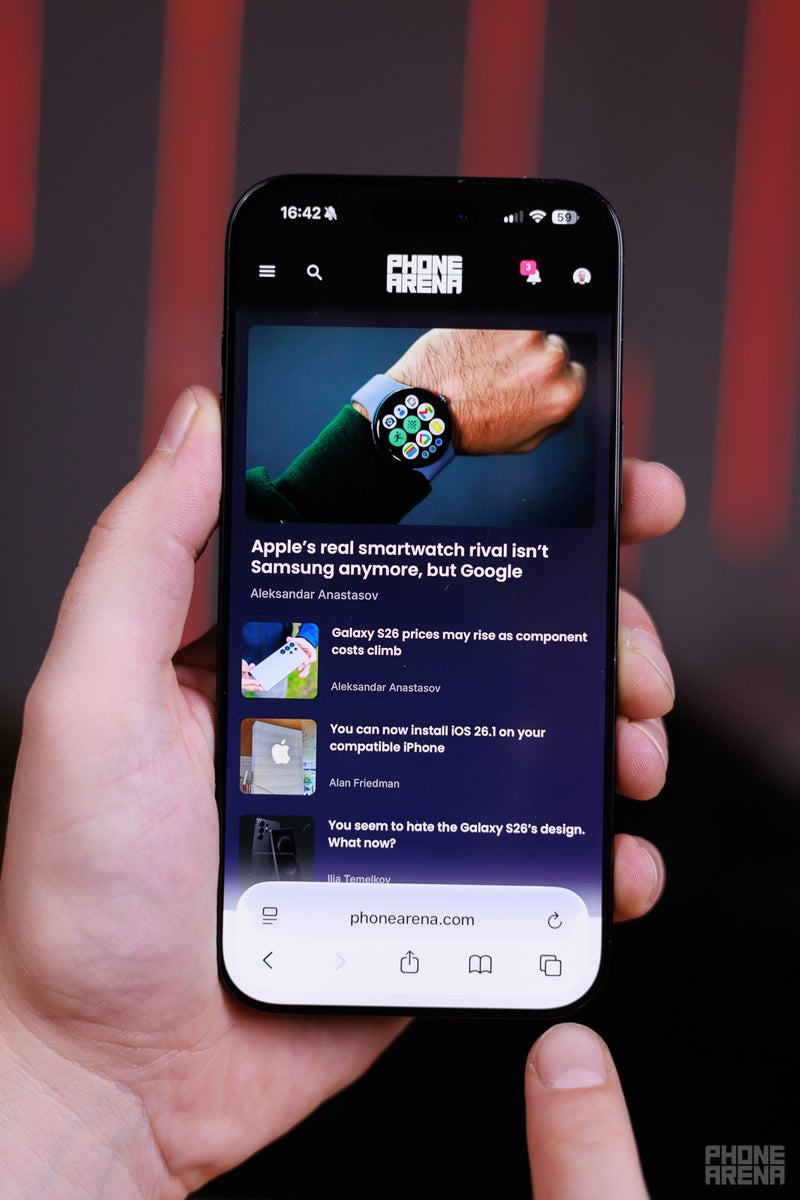
The Compact view
So minimalistic! (Image credit - PhoneArena)
When you first open Safari in iOS 26, it looks new and fresh. Its controls are situated in a few droplets of “Liquid Glass” at the very bottom. However, once you start using it, it feels like a browser that hasn’t been made for people that like to use multiple tabs.
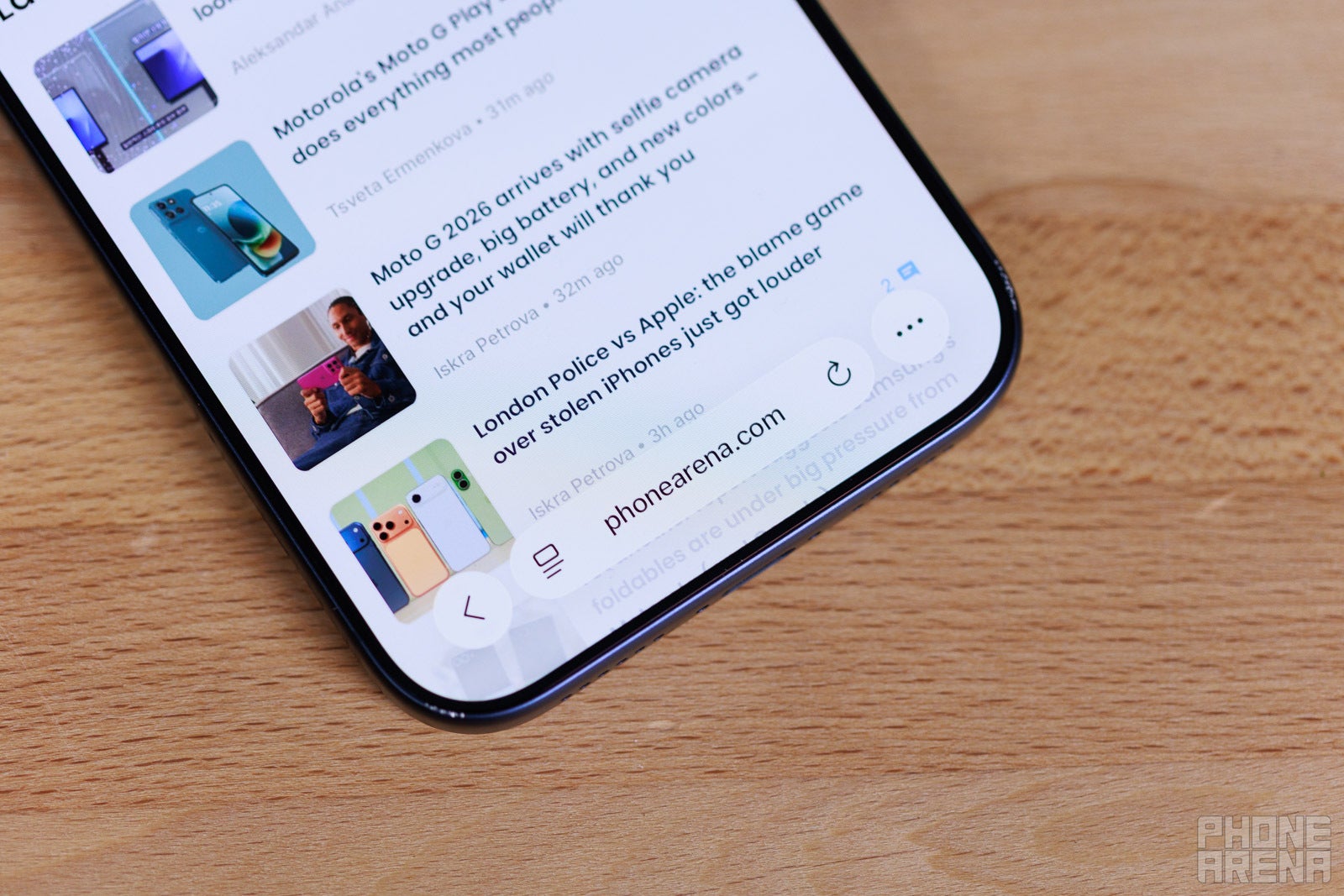
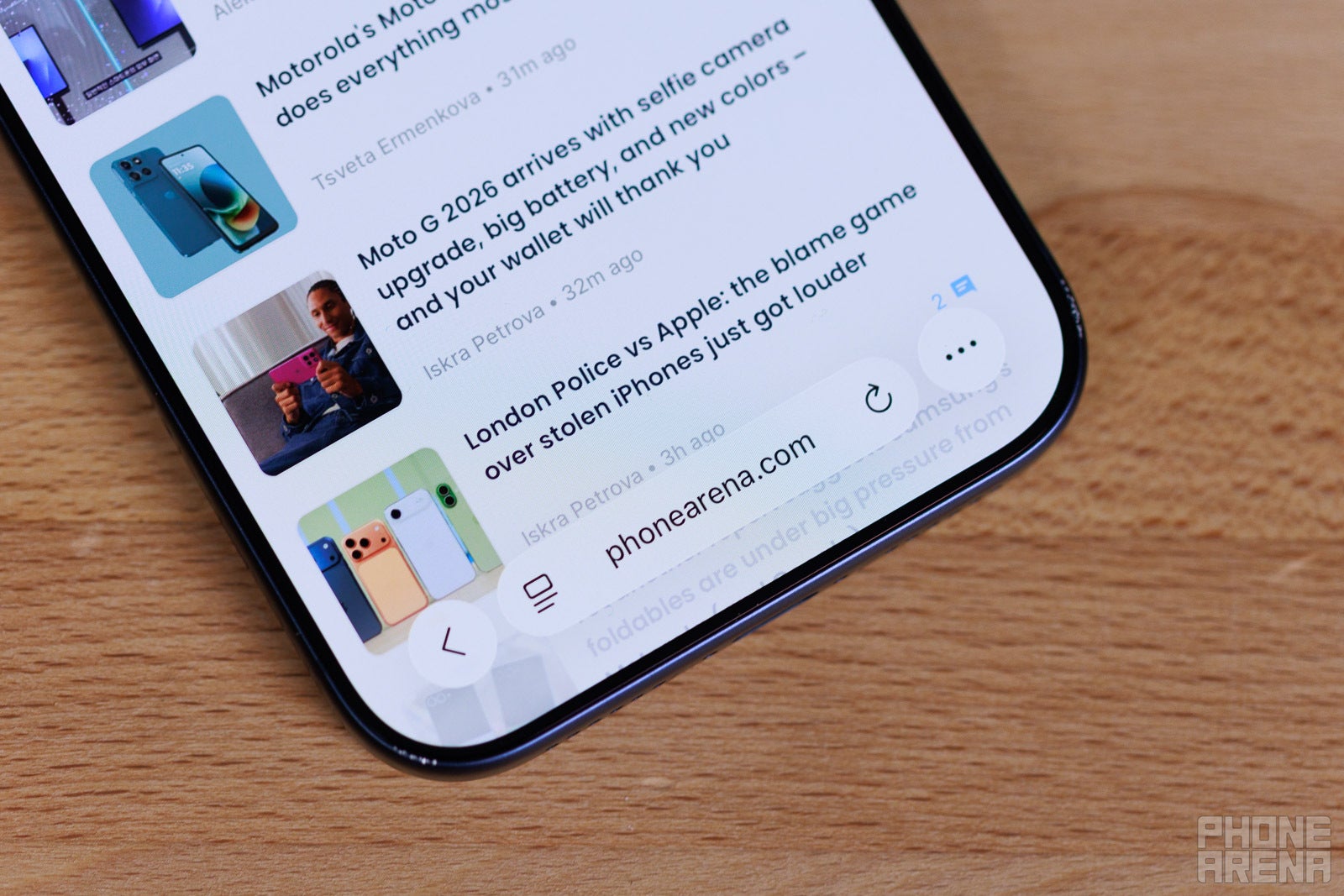
Tap once to find All Tabs (Image credit - PhoneArena)
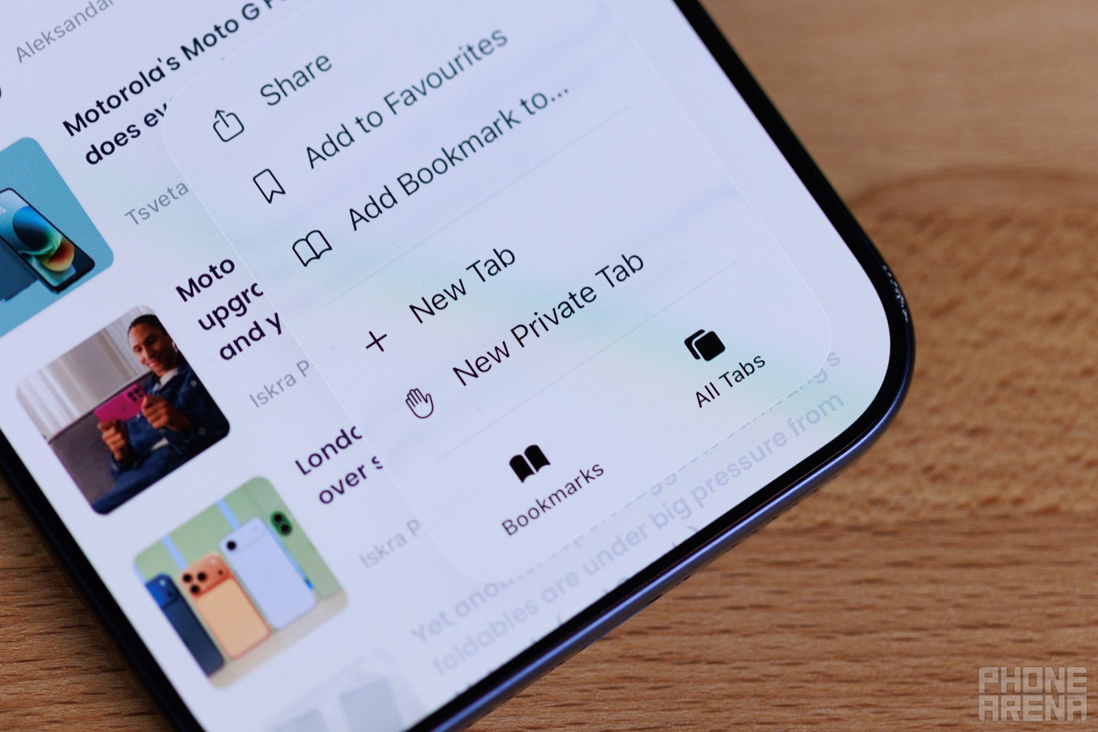
The “All tabs” button is now hidden behind the “...” button at the bottom right. Thus, accessing them takes an extra tap, which is frustrating since this is the first time in the history of iOS, since inception, that it actually hides All Tabs behind a menu button.
Recommended For You
The issue is further compounded by the fact that, by default, if you hold on a link and choose “Open in New Tab”, said tab will immediately open on screen. Returning to what you were previously viewing requires too many taps now.
Apple thinks gestures can make up for this?
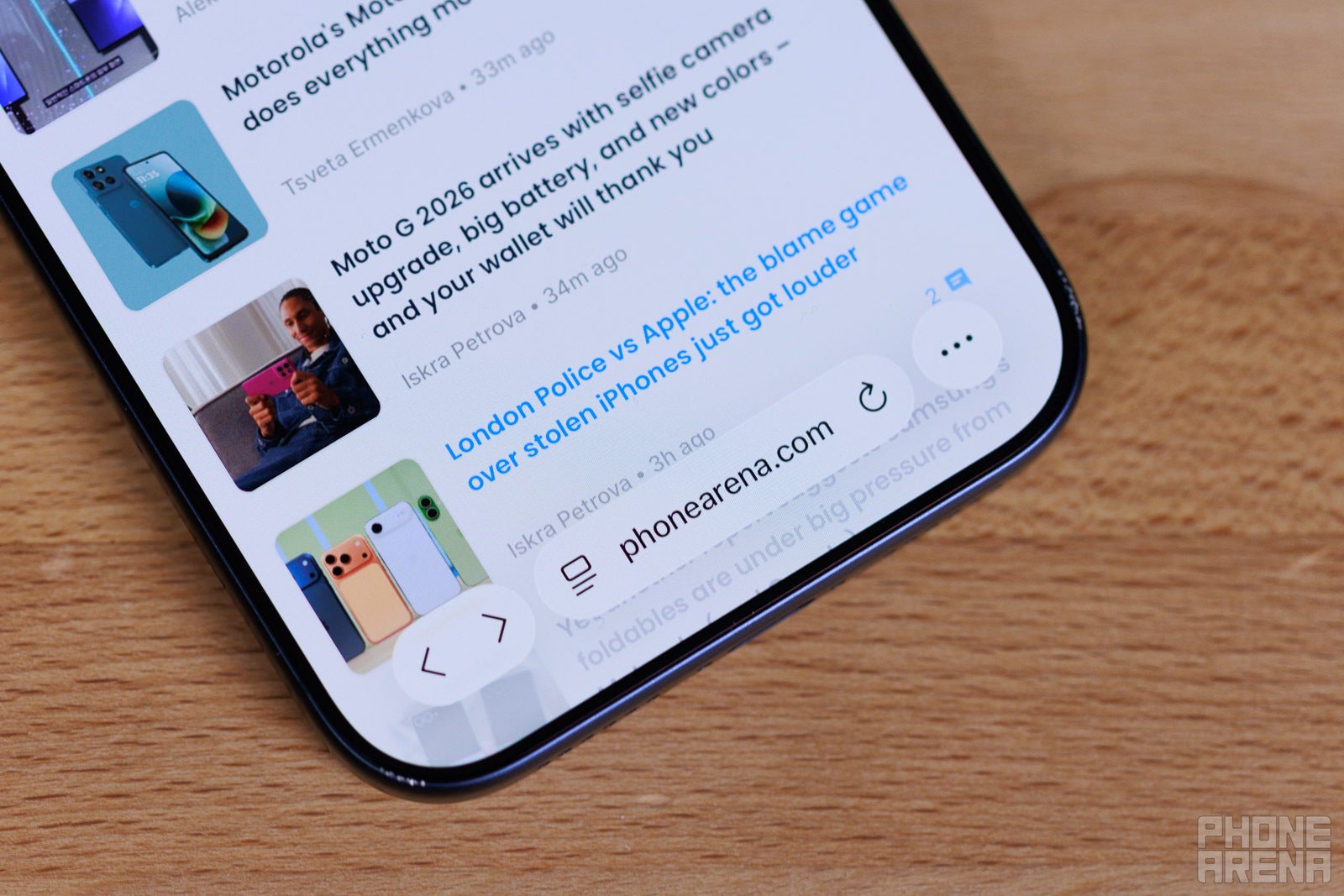
Safari has pretty intuitive gestures when you swipe from the address bar, which is situated on the bottom now. If you “grab” the bar and swipe up, you enter the “All tabs” menu. If you swipe horizontally over the address bar, left or right, you instantly swap to previous or next tabs.
Flick up to browse all tabs, careful not to flick the Nav bar instead! (Image credit - PhoneArena)
This is very convenient and cool, I agree. The problem is that, just below the address bar, there’s the iOS navigation bar. And sometimes, I accidentally swipe up from the navigation bar and minimize Safari. Or, sometimes I swipe horizontally over the navigation bar and switch apps instead of switching tabs.
Needless to say, I wince every time I choose to use Safari gestures, and ultimately prefer not to.
No clear feedback
The Back button’s inconsistency is also extra frustrating. By default, it’s just a left-pointing arrow for back. However, it’s contextual — if you do tap “Back” once, it expands to feature two buttons — back and forward.
< <> >
By itself, that’s an annoyance for anyone who likes the interface to be constant and consistent. But then, there’s also the slightly irritating UI feedback when tapping on either arrow. You never see a clear indication of which button you tapped. When you press “forward”, for example, the entire Liquid Glass droplet that houses both buttons jumps up, with no “weight” to it to show you which side you pressed.
Did I tap Forward or did I tap Back? Guess! (Image credit - PhoneArena)
This is a bigger issue with drop-down or multiple choice menus. You get one big Liguid Glass panel with all the options you have to tap on. No separators between them or anything. When you tap something, you get no indication of where your finger landed — you just hope you were accurate until Safari loads up whatever it was you were going for.
You can fix some of this in Settings
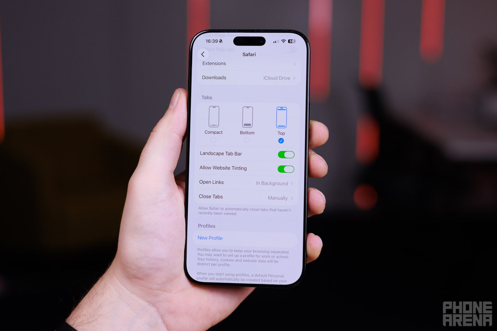
Thankfully, Safari does allow for some customization within Settings. Just go to Apps -> Safari and scroll down for the Tabs options.
If you were used to the way iOS 18 had the address bar and all navigational buttons at the bottom of the screen, switch to the Bottom option. Though that does add a huge chunk of interface at the lower end of the screen.
The classic look with the address bar on top and nav bar on the bottom seems the most balanced to me — choose the Top option to try it out.
For classic boomer controls, choose Top (Image credit - PhoneArena)
While you are here, go to the Open Links menu and choose “In Background”. This will stop Safari from constantly changing what you are looking at every time you decide to open a link in a new tab. By definition, we do that because we are not done with our current tab, yes?
Speaking of fixes — if you’ve been annoyed by how some of Safari’s translucent elements become hard to see, depending on the website content behind them, you should download iOS 26.1. Now, there’s an option where Liquid Glass can be a bit more tinted and opaque, making things across the entire interface a bit more legible. Though, it will lose some of that shiny luster.
In general, it was a step in the wrong direction
It’s wild that, in 2025, Safari doesn’t give us a “New tab” button at the very face of the interface. If you look at Google Chrome on mobile, you will see the “+” button right next to your address bar — because it makes sense, and every other operating system has it there. iPadOS, macOS, Windows, Android — no matter what you are using, you have been “taught” that New Tab is just a click away!
But OK, let’s say the minimalist approach has some appeal to it. Safari is meant to have a “swipe-first” type of interface, and it’s a legitimate way of implementing it, considering the way we interact with smartphones. For example, if you are swiping on the address bar to swap between tabs, swiping all the way to the right will always open a new tab, and apparently that’s how you are meant to do it.
Still, it doesn’t make sense that in iOS 26’s Safari, the “All Tabs” button is in the bottom-right corner of the screen, but after you access it, the “New Tab” button is in the bottom left. It’s a very “Un-Apple” thing that the interface element for “New Tab” is on the left side when tapping, but to swipe to a new tab, you have to go to the right-most side.
And, if you are old school, and you want to tap your way to “New Tab”, it requires two to three taps to do so, and said taps are located on the opposite ends of the screen. Almost as if Apple makes sure you are not going to open a new tab… by mistake? Is that a fatal error I should be worried about?
Also, I think it’s silly that “Open in New Tab” doesn’t put that new tab in the background by default. As stated before — this is the very reason we choose this option in the first place.
Do you use Safari on your iPhone, or have you been tempted to switch to Chrome, Opera, or something else as a default go-to browser?
Get Visible as low as $20/mo for 1 year. Limited time offer with code: FRESHSTART
$20
/mo
$25
$5 off (20%)
Offer Ends 6.1.2026 at 11.59pm ET. New members get $5/mo off the $25/mg Visible plan, $35/mo Visible+ plan, or $45/mo Visible+ Pro plan for the first 12 months. Promo code FRESHSTART required at checkout.
Preslav, a member of the PhoneArena team since 2014, is a mobile technology enthusiast with a penchant for integrating tech into his hobbies and work. Whether it's writing articles on an iPad Pro, recording band rehearsals with multiple phones, or exploring the potential of mobile gaming through services like GeForce Now and Steam Link, Preslav's approach is hands-on and innovative. His balanced perspective allows him to appreciate both Android and iOS ecosystems, focusing on performance, camera quality, and user experience over brand loyalty.
A discussion is a place, where people can voice their opinion, no matter if it
is positive, neutral or negative. However, when posting, one must stay true to the topic, and not just share some
random thoughts, which are not directly related to the matter.
Things that are NOT allowed:
Off-topic talk - you must stick to the subject of discussion
Offensive, hate speech - if you want to say something, say it politely
Spam/Advertisements - these posts are deleted
Multiple accounts - one person can have only one account
Impersonations and offensive nicknames - these accounts get banned
To help keep our community safe and free from spam, we apply temporary limits to newly created accounts:
New accounts created within the last 24 hours may experience restrictions on how frequently they can
post or comment.
These limits are in place as a precaution and will automatically lift.
Moderation is done by humans. We try to be as objective as possible and moderate with zero bias. If you think a
post should be moderated - please, report it.
Have a question about the rules or why you have been moderated/limited/banned? Please,
contact us.


Things that are NOT allowed:
To help keep our community safe and free from spam, we apply temporary limits to newly created accounts: