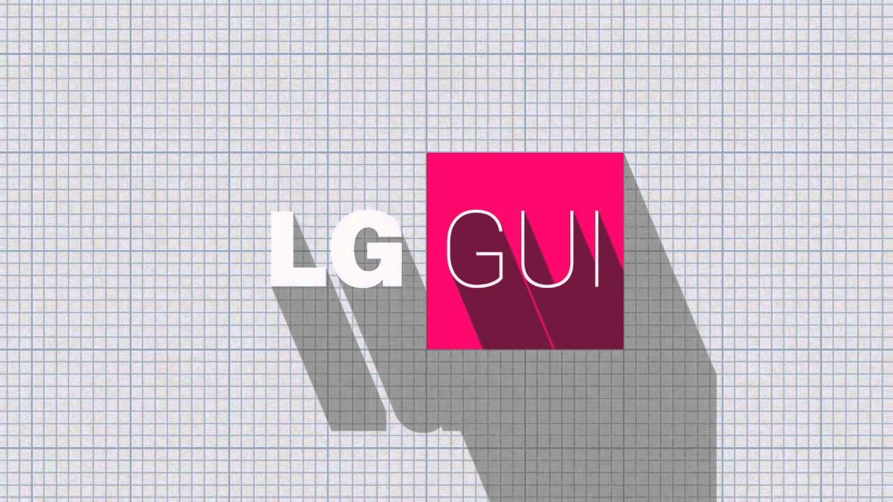
LG provides one of the better explanations about flatter user interface design

The world is flat. Or, it’s becoming flatter when it comes the user experience on the newest crop of smartphones. The world was all abuzz when we started to learn about what iOS 7 was going to look like when it was introduced last year.
Gone was the skeumorphism that adorned the user interface designs in previous devices. Yes, Apple was arguably the first on the scene, but given how quickly the other user experiences followed suit with the competition, it is safe to say that everyone was on the same page for the most part.
The methodology behind the flat design gets talked about here and there, but LG put together a rather nice presentation behind the nuances of turning the world of its user interface flat. Since LG’s logo is a circle, the motif follows geometry that is centered around that shape, even though many of the icons are square.
Of course, it helps that this new UI is also making its debut on the LG G3, so there is no doubt that LG wants you to get excited about the user experience and buy the new flagship right away.
Of course, it helps that this new UI is also making its debut on the LG G3, so there is no doubt that LG wants you to get excited about the user experience and buy the new flagship right away.

Popular stories
Latest News

Things that are NOT allowed:
To help keep our community safe and free from spam, we apply temporary limits to newly created accounts: