Google's Duarte: iPhone UI is "heavy and burdensome"

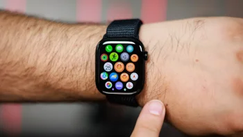
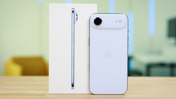
Google's VP of design, Matias Duarte, said in a recent interview that the iPhone's UI is "heavy and burdensome." The grid of app icons has barely changed since the device was unveiled in January 2007 by Steve Jobs. The executive points out how random icon placement is by saying that he is tempted to organize the apps on his phone by color. Talking about the typical smartphone and tablet interface, Duarte says that he finds it hard to believe that the solution devised 30-years ago for desktop PCs will remain the best choice for consumers forever.
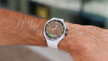
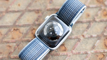
Android Wear, forced by the small watch screen to be different, could be on the path to an answer. But Duarte says, "I don't know that Android Wear has the right solution or even is on a vector to the right solution, nobody knows," He adds, "We're just trying things to see which are successful. That's what design is. You form a thesis, you try to do it without any ego or hubris."
Duarte has started a "design incubator" at Google, looking to implement new changes in design both inside the company and outside of it. Material Design, which started with Android 5.0, was one of the first major changes that he brought to the table at Google. He now is working on Android Wear, which as we pointed out, is forced to move away from the typical row of app icons.
While he does seem a bit frustrated, Google's design chief knows that in the bigger picture, the smartphone is just in the first inning of a nine-inning game. "When we talk about phones and websites and apps, this is an incredibly young medium still," Duarte says. "It's changing very quickly and it's still almost at this raw industrial state."
source: Wired via BGR
While he does seem a bit frustrated, Google's design chief knows that in the bigger picture, the smartphone is just in the first inning of a nine-inning game. "When we talk about phones and websites and apps, this is an incredibly young medium still," Duarte says. "It's changing very quickly and it's still almost at this raw industrial state."
Google's Duarte calls the iPhone UI heavy and burdensome
source: Wired via BGR



Things that are NOT allowed:
To help keep our community safe and free from spam, we apply temporary limits to newly created accounts: