Google might revamp the layout of the Play Store's desktop version, this is how it might look
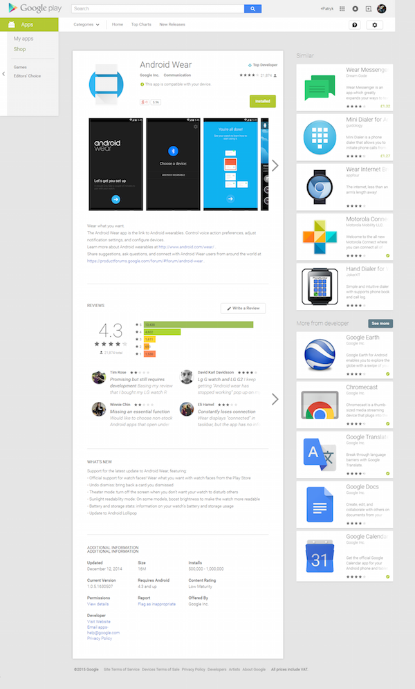
It's been a while since Google last decided to dust off the desktop web version of its Play Store app repository, but from the looks of it, a new refreshment of the interface is imminent. Several sources claim that Google is currently testing a new layout for the Play Store.
Currently, as you most likely know, when you open the page of a given app, the Play Store suggests some similar ones all the way at the bottom of the page, which is not quite intuitive and user-friendly.
Google seems to be aware of this - according to a leaked screenshot of a test layout for the Play Store, Mountain View might be poised to bring the similar app suggestions to the right side of the screen, in a dedicated sidebar. Other apps from the same developer are also being shown.
Say what you want, but that seems like a more user-friendly suggestion, as it is somewhat more "involving" and potentially allowing users to discover new apps more easily. And Google will undoubtedly benefit from this.
What do you think about this new layout?
source: GoogleSystem via GSMDome
Follow us on Google News






Things that are NOT allowed:
To help keep our community safe and free from spam, we apply temporary limits to newly created accounts: