Android 10’s new Share menu is still a sorting mess, now at double the speed

Android’s Vice President of Engineering, Dave Burke, mentioned last year that working on the share menu is a formidable task that has to account for many variables, and yet it was a priority for the team, as so many people were ranting about it.
At the time, Burke said that it will be "much faster and nicer to use," and with Android 10 we can confirm that the new data model that is used to enhance the share menu, is working well, and shooting off anything to anyone is faster though not more cleverly arranged. How much faster, though?
At the time, Burke said that it will be "much faster and nicer to use," and with Android 10 we can confirm that the new data model that is used to enhance the share menu, is working well, and shooting off anything to anyone is faster though not more cleverly arranged. How much faster, though?
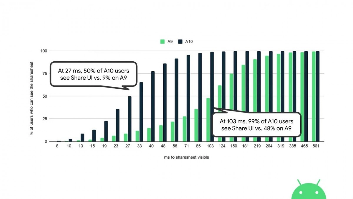
Well, Google now has the answer, in the form of a handy chart that shows that in a tenth of a second, most every user with a phone already on Android 10, will have seen the share menu interface after pressing the infamous connected dots icon. For the same time, just half of those with the same phone, but running on Android 9, will have seen the share menu UI.
Keep it up, Google, it's the little things that matter most when it comes to subconscious perception of your mobile operating system as "fast." Now, if we could only pin a few apps of our own choosing that we share to most frequently there, and discard the rest, that would be svelte. What do you think, has the shared menu speed tangibly improved for you with Android 10?

Popular stories


Latest News


Things that are NOT allowed:
To help keep our community safe and free from spam, we apply temporary limits to newly created accounts: