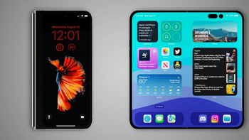
Apple vs Samsung vs Pixel vs LG notification shades: which one you prefer? (poll results)
Apple vs Samsung vs stock Android vs LG notification shades
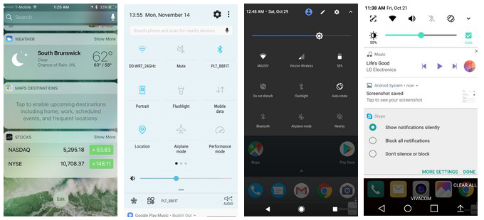
We made a quick overview and a visual comparison of the various approaches to the notification and connectivity toggle shades solution that different phone makers employ in their interfaces, and asked you which one you prefer. You can have a glimpse of the most popular notification shade layouts in the slideshow below, as, somewhat surprisingly given the spartan visuals and features of a stock Android shade, that's the one that took the cake with more than 40% of the 1859 votes. Next in line are Samsung and Apple's solutions, while LG and the rest are trailing in preference.
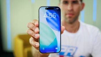
Those hidden interface panels where phone makers place shortcuts for quick access to connectivity toggles, and host app, call or message notifications, are one of the more diverse interface segments that can make or brake the respective user experience. From background to layout, from iconography to notification access - each and every one of the major phone brands approaches the notification and toggle shades' visuals in a different manner, and provides different ways to access them.
This interface element is usually tucked away from plain sight, and only visible when you pull up or down to preview a message or turn on, say, Bluetooth. The way you access the shade, however, and its layout, could make interaction with your device easier, or an exercise in frustration, that is why we wanted to do a brief listing of who does it how, so you can gauge what you are missing, or where the toggle panel of your phone maker excels compared to the rest.
Whose notification/toggles shade solution you like most?
Samsung
25.44%
Apple
18.07%
LG
10.27%
Stock (Pixel, HTC, Moto, Sony)
41.53%
EMUI (honor, Huawei)
2.96%
Other
1.72%
Apple vs Samsung vs LG vs Pixel and more notification shade solutions
Follow us on Google News


Things that are NOT allowed:
To help keep our community safe and free from spam, we apply temporary limits to newly created accounts: