Motorola Moto G 2014 vs Moto G 2013
Introduction
Smartphones are increasingly becoming cheaper, making them disposable to a wide array of people. On one side of the spectrum, we have cream-of-the-crop devices that deliver cutting-edge experiences – while on the other, entry-level devices help newbies, or those on a budget, to experience all of the features and power of a smartphone. And that’s without the hefty cost normally associated with them. Being one of the more prominent ones recently, the 2014 Motorola Moto G seems like a considerable step up to its predecessor in last year’s Moto G, but by how much really?
Design
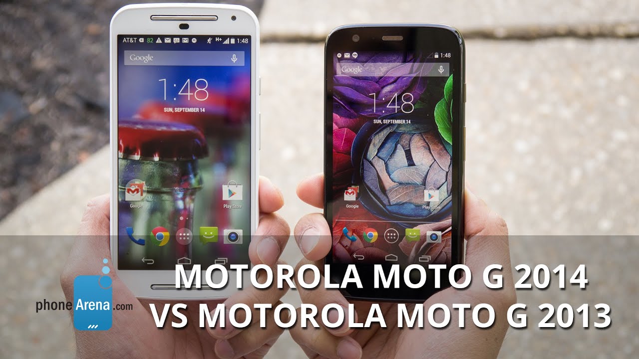
Let’s be frank here folks, these two handsets aren’t graced with stylish designs, but despite that, they’re noted for the subtle design customizations they have to offer – where their rear casing can be replaced for other ones. Visually, the two share the same design language and decent construction. At the core of it all, though, is the difference in size between them. Due to the original’s more compact and lighter frame, it’s undoubtedly the more comfortable one to grasp with a single hand.

5.57 x 2.78 x 0.43 inches
141.5 x 70.7 x 11 mm
5.26 oz (149 g)

5.11 x 2.59 x 0.46 inches
129.9 x 65.9 x 11.6 mm
5.04 oz (143 g)

5.57 x 2.78 x 0.43 inches
141.5 x 70.7 x 11 mm
5.26 oz (149 g)

5.11 x 2.59 x 0.46 inches
129.9 x 65.9 x 11.6 mm
5.04 oz (143 g)
See the full Motorola Moto G (2014) vs Motorola Moto G size comparison or compare them to other phones using our Size Comparison tool.
Display
Similar to their designs, the only two separating their display are their sizes – so depending on your taste, either one will suffice. Sporting the larger 5-inch 720 x 1280 IPS LCD display, the new Moto G’s size is more akin to today’s flagship smartphone, as opposed to something in the budget segment. Meanwhile, the 2013 made Moto G is packing a modestly sized 4.5-inch 720 x 1280 IPS LCD display – one that we feel to be a more fitting size for this caliber smartphone.


Interface and Functionality
Surely it’s something that purists appreciate, but to the average person, having stock Android presents them with an experience that’s simple, intuitive, and straight to the point. Unlike other handsets sporting customized experiences, the vanilla one here isn’t riddled with a whole lot of redundant software features. In fact, there are barely any of them here, as Motorola’s presence is reserved in services like Motorola Alert, Motorola Assist, and Motorola Migrate.
Even the two experiences almost mirror one another, the differences are some minor cosmetic changes to the interface – like how the newer build of Android running in the new Moto G has a transparent background with the app panel. Another minor difference here is that the new Moto G is running Android 4.4.4 KitKat – whereas the old Moto G is at Android 4.4.3 KitKat. Besides those things, we hardly recognize any profound differences that would sway us to like one experience more than the other.
User interfaces
Processor and Memory
Generally speaking, successors tend to receive processor upgrades to make them superior over their predecessors, but that’s not the case here, since both smartphones are powered by quad-core 1.2GHz Qualcomm Snapdragon 400 SoCs coupled with 1GB of RAM and the Adreno 305 GPU. Superficially, there’s not one that seems to outperform the other when it comes to executing basic tasks, but there’s a slim advantage to the newer model after glazing over some of their benchmark scores.
At the bare minimum, both Moto G handsets are available with 8GB of internal storage. Unlike its predecessor, the new Moto G benefits right out of the gate with a handy microSD card slot to supplement its capacity.
Internet and Connectivity
Needless to say, the original Moto G is still an effective device for surfing the web, but the only benefit to the new model is its larger screen size – allowing us to see more of a page when in a zoomed out view. Beyond that, we hardly realize any major advantage with one handset over the other in this particular department.
With the success of the original Moto G in emerging markets, Motorola has decided to offer the new Moto G in a GSM-only flavor. Well, there was a CDMA model of the 2013 Moto G, but that decision doesn’t extend with the new one. Aside from that, they offer the same set of connectivity features – like aGPS with Glonass, Bluetooth 4.0, and 802.11 b/g/n Wi-Fi.
Camera
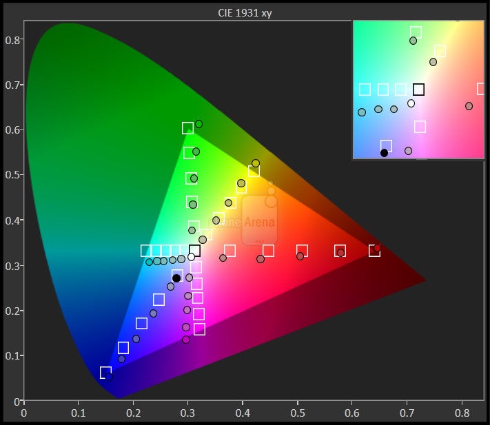
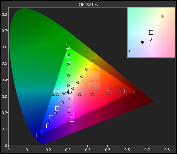
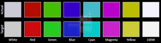
You’d think that the difference is enough to give more detail to the new Moto G’s camera, but that’s not necessarily the case. On paper, one would expect that kind of result, but the older camera gear is still able to snag some pretty looking photos. Interestingly, it’s the warmer color reproduction of the new Moto G that makes us prefer its quality more – as the older model casts cooler colors. Heck, it pretty much translates to all shooting conditions.
Sample images
Likewise, we prefer the new Moto G’s 720p video recording quality over its predecessor, mainly because of the softer detail quality and subdued audio recording of the 2013 Moto G.
Sample Videos
Multimedia
Boasting stock Android experiences, there’s no surprise that the two resort to the Google Play Music app as the default music player out of the box. Armed with only a single rear firing speaker, one that churns out 87 dB of audio, it easily eclipses the newer model’s dual front-firing speaker’s output of 74.2 dB. Naturally, it’s one of those freak things that catch us by surprise.
Videos play nicely on both devices, but the larger sized display of the new Moto G undoubtedly makes it the more ideal candidate for the experience. It’s not to say that it’s bad with the original handset, but we just simply prefer a larger panel for the experience.
The two Moto Gs resort to the Google Play Music app as the default music player
Call Quality
Although it’s still not perfect, we prefer the call quality of the new Moto G more than its predecessor. From the sound of it, Motorola has tweaked the quality, just because the original was plagued with noise and hollow sounding voices.
Battery
Considering that both phones are stuffed with the same 2070 mAh battery, we’re not too shocked to find that the older model outlasts the newer one in the battery life department. Due to its larger sized screen, the new Moto G taps out at 6 hours, 17 minutes in our battery benchmark test – while the original reaches 7 hours, 12 minutes.
Conclusion
Motorola has seemingly found success in the entry-level market, and it obviously shows with its Moto G smartphones. Before its introduction, owning a decent performing basic smartphone meant forking over $200 to pick up – so the feeling felt rewarding when we found out that the original model would bear an easy-to-pay price of $179.99. Of course, Motorola realized this advantage and has once again graced its new Moto G with the same, lovely price point.
In looking at their specs sheet, there aren’t a whole lot of changes to the new model. Heck, it features the same processor and battery capacity as its sibling, but it comes in a larger package. Quite simply, that’s going to be the differentiator when looking at these two, since the new Moto G is equipped with a more spacious 5-inch screen – in comparison to the original’s 4.5-inch one. Sure, there are also other reasons why you ought to choose the newer model, like the fact that it has a microSD card slot, dual speakers, and better call quality, but for some folks, the humbler performance and offerings of the 2013-made Moto G are enough to keep them content.
Follow us on Google News


Things that are NOT allowed:
To help keep our community safe and free from spam, we apply temporary limits to newly created accounts: