Just recently launched, AT&T has added the Motorola Z9, to stand alongside the RAZR2 lineup that was launched several months back. With the way things have been going for Motorola, we imagine that they are hoping to add onto the success of the RAZR2 with those handset to keep up with the competition. A quick glance over the specifications and just looking at the model shows that it wasn’t skimped on but the real question is how well does it perform? Well, let’s take a look and see.
What’s in the box?
Motorola Z9
Battery
microUSB to miniUSB converter
manual
Design:
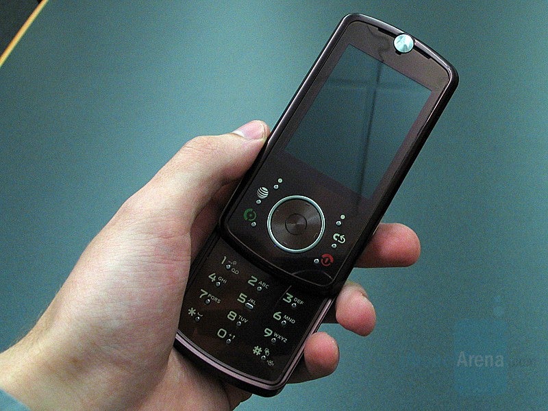
Dressed in the same deep burgundy color that the RAZR2 V9 is, the handset looks very stylish. The high glossy material on the front just screams out for more attention. The display takes up most of the front showing very bright and rich colors. Even on medium brightness, it was easy to make out what was displayed in very bright environments. The D-pad, found just below it, is quite large and comfortable to use and its texture make it easily distinguishable from the rest of the handset.
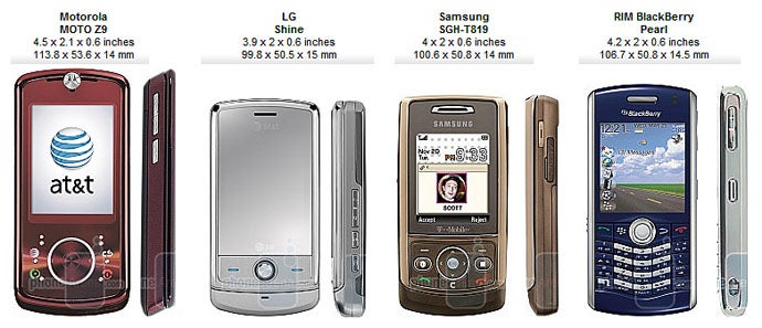
You can compare the Motorola Z9 to many other phones, using PhoneArena's Visual Size Compare tool.
The small buttons that make up the keypad and the navigation keys are rather annoying to use. They don’t take much effort to be pressed but it has to be right on them. If the surrounding area is pressed instead, it takes much more effort to activate the button. They are far too recessed and small to be easily felt without looking down at them and they are spaced far apart requiring lots of movement. Regular keys would be much better than what we have here.
The Z9 feels very sturdy and there was very little play in the slider in both closed and opened positions. The handset doesn’t feel as if it’s going to fall apart or break easily at any time.
Motorola MOTO Z9 Video Review:
Motorola MOTO Z9 360 Degrees View
Features and Software:
While the Z9 offers features you’d find with the RAZR2 V9 , such as Bluetooth, media player, microSD slot, it also offers some extra goodie, mainly the GPS navigation and AT&T’s media net that makes use of 3G.
What is media net you ask? Well, it’s a collection of all of the AT&T’s online offerings. This goes beyond just simple web surfing and gives you the option to download games and ringtones, watch videos, check email, listen to and download music, chat, and much more. Shopping, videos, and music have their own links or they can be accessed through the browser.
The Z9 is the first non-Smartphone in AT&T’s lineup to offer Navigator thanks to its built-in aGPS. To those who have used TeleNav before, this is the same software so don’t expect surprises. For the new comers, it’s a very simple GPS to use. The menus are well laid out with each subcategory falling into logical places.
Locations can be search for by city, address, intersection, business address, or by recent searches. If the still does not help, there is another spot to search for it by name. Find yourself in a remote location with no address and want to come back but don’t know how? Simple, just record the location into the navigation. It will show up in your favorites.
On cold boot, it took the handset about 45 seconds to acquire our location. Afterward, it was anywhere between 20-30 seconds depending on the location and signal strength. It’s a great alternative for those out of the blue moments so that your Tom-Tom or Garmin doesn’t have to ride along everywhere with you.
The web browser on the Z9 gets the job done fairly well. Its features include fit to page, full screen, zoom, and page scan. When fit to page is on, all scrolling is done vertically where as with it off, it’s like a regular browser on your desktop. Full screen just takes the status bar at the top and the menus at the bottom off of the page so that the entire display can be used. Zoom in and out do exactly what they sound like.
With page scan, the site can be scrolled across much faster. By default, when scrolling through it, the browser goes by links. Once page scan is turned on, half of the visible page is scrolled through at a time. The only issues we found was that some of the advertisements brought back a proxy server could not be found error and that the fit to screen feature didn’t work at times and it took two or three tries to get it to work. This only happened twice but it was frustrating.
Enough of all the explanations, you’re probably wondering how well pages were displayed. In most cases they render correctly and it is rare that some content overlaps other. Most pages display as expected, as on a computer.
The Z9 comes with a 2-megapixel camera with flash but is lacking auto-focus. Pictures came out good but there were times when they were dull. There wasn’t as much noise captured in the dark, as expected. Natural light brought the best results when it came to taking photos but they did tend to come out unsaturated in the outdoors on very bright days. Overall, it gets the job done when needed but results could be better.
Themedia player was great to use regardless of whether the environment wasquiet or loud. Unlike the loudspeaker during calls, it was actuallyvery loud. Even on it’s lowest setting, it managed to blast the music.Turn it up all the way it’ll really be loud. There is a setting forbass boost and special audio but the difference it makes is veryminimal.
Performance:
We tested the Z9 around Chicago and were extremely impressed by the reception quality. Only once did we experience having no signal, and this was even tested in spots where most of our other phones worked. The ones that did managed at most one bar while this handset pulled off a steady four to five bars. It did struggle holding onto the 3G signal as we were constantly seeing it going back between 3G and EDGE, especially once indoors.
Call quality could have been better though. The voices came through loud but sounded a little muffled. The recipients informed us that they experienced no such problems from their end. The speakerphone could have been much better. It wasn’t nearly loud enough and the voices sounded tiny. The positioning of the speaker also made it very easy to cover it up during conversations if the display was facing us.
Battery life was average at best. When roaming on the 3G network, it is rated for 3 hours of talk-time and the best we managed was 3 hours and 20 minutes. Day to day use showed that it could last you for about a day with heavy use and about 3 days with little to medium use.
Conclusion:
The Z9 turned out to be a great performer in the end. While the battery life could have been much better, it’s still not bad as long you carry a charger around. The strong reception makes it a great choice when traveling around and all the goodies that are packed into it, navigation, media player, mobileTV, and the games, can help anyone kill time during those boring moments. The stylishness of the handset will surely turn heads and separate you from the other models that are out there.
A discussion is a place, where people can voice their opinion, no matter if it
is positive, neutral or negative. However, when posting, one must stay true to the topic, and not just share some
random thoughts, which are not directly related to the matter.
Things that are NOT allowed:
Off-topic talk - you must stick to the subject of discussion
Offensive, hate speech - if you want to say something, say it politely
Spam/Advertisements - these posts are deleted
Multiple accounts - one person can have only one account
Impersonations and offensive nicknames - these accounts get banned
To help keep our community safe and free from spam, we apply temporary limits to newly created accounts:
New accounts created within the last 24 hours may experience restrictions on how frequently they can
post or comment.
These limits are in place as a precaution and will automatically lift.
Moderation is done by humans. We try to be as objective as possible and moderate with zero bias. If you think a
post should be moderated - please, report it.
Have a question about the rules or why you have been moderated/limited/banned? Please,
contact us.


![T-Mobile representative paints a super grim future for customers, reveals how you’re being lied to in stores [UPDATED]](https://m-cdn.phonearena.com/images/article/173253-wide-two_350/T-Mobile-representative-paints-a-super-grim-future-for-customers-reveals-how-youre-being-lied-to-in-stores-UPDATED.webp)


Things that are NOT allowed:
To help keep our community safe and free from spam, we apply temporary limits to newly created accounts: