
Clash of the titans: iOS 7 vs Android 4.3 comparison

Lock and home screens
On each home screen of an iPhone 5, 5S, or 5C there's room for 24 icons in total. Interestingly, a stock Android home screen on a Google Nexus 4 leaves room for only 20 app shortcuts even though the smartphone has a larger display with higher resolution. Of course, that's not too big of a deal, especially when both interfaces allow apps to be sorted in folders. Speaking of which, the iOS 7 approach to folders is more elegant as there is virtually no limit to how many apps the user can place in one. On Android in its stock form, there's a limit of 16 apps per folder, which isn't bad, but it is a drawback nonetheless.
The layout of an iOS 7 home screen is well designed, but perhaps it's all a bit too static, which is why we tend to like the versatility of Android. It is just that widgets are a pretty cool feature that Apple's mobile OS has yet to adopt in one form or another, and we don't see this happening anytime soon. But there are things that Android might learn from iOS 7. One of them is that the text, which is used to display the names of apps, changes color depending on what wallpaper image is being used (but it doesn't work with dynamic wallpapers for some reason). If the image is light, the text goes dark, and vice versa, which makes app names much easier to read. On Android 4.3, there's a shadow under the apps' names, but still, text isn't as legible as it is on iOS 7.
Quick controls and notifications
The Notification Center in iOS 7 has been overhauled and now takes the user straight to their agenda. That's very convenient for people who actually use the Calendar app. Those who find it too crowded in there are free to pick what notifications are to be displayed there – stocks information, unread email, Game Center alerts, reminders, and more. Android's notification bar is a bit different for it doesn't display much if there aren't any pending notifications. But on the other hand, the user does get updates via Google Now.
A noteworthy advantage for iOS 7 versus Android is that both the Notification Center and the Control Center can be accessed from any screen, even when they are hidden. Yup, even if you're playing a game or watching a movie. However, a double-slide is required in order to do that, which prevents the user from accidentally pulling out either of them. In Android, the notification panel is often not visible if a full-screen application is running, which renders it inaccessible.
Customization features
In addition, we have Apple's dynamic wallpapers (yup, they are just like Android's live wallpapers) – these can be set on both the home and the lock screens. Unfortunately, all you get out of the box is a single dynamic wallpaper in several different colors, and the wallpaper is suspiciously similar to Android's stock Phase Beam live wallpaper. We hope that someday, more dynamic wallpapers will be released for iOS 7, but this could be just wishful thinking.
Dialer and Contacts
Android's Phone app is very similar, but it has one notable advantage over its iOS counterpart, namely that it displays a photo of each contact as you scroll down the list, while the iPhone's contacts app shows a contact's image only if you tap on them to view detailed information, or if that particular contact is in your favorites.
On-screen keyboard and messaging
But when it comes to messaging, iOS has the upper hand over Android with its iMessage system, which automatically routes texts over the web instead of eating up the user's monthly SMS allowance. The feature works as long as the recipient is also using an iPhone or another compatible Apple device. Moreover, iMessage is usually faster than sending regular texts, shows you when the other person is typing their response, and syncs your conversations across Apple devices. It would be nice if one day Android integrates Hangouts with the messaging app, thus replicating to some extent the functionality of Apple's iMessage service.
Productivity tools
At a glance, the calculators on both platforms look pretty similar, but those who need to access advanced functions often will appreciate iOS 7's solution a lot more. The advanced panel is accessible as soon as the phone is flipped in landscape mode, while stock Android 4.3 requires the user to bring forth the advanced panel manually.
Also, we find the clock on iOS 7 better designed than Android's, and that's not only because its home screen icon now displays the actual time. It is more intuitive to use and better-looking, with easy to access additional timekeeping features.
Furthermore, we must mention that iOS 7 has apps for Notes and Reminders out of the box, while on stock Android 4.3, these have to be downloaded separately. On top of that, you get a Compass that has a built-in level as well, and Apple's Passbook app, which keeps track of your boarding passes, movie tickets, retail coupons, and more. Clearly, iOS 7 is loaded with more goodies out of the box.
Multitasking and support for multiple users
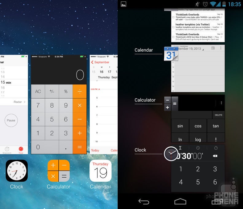
Multitasking on iOS 7 vs Android 4.3
One of Android 4.3's significant advantages over iOS 7 is that it allows multiple user accounts to be set on the same Android tablet. That allows one, for example, to share their Android tablet with friends and family without them having access to other users' personal stuff.
Siri vs Google Now
Both iOS 7 and Android 4.3 offer intelligent assistance provided by Siri and Google Now respectively. The former recognizes commands spoken in every-day language, so you can ask it to set your alarm clock, a reminder, or even send a text message to a specific contact, or get you driving directions. Moreover, Siri can search the web via Bing, look up things on Wikipedia, or check what's trending on Twitter. Don't speak English? No worries! Siri recognizes input in French or German as well.
Google Now is a little bit different. It is also capable of interpreting accurately your voice commands, but in addition, it attempts to provide the user with relevant information exactly when they need it. For example, driving directions will appear if it is the end of the work day. If you just looked up some place on Google Maps, Google Now will show you how to get there when triggered. If you have a plane trip coming, it will provide you with up-to-date details about your flight. And if you're in a different country, Google Now lists places of interest, currency exchange rates, and other useful information.
All in all, both Siri and Google Now are great additions complementing the overall user experience and can come in handy in all kinds of situations.
Internet browser
Both Chrome on Android 4.3 and Safari on iOS 7 are ideal for surfing the web as they are very fast, with support for multiple tabs and incognito browsing. Also, both can synchronize bookmarks and opened tabs between multiple devices, which is pretty cool for people who have to switch frequently between their desktop computer and a smartphone or tablet. We only wish that Chrome had Safari's Reader mode, which cleans all unnecessary content from a web page, leaving only an article's text and some images for easier reading.
Maps
Camera UI and Image Gallery
The iOS 7 gallery application has grown smarter now and it can sort your images based on the time and location they were taken at. It also lets you edit the image by adding filters, removing red eyes, fine-tuning the color balance, or simply cropping it in a desired proportion. Sharing photos online, be it on Facebook, Twitter, or via Email, is also an option, although a huge drawback here is that sharing via other apps or services – Instagram, Skype, or WhatsApp, for example – is not available, while Android has had this option for ages. The Android 4.3 gallery app can also edit and share images, as well as to sort them by date or location, so we don't think it is any less functional. It would have been cooler, though, if there were more thumbnail sizes available in grid view.
Multimedia

Music player on iOS 7 vs Android 4.3
If we had to pick between the iOS 7 music player app and Play Music on Android 4.3, we'd most likely go with the former. Apple's solution just feels a bit better organized, although Google's music player is definitely not bad either. Both apps allow one to control music playback from the lock screen, which definitely makes things more convenient. Also, they both come with built-in streaming music services – iTunes Radio for Apple's iOS 7 and Play Music All Access for Google's Android, and offer the ability to stream whatever audio the user has stored in the cloud.
To watch videos on Android 4.3 one has to use the Gallery application. Strange, we know, but for some reason, Android in its stock form lacks a dedicated video player. Fortunately, the Gallery gets the job done, although you might want to browse the Play Store for a proper video player in case you watch a lot of video on your smartphone. The iOS 7 video player is okay as well, with a pretty simple UI and support for closed captions.
Conclusion
It is pretty hard, if not impossible, to say whether iOS 7 or Android 4.3 is better. That would be like saying that bananas are better than oranges, or vice versa. The fact of the matter is that both operating systems are pretty well made. And perhaps we won't be wrong if we say that the two are in their best state to date, although we can't be sure whether the new look of iOS will appeal to all long-time fans of the platform. To wrap it all up, those who favor a clean, elegant, intuitive interface (also the people who aren't sure what they want) would likely be perfectly happy with iOS 7 in its latest form. Sure, it might be limited when it comes to customization, but it is well polished and crafted with lots of attention to detail. And let us not forget that iOS excels when it comes to availability of high-quality applications for download. On the other hand, people who are into tweaks and modifications, those who like the feeling of having more control over their smartphone would be better off with Android. It may lack the elegance of iOS, but it is still a full-fledged contemporary operating system loaded with useful features. Moreover, Google's Play Store tends to be richer in free applications, even though their quality sometimes lags behind that of the software made for iOS.
Popular stories


Latest News

Things that are NOT allowed:
To help keep our community safe and free from spam, we apply temporary limits to newly created accounts: