Apple's new logo: vivid, colorful, still bitten?
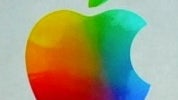
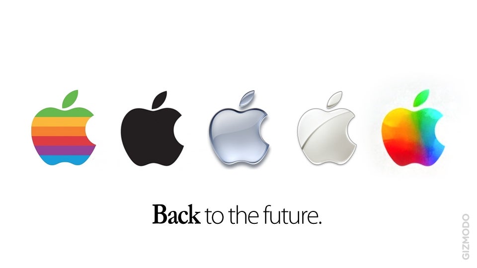
Apple’s third iPad event had a couple of “Back to the future” moments. First, after the iPad 2, we’re back to the iPad, or the “new iPad” as Apple calls it. And then, a slide left on the presentation screen at Yerba Buena in San Francisco showed a new Apple logo - something somewhat similar to the first colorful Apple emblem.
A departure from the purpose-driven cold metallic bitten apple, with its message of cold simplicity, that's what we see in it at first glance.
You see the new logo Cupertino used yourself - it’s a rainbow, or a palette inside a bitten apple. Nothing revolutionary, but still beautiful. Much more humane, much more lively.
Is this a tribute to Steve Jobs? Or does it have something to do with the amazing Retina screen of the new iPad? We don’t know, but you can feel free to share your suggestions and thoughts about it below. Oh, and do you like it?
source: Gizmodo
Follow us on Google News










Things that are NOT allowed:
To help keep our community safe and free from spam, we apply temporary limits to newly created accounts: