Apple vs Samsung, Google, Huawei and OnePlus navigation gestures comparison, vote!

Navigation gestures have been around for a while, but there is a renewed focus on employing them at a system level, both on iOS and by Google. With Android phones, of course, manufacturers can freely add gestures on top of what Google has hard-coded as options resulting in a richer variety of options that we are now going to preview for you by platform and brand.
The days when you had to root, jailbreak or install third-party apps in order to forego stretching all the way up or down while holding the phone with one hand are (almost) gone, so here is how everybody is coping with "all-screen" phones gesture navigation at the moment.
Apple - the 'gestural' iOS
Despite the giant protrusion at the top, Apple managed a nice screen-to-body ratio percentage by trimming the bottom bezel significantly, but that had one side effect - no home button. With the 2018 iPhone crop, Apple killed its iconic home key for good, carrying over the simple iPhone X gestures that were seemingly easy for people to adapt to.
Samsung One
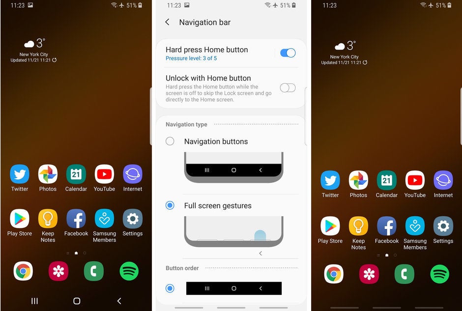
Samsung is a bit handicapped when it comes to navigation gestures, as the sides of its curved OLED displays are doing their People Edge or other duties, so busting a move from there is out of the question for now. It already has a pull-down and swipe-up gestures on an empty screen area to bring the notification shade from the clouds or open the app drawer, therefore the only side left for a new navigation party, is the very bottom.
That's exactly what the new One UI does - its gesture navigation option replaces the bottom strip with three even-spaced "pills" for home, back and recent apps, or you can hide those altogether and only swipe by muscle memory. Unfortunately, except being more aesthetically pleasing by doing away with the navigational strip, these gestures add no value to the navigational ergonomics, as you have to stretch even further down with your thumb to execute. We won't comment on the smoothness of the One UI gestures until it hits a retail stage, of course, but the basic concept is unlikely to change until then.
Huawei Emotion
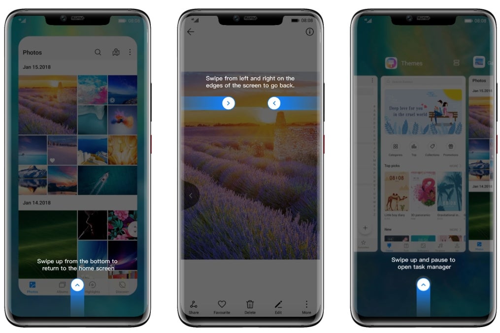
Huawei's gesture-based interface option tries to, thankfully, incorporate the sides of the new Mate 20 series, and the P20 will join when it gets the new EMUI 9 with Android Pie. We know what you are going to ask - does going back by swiping from the screen edges works well with cases on? It does surprisingly well, at least with the official silicon case that comes in the Mate 20 and 20 Pro boxes.
Moreover, Huawei didn't complicate things further by asking you to guestimate where does the home button gesture area end and the recent apps one begins like Samsung. It just did what Apple does with the notch-y iPhones, and incorporated one move for both home screen and recent apps calling by simply holding the swipe-up gestures a bit longer.
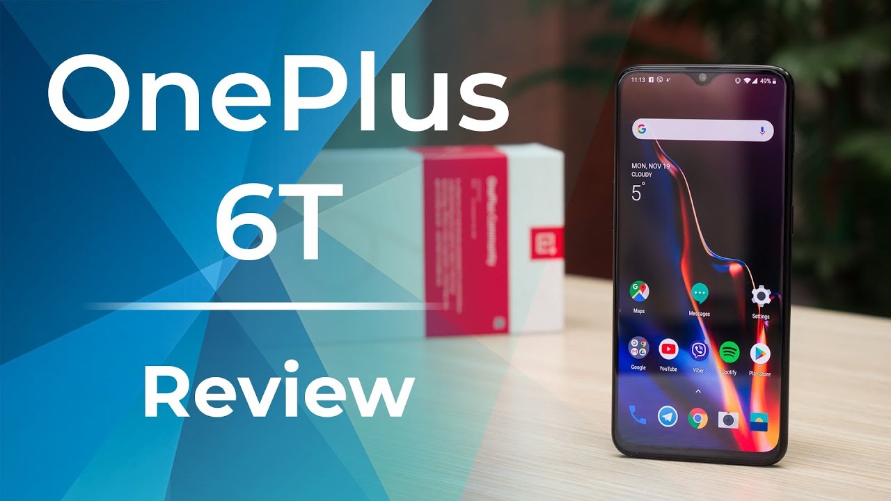
OnePlus Oxygen
Given that OnePlus has wiggled its way onto US carriers like T-Mobile, we are using its approach as an example, but Xiaomi and other smaller than Huawei Chinese makers have been having gesture navigation before it was a thing. They are now much more polished, though, given that Google has incorporated them in Android on a system basis.
On the OnePlus 6T, for instance, you can choose from a traditional strip, Android Pie navigation indicators similar to what Google's Pixel 3 has, or a clean bottom with no navigation visuals. Should you choose the latter, the OnePlus 6T indeed becomes "all-screen" at the front, at least from a navigational perspective.
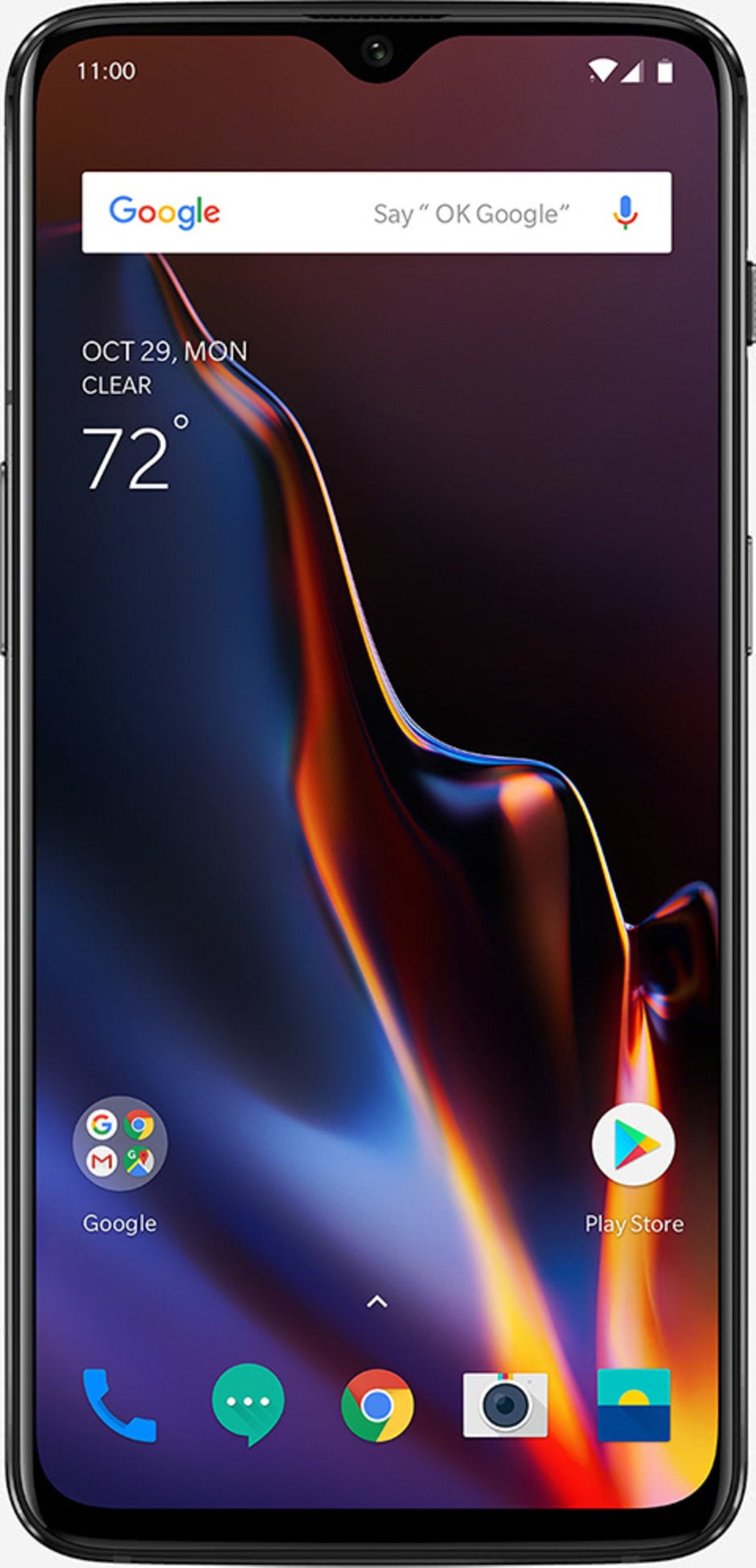
Google Pixel
Swiping up from the pill brings the multitasking view with current app frames to swipe between, pick or flick away. Below them, you can now find the search field and a few often used apps for added convenience.
This system works and it works fine, with the typical Pixel smoothness. There is still no going back by swiping from the sides though, though, and you still have to stretch all the way down and to the left to reach the most used navigation key on your phone.
Google hasn't given you the options to customize or bring back the navigation bar of yesteryear, so the learning curve might be steeper.
Follow us on Google News


Things that are NOT allowed:
To help keep our community safe and free from spam, we apply temporary limits to newly created accounts: