Every product we review or recommend is thoroughly tested by our in-house experts in real-world conditions, following our
review methodology
and
ethics statement
to ensure honest, independent, and data-driven results.
Introduction:
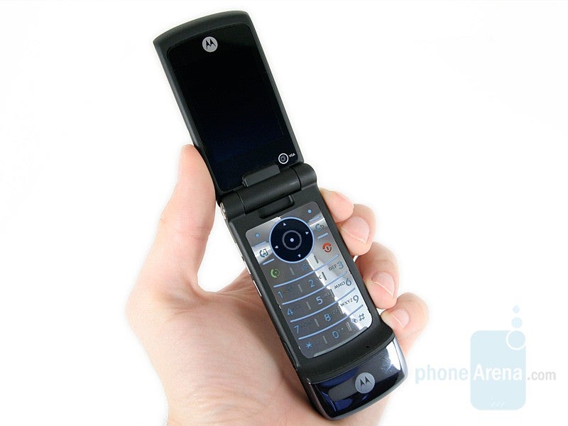
What we are currently previewing is the new Motorola KRZR K3, the successor of the K1 which we reviewed last year. The new model is based on the successful glossy first KRZR but builds on it by improving the functionality and the hardware, now supporting 3G networks.
Design:
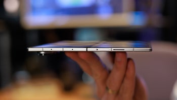
The original KRZR was available in a few color schemes, just like it happened with the RAZRs, but each one used this color for glossy front, math aluminum back and colored the sides in silver. The K3 would also be available in more than one color but replaces the silver with black and adds black area on the front, for contrast when put next to the K1. We don’t really get its idea as the phone remains very friendly to fingerprints, but you can easily make the difference between it and the K1. The whole construction feels well and is solid, but we received two units – brand new device and one that has been used for tests. It shows how your phone will look if you don’t care for it much – fallen paint, wobbling shell and battery cover. A unit in good conditions opens very easy, the spring mechanism is robust and thanks to the fossette between the two shells, where you can easily push a finger.
One of the improvements when it comes to hardware is the increased size of the two displays. The larger external display is now readable even in bright light but unfortunately this is not the case with the internal one. Still it is slightly larger in size and uses QVGA resolution instead of 176x220 pixels that was put in the K1.
Unlike the K1m, which was offered by CDMA carriers, the K3 doesn’t feature external keys for controlling the media player. The internal keyboard left us happy, keeping in mind it is very flat. All buttons are big enough, press with no worries and have tactile feedback. The four side keys can hardly be felt and pressed if you don’t know their position by heart.
The K3 is using Motorola’s Synergy OS, which can be found in many of their phones. Compared to the K1, the main menu will show 3 icons more (3x4 instead of 3x3) which results in layout similar to other modern phones. The Phonebook is very similar to other Motorola phones, and we love that a contact can store a slew of numbers. The organizer won’t surprise you but will do the job, featuring 5 alarms, calendar, calculator and world clock.
But we won’t discuss these features really in-depth, as the KRZR K3 is not designed as a working horse, it is mainly a phone, and a fun device on the second. The multimedia menu stores the handy Media Finder, which sorts your music, video and imaging files. Let’s try the music capabilities: the songs are sorted by artist/albums/genres or playlists, and the now playing interface visualizes big album art cover. The music player can be left at background level while you do something else on the phone. We are disappointed that the Video player didn’t open simple MPEG4/H.263 clips in QVGA resolution. It didn’t have any problem with 3GPP, but it is of very low quality.
The Camera interface also won’t really impress you, with its 90’s look. The most inconvenient is that if you shoot with the central position of the D-pad, by pressing it again it won’t save the picture but start composing a message and if you want to shoot in a series, the left soft-key should be used to go back to the interface.
The quality is on the average for a 2-megapixel unit. The images have the typical “cameraphone”-taste with strange oversaturated colors and burned areas when shooting in bright light. Indoors, they will be usable only if there is lots of light, so avoid shooting when it is dark.
One of the really cool features of the K3 is its new full HTML browser that allows you to preview internet pages as on a computer. This is a version of mobile Opera, done for the Synergy OS and works very well, rendering correctly most pages. If the speed or the traffic is a problem, you can prevent the images from loading. If we compare this miniOpera to the browser of Symbian S60 phones, we miss the minimap feature which shows you which part of the page you are looking at, which is handy as on those small displays one can have problems with the orientation.
Performance:
As the K3 is a 3G-enabled handset, Motorola has packed it with powerful processor which during usage will result in fast opening of the menus. Although both K1 and K3 use the Synergy OS, the K3 is significantly faster. More power is always welcome. As a phone, it disappointed us with the mediocre signal reception. As any other unit, we tested in an area with decreasing signal strength, and it scored 3.5 out of 5, which puts it next to other pretty phones like the Nokia Luna and Sony Ericsson T650. The sound quality is good one, above the average level so we won’t really complain about it. The volume in both sides is strong and the voices sound realistically, but slight lack of high-frequencies makes them feel flat.
Conclusion:
We are not really impressed by the K3 as it builds on the first KRZR but brings just too little improvements. The design has just minor changes and doesn’t bring the phone to the next level, which the RAZR2 series do. If you have been in love with the K1 but wanted a 3G capable version – go for it, otherwise we would prefer looking at the RAZR2 devices.
A discussion is a place, where people can voice their opinion, no matter if it
is positive, neutral or negative. However, when posting, one must stay true to the topic, and not just share some
random thoughts, which are not directly related to the matter.
Things that are NOT allowed:
Off-topic talk - you must stick to the subject of discussion
Offensive, hate speech - if you want to say something, say it politely
Spam/Advertisements - these posts are deleted
Multiple accounts - one person can have only one account
Impersonations and offensive nicknames - these accounts get banned
To help keep our community safe and free from spam, we apply temporary limits to newly created accounts:
New accounts created within the last 24 hours may experience restrictions on how frequently they can
post or comment.
These limits are in place as a precaution and will automatically lift.
Moderation is done by humans. We try to be as objective as possible and moderate with zero bias. If you think a
post should be moderated - please, report it.
Have a question about the rules or why you have been moderated/limited/banned? Please,
contact us.


Things that are NOT allowed:
To help keep our community safe and free from spam, we apply temporary limits to newly created accounts: