The Facebook Messenger design update is live and oh boy... it's something else
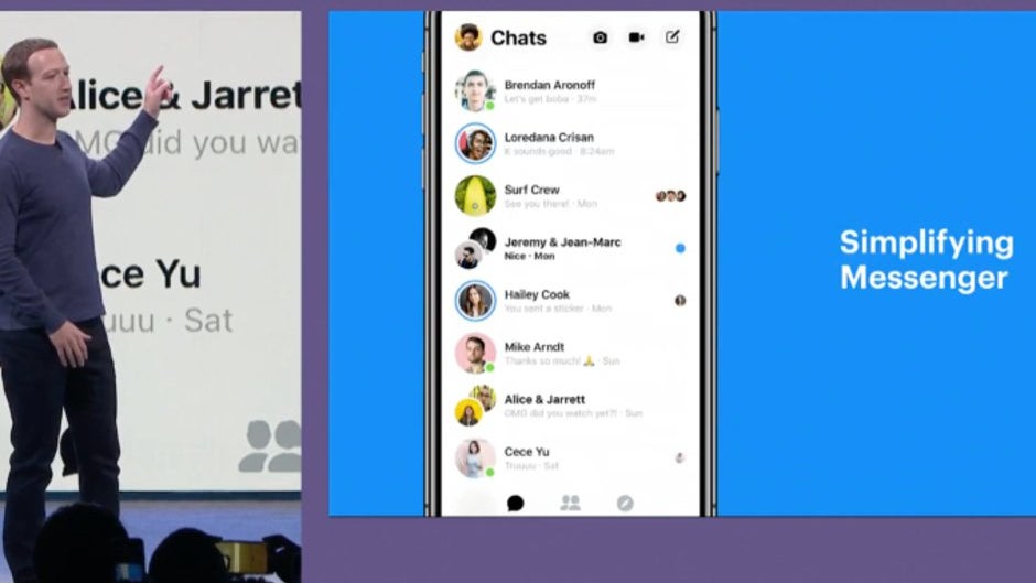
Facebook has been brewing an UI design update for its Messenger app for quite a while now and it seems it finally feels it's complete, as the new appearance is now popping up on user phones worldwide. It's a server-side update, so if you don't have it yet, don't go looking for an app patch in your app store — it'll come automatically.
If you're among those that already have it, you may be a bit irked by the new appearance. Don't worry, you're not alone.
There's a silver lining, though — Facebook is testing out a Dark Mode for its new design, which means that you will be able to grey-out that bright background. When is it going to roll out? Hopefully soon. Whether or not we will be able to get a zoom-out feature for the freakishly large content — we'd wager that's a "no".
New Facebook Messenger
The issue is that the new design is big, bold, and extremely white. This accomplishes two things that users tend to... adore. The searing white background is quite aggressive when you open up the app in the dark, while the big icons and bold text take up a lot of screen real estate. Suddenly, your 6-inched display doesn't look like it can hold that much content anymore.
When you open new #Facebook #Messenger at night pic.twitter.com/jFdZKSGCVG
— Neo Genesis (@genesis_neo) January 9, 2019
There's a silver lining, though — Facebook is testing out a Dark Mode for its new design, which means that you will be able to grey-out that bright background. When is it going to roll out? Hopefully soon. Whether or not we will be able to get a zoom-out feature for the freakishly large content — we'd wager that's a "no".
But hey, on the bright side, you can now customize chats with color gradients!







Things that are NOT allowed:
To help keep our community safe and free from spam, we apply temporary limits to newly created accounts: