Ever since the OG
iPhone, the Apple handset has had one signature characteristic — just one button on its front. A very simple concept to get — you've got power and volume off to the side of the phone, just like how it has been since the first cellphone; when it comes to navigating the smartphone's interface, the only hardware button you have is “Home” — everything else is in text and on the screen.
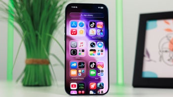
Apple's iPhone user experience has been touted as being simple, straightforward, and pleasurable over the years, and that home button played a huge part in that. Now that it's gone, Apple has moved to a gesture-based UI, and the features it couldn't assign to gestures, it has moved to the power button.
So, now, a single tap on the power button is a sleep / wake, as before; a dual-tap activates Apple Pay; triple-tap will bring up any accessibility options you have enabled. A press-and-hold activates Siri. A power + volume up press takes a screenshot; holding power + volume up will bring up the Power Off prompt.
On the UI side, swiping up from the bottom now acts as pressing the home key; swiping up and holding for a bit activates the Recent Apps menu / carousel; swiping down from the top-right calls out Control Center, while top-middle and top-left bring down the notification shade, like before.
That's a whole lot of changes to the iOS user experience. Sure, one can learn to use them, but the amount of time your regular, 2-year-cycle upgrade person would need to research this seems very... in-Apple-ish. A lot of stuff has been switched around because of the new hardware, and we can't help but wonder if some issues might have been solved by just making an area of the screen always act like a home button. Apple has a pressure-sensitive 3D Touch display, why not have the lower center of it be a virtual home button like Samsung did with the Galaxy S9?
What's your take on this?
Read the latest from Preslav Kateliev


Things that are NOT allowed:
To help keep our community safe and free from spam, we apply temporary limits to newly created accounts: