Check out these concepts that might have been Windows Phone

As many of you, our learned readership, may already know, the Metro Modern UI that graces Windows Phone was not arrived at in a flash of genius. Like so many designs, it was an evolution.
Part of the user experience was derived out of the Zune music players, which had a clean interface and ran smoothly on the hardware that was available at the time.
Running up to the release that would become Windows Phone 7 and Windows Phone 8, it is quite interesting to see which way the design might have gone. Some of the early renderings in the short video below are reminiscent of Symbian in a way. Another view depicts a land of bubbles.
Then we see the beginning of the clean lines and use of space to provide content and a super smooth user experience. It also marks how Microsoft has pursued a new design philosophy. That focus is reaching near ubiquity across the line of products powered by Microsoft’s operating systems. Now we will be able to see how that design philosophy evolves later this year.
source: WMPowerUser
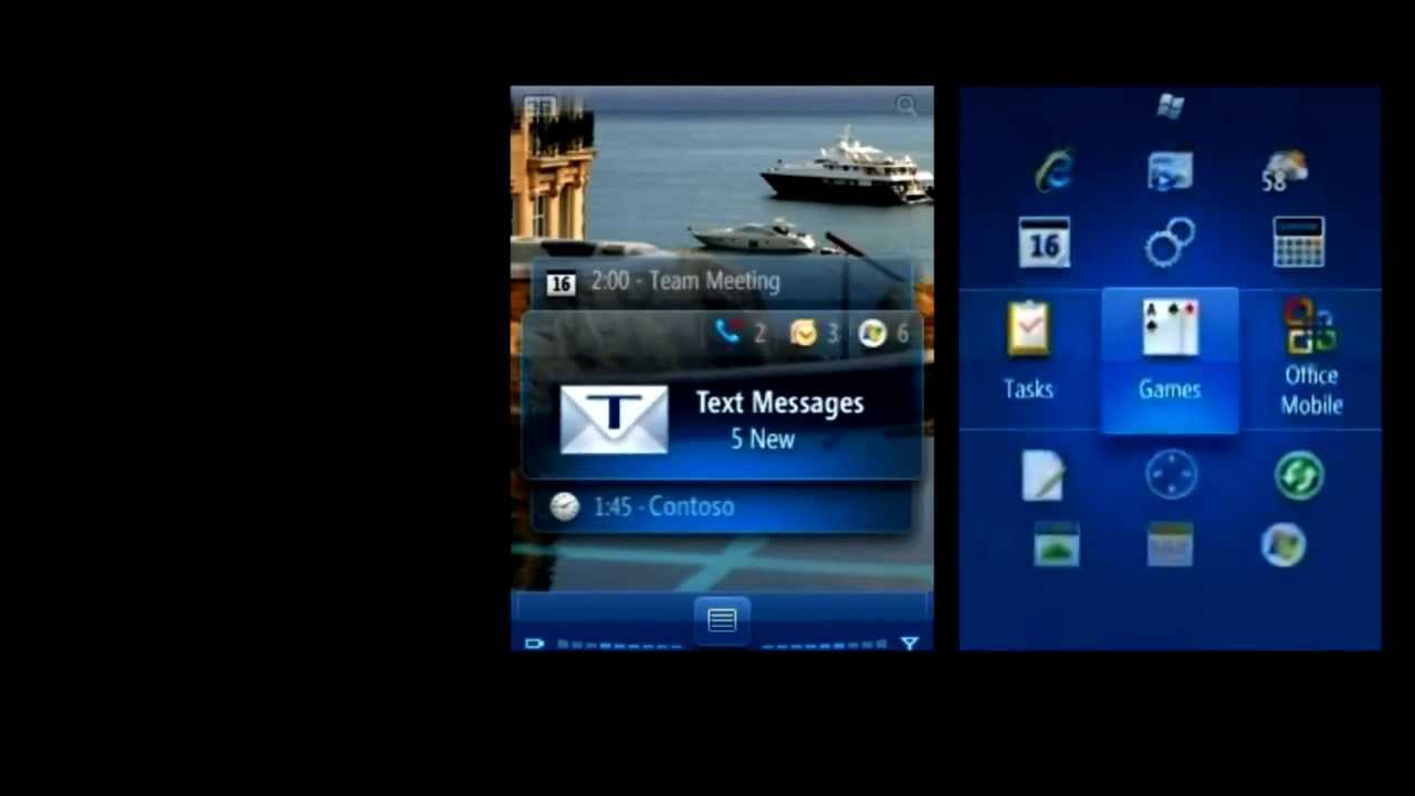
Part of the user experience was derived out of the Zune music players, which had a clean interface and ran smoothly on the hardware that was available at the time.
source: WMPowerUser





Things that are NOT allowed:
To help keep our community safe and free from spam, we apply temporary limits to newly created accounts: