Google Play app icons get a refreshed new look
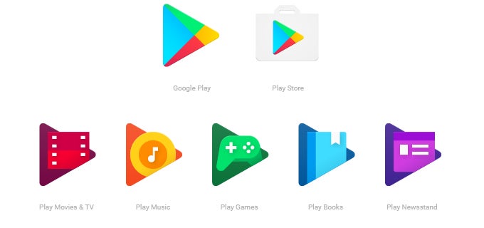
As noted in an official blog post on the matter:
Since launching Google Play four years ago, we've always had dedicated apps in addition to the Google Play store. Today, all our icons are getting an update to provide a consistent look across the entire family of Play apps.
The old icons, as seen below, will be phased out over the next couple of weeks in favor of the new look (above).
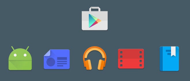
Not a groundbreaking adjustment, by any means. But if we had to pick, we'd say that the new play-shaped icons are an improvement on the older look.
Do you agree, or would you rather Google left them be? Let us know of your thoughts below.
source: Android Blog via Droid-Life
Follow us on Google News





Things that are NOT allowed:
To help keep our community safe and free from spam, we apply temporary limits to newly created accounts: