HTC One (M8) with Lollipop vs One (M8) with KitKat: UI comparison
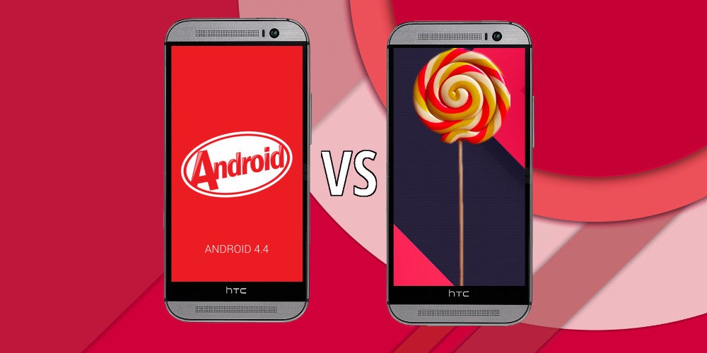
After a plethora of petty delays and detains, HTC has finally begin to roll the newest, Android 5.0 Lollipop-based version of its Sense UI for all those who have opted for an HTC One (M8) flagship. The rollout began today (January 28) and will likely hit the majority of One (M8) users in the following days. We were among the lucky ones, as our resident HTC representative was among the first ones to get its fair taste of the Lollipop sweetness.
As curious as we are, we quickly and eagerly buried our heads inside the updated interface and began an extensive search for all everything that's been changed and overhauled after the transition from Kitkat to Lollipop. Frankly said, this ordeal did not take us long, as HTC, just like Samsung, has changed just a few things in its the newest version of its firmware - Sense 6.0 on Lollipop is similar to the "old" Sense 6.0 UI that ran on KitKat.
The majority of improvements is certainly under the hood, as the UI feels a tad more fluid and snappier than before, but then again, this might be a placebo effect. Without any more ado, let's explore the changes right below!
Lock screen
The first difference that you'll notice when you update your One (M8) to Lollipop will be the lock screen. It's now a bit more polished and streamlined, displaying your notifications in a Lollipop-like fashion. Just like in stock Android, swiping dismisses the notification and double-tapping it opens the corresponding app. Apart from the slightly dimmed lock screen wallpaper at the bottom, you are also treated to an estimate of how long it will approximately take before your phone's battery gets charged to the brim. The lock screen shortcuts at the bottom have fortunately remained intact.
Notification drawer and Quick Settings toggles
Here is it, another pretty substantial and nice improvement of the interface. The One (M8) now acts has adopted Lollipop's revamped notification drawer and quick toggles panel to some extent. Gone are the times when you had two separate, side-by-side screens (one for your notifications and the other one housing your quick toggles) - say "Welcome!" to a slightly revamped Lollipop drawer. A single swipe brings down your notifications, while an additional one reveals the quick toggles shade, which has been treated to a noticeable Material Design revamp.
This is where most similarities end, however - there is no brightness slider (HTC has decided that a toggle is a much more appropriate solution) and the Settings toggle is gone (this menu can be accessed via a handy button above the toggles now), for example. HTC has also kept the long-press functionality for almost all of the toggles, which turned to be quite the persona non grata in stock Android 5.0.
Recent Apps switcher and active applications
If you've been fond of the organized task switcher menu in the KitKat version of Sense 6 UI, then we have some very, very bad news for you - it's gone by default, vacating the place for the carousel-like menu of Lollipop. You can, however, still opt for a more classic, Sense UI-like grid menu with your recent apps. The new carousel one that tends to get quite cluttered fairly quickly, but it's still quite pleasing to interact with if stock Lollipop floats your boat. However, we feel like HTC was on the right track with its Recent Apps menu in Kitkat, which felt a bit more functional. It's gone now, so we have to get used to the new entrant, which doesn't allow you to close all app cards at once (like Samsung does with in its Lollipop-based TouchWiz on the Galaxy S5), so you'll have to do this manually.

Apart from this, the Running Apps menu hidden in Settings has also been improved - it now displays a much more user-friendly breakdown of the current state of your 2GB of RAM, separating the system from the user-installed apps. Generally, we see this as a huge improvement in comparison with the KitKat-based Sense, which can't hold a candle to the new view of the menu.
Settings and Battery usage history
The Settings menu has remained the same except for a useful addition - you can search through the various menu entries thanks to a newly-added search button in the upper right corner of Sense UI's Settings. This addition can be overlooked quite easily, mind you. Another noteworthy improvement can be found in the battery consumption menu of the Lollipop-based Sense UI. It's pretty similar to the one in stock Android. It now provides you with a more in-depth breakdown of your battery usage.
Conlusion: Is it worth it?
Yes, it is. Those who have been expecting a complete and total Material Design will certainly be disappointed, but the visual and functionality improvements that the Lollipop-based Sense dons over its predecessor are mostly spot-on. We bet that the next iteration of Sense UI will probably be the one to really shake things up in HTC's camp.
As a whole, the highlight of this update for the HTC One (M8) will be the performance improvements - we are yet to spend more time with our updated One (M8), but we can definitely say that there's a noticeable improvement in the overall responsiveness of the device. And this is always welcome, right?


Things that are NOT allowed: