Samsung Galaxy Note and Galaxy Nexus sport HD Super AMOLED - is the PenTile matrix bad for you?

The first generation Super AMOLED displays, as found on the Samsung Galaxy S, used a then new matrix arrangement called PenTile, which allowed for high resolutions on the tricky to manufacture OLED displays. For various reasons it degraded visibility in certain conditions, compared to the traditional RGB matrix.
Since then many smaprthones, and even tablets, started using the PenTile matrix, in both AMOLED and LCD screens. Now that we are holding the first HD Super AMOLED display on a prototype Samsung Galaxy Note, we decided to check if things are advancing with the PenTile pattern on the new HD displays.
To PenTile or not to PenTile – where's my resolution?
Samsung's seed investment Nouvoyance, the company behind the PenTile matrix used in the HD screens of the Samsung Galaxy Note and Galaxy Nexus, informs us that the PenTile matrix technology complies with the accepted VESA standard for display resolution.
While the PenTile creators say the technology is just different from the stripes we are used to look at with RGB matrices, but its subpixels are a third wider, thus increasing aperture, some argue about the "missing subpixel" paradigm. Others even go as far as cutting the default horizontal and vertical numbers by a third, and then calculating the density from a subpixel standpoint.
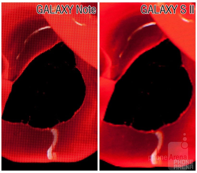
Nouvoyance says that the difference in pixel arrangement is clearly visible only when you look closer while displaying small details on saturated red for the RGBG PenTile in AMOLED displays, and when showing them on saturated green for the RGBW PenTile in LCDs, like the one on Motorola's qHD Droids.
Moreover, the Android UI used some elements that exacerbated the PenTile pattern visibility, such as pixel-wide UI elements, and some fonts on saturated primary colors, where the matrix arrangement could make things appear fuzzy. The ATRIX, for example, used to have this solid green battery icon that showed RGBW PenTile pattern visibility when looked at from very close, so Motorola changed it with one of the software updates. With the new Roboto font in Android Ice Cream Sandwich, built from scratch for high-res displays, this should be even less of an issue.
The premise of the PenTile creators is that their invention is not inferior to the traditional RGB, but actually a different way to arrange a display matrix, where you lose some definition diagonally, visible at lower pixel densities, but gain brightness, ease-to-manufacture, contrast and power efficiency. For higher pixel densities you stand to gain from PenTile, they argue, and, since this novel arrangement is slowly creeping into both LCD and AMOLED screens of various high-end smartphones, starting with Samsung and Motorola, we'd better check if these claims hold water.
We test
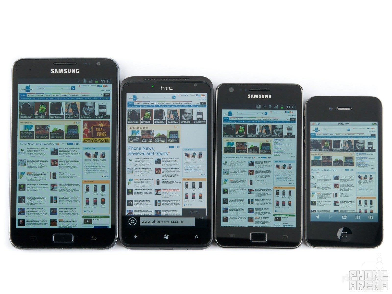
To save you the suspense we want to state clearly that at no point while using the 800x1280 pixels 5.3" screen on the Galaxy Note could we see any jaggies or the pattern of the pixels arrangement - even on individual letters at full zoom at the closest possible distance to our eyes we couldn't discern anything, let alone in normal use. Cold colors making white appear blueish ever since the Super AMOLED on the first Galaxy S - yes, that exists even in the new HD Super AMOLED , but details were the clearest we've seen on any AMOLED to date.
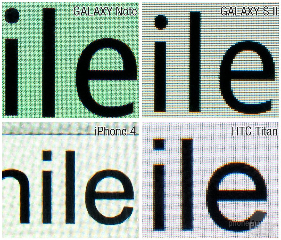
If we follow the “cut a third” logic, then the Galaxy Note density should go down to about 190ppi from the official 285, and thus fare worse than the 217ppi on the Galaxy S II, which is not the case. Again, this is zoomed to a level that you will never encounter on the phones themselves.
Of course, the best way to compare an HD screen with PenTile is to pit it against another HD one with traditional RGB matrix, but for now we are working with what we have.
Conclusion
To wrap it up we'd say that the fears about PenTile appear hugely overblown when it comes to the new HD Super AMOLED technology, which delivers higher pixel density. The folks from Nouvoyance seem to be open about the advantages and disadvantages of their matrix arrangement, and never said flaws don't exist in certain conditions. Moreover, it seems that PenTile is here to stay, and Samsung is even prepping an RGBW LCD screen with 1600x2560 pixels resolution, resulting in 300ppi at 10.1-inch size.
In any case, if we nitpickers couldn't find anything troubling with the screen on our prototype Galaxy Note, then the average user shouldn't even care what matrix their smartphone or tablet display uses to bring them those entertaining YouTube clips of cats falling off TVs.
additional info: OLED-A & PenTileBlog


Things that are NOT allowed: