iOS 7 concept shows that change is good
Even diehard Apple fans have gotten to the point where they are looking forward to a UI redesign for iOS, and the rumors say that is exactly what Apple has been working on. And, while Apple may not pay attention to concept renders, maybe Tim Cook and Jony Ive should take a look here and there, because this new one shows a striking new look for iOS 7.
One of the keys to a quality concept render in our opinion is keeping the concept in the same spirit as the company that makes the real life product. That was one thing that disappointed us about the recent multitasking concept we saw, because it didn't feel like an Apple design. It felt like the BlackBerry 10/MeeGo multitasking pasted into iOS. It's also what we really enjoyed about the iOS widget concept we saw way back (that led to the designer being hired by Apple). That felt like an Apple implementation.
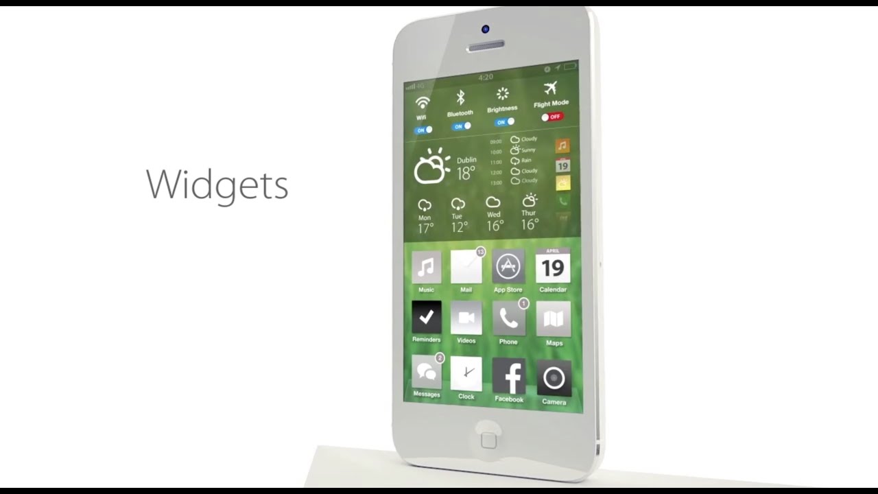
And, that's what impresses us about this iOS 7 concept from Simply Zesty. Certain elements were obviously lifted from other sources. For example, the weather widget is just the Eye in the Sky weather from Android, some of the color and design looks inspired by the Google Play Store, and the lockscreen feels a bit like Windows Phone with the popup menu. But, overall, it feels like a product that Apple could actually release. The widgets are hidden in the notification tray, the homescreens still look like iOS, and while certain items are similar to other platforms, there is just enough change to seem like an Apple product.
source: The Next Web

![T-Mobile is phasing out plans with included taxes and fees starting tomorrow [UPDATED]](https://m-cdn.phonearena.com/images/article/169988-wide-two_500/T-Mobile-is-phasing-out-plans-with-included-taxes-and-fees-starting-tomorrow-UPDATED.jpg)


Things that are NOT allowed: