Sony Xperia XZ user interface: here's how it looks compared to the last generation!
As you probably know, Sony released what is considered its 2016 flagship, here at IFA 2016 in Berlin. The Xperia XZ a Snapdragon 820-equipped beast with a camera, which Sony claims it put a lot of effort into, and some new design elements to it, which make it look a bit more contemporary and even desirable.
Now, we have touched a bit on the new interface on our hands-on, but came back for a few screenshots to share. Sony's new interface definitely looks and feels cleaner, but without sacrificing the typical Sony look and operation. Well, not all of it at least — it seems that the floating Small Apps are gone for good. That's something that Sony decided to kill off back with the release of its first representatives of the X series and it seems it's sticking to that decision.
So, on to the interface, we are greeted by the clean reskin of Android that Xperias have been known or. Most stock apps are not placed in a circle, and definitely look flatter than before, keeping up with contemporary fashions. There doesn't seem to be an option to put 3rd party icons in circles, however — that's something that Samsung, for example, does to maintain coherency among its icons.
But all in all, we are happy to see that there isn't much bloat to be found, and the separate camera modes seem to be gone from the app drawer, instead of flooding it with icons. Their place is in the camera app and not on our homescreens, and we are glad to see that Sony agrees.
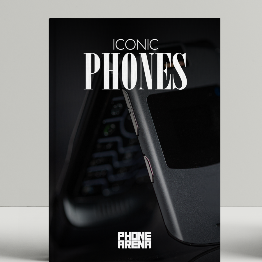
So, since the Xperia XZ is considered to be the flagship this year, we drew a quick comparison between it and last year's Xperia Z5. Check out how the interfaces differ below!


Things that are NOT allowed: