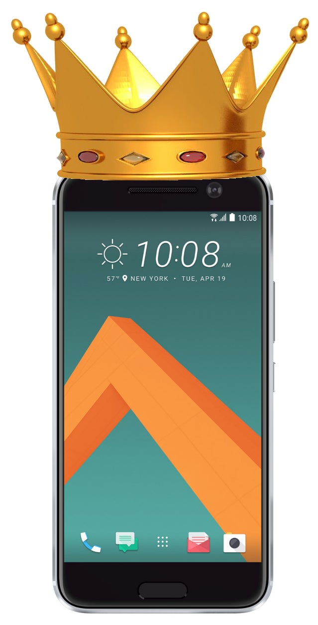
When HTC was launching the HTC 10, one of the main things it took pride in was the fact that its interface is rid of duplicate apps — the bane of every Android smartphone. If you are curious what it is we are talking about – here's a quick rundown:
Google allows manufacturers to use its Android OS for free, but obliges them to keep certain Google apps on their handsets as a part of the deal. These are your usual Gmail, Drive, Google Photos, Google Play, and a few more. Some manufacturers, however, like to customize user experience fully to their own style and want to create their own app equivalents of the Google apps. Even worse, some might just go overboard and create apps that overlap in function, effectively ending up with a confusing mess of duplicate apps on their smartphone.
HTC said it worked closely with Google in order to get rid of most duplicates on the HTC 10. The company promised a slim and streamlined interface right out of the box. Many were happy at the news and quickly started drawing comparisons to competitors like Samsung and LG, pointing at their interfaces, allegedly full of bloat. So, we decided to take a closer look and really see if anyone is still a serious offender in the duplicate apps game.
In all fairness, most of the time, these "bloat apps" or duplicates can be uninstalled, or, at the absolute least, disabled. But, let's be honest — nobody likes to open a brand-new smartphone only to start deleting stuff off of it. And many non-power users out there have absolutely no idea what they are looking at, feeling confused and overwhelmed when attacked by an army of colorful icons.
Recommended Stories
We grabbed the current giants — the Samsung Galaxy S7, LG G5, Sony Xperia Z5, and, of course, the HTC 10 — performed a Factory Reset on each of the phones, and counted the apps in every one upon a fresh launch. Here's what we found out:
The worst offender
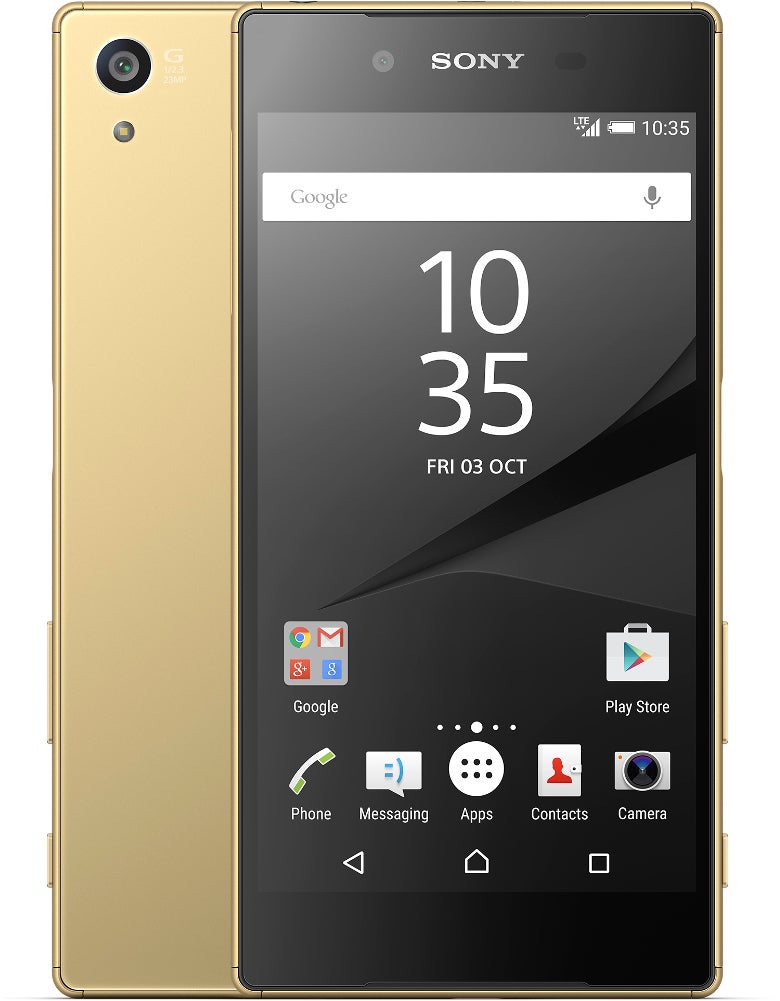
It didn't take us long to notice that Sony's Xperia Z5 is the worst offender in terms of having a bit too many apps in its utility belt. For example, we have Google's Photos app, which serves as a gallery browser and video player. However, Sony also has the separate apps Album – for photo viewing – and Video, for clip playback. Additionally, the Xperia has its own Music app, then the obligatory Google Play Music, and Spotify to top it off. We've got File Commander for our file exploring needs, but then have a separate Downloads app, which lets us view our recently downloaded files, despite the fact that File Commander already has such a tab. You can check out all our notes in the table below.
LG and Samsung are not as bad as believed
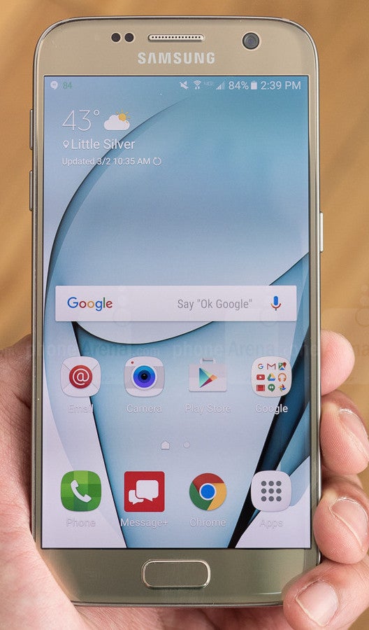
Samsung's TouchWiz UI has garnered the reputation of being heavy and bloated, and sure – it has had a fairly long period when it deserved these adjectives. However, for the past year or so, Samsung has been working on streamlining the experience and cutting off the excess bloat. Checking for duplicates, we didn't find many offenders.
Samsung does have its own Email app, next to Google's Gmail, which serves the same purposes; there's a proprietary Internet browser, doubling Google's Chrome. Sammy also continues to install S Voice on its smartphones, effectively doubling the Google Now voice-activated assistant. Finally, there's Samsung's proprietary Gallery app, co-existing right along Google's Photos. Arguably, Sammy's Gallery is a pretty useful tool, so it may have won its right to be a duplicate app.
To top it off, we also have some extra Microsoft productivity apps pre-installed, such as Excel, PowerPoint, and OneDrive. Not necesarrily bad, as many users may actually be using these apps, and Sammy does make up for this sin by offering users 100 GB of free OneDrive storage bundled with every Galaxy S7, so it's kinda hard to be too mad about these.
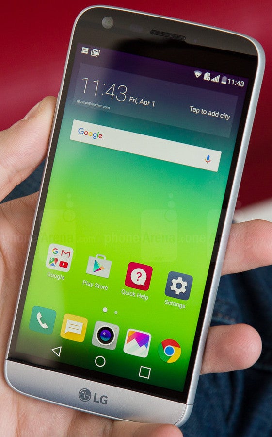
LG's G5 goes even lighter on the bloat – we've got the duplicate Email app, a Music app, Gallery, and the ever-confusing combo between separate Downloads and File Manager icons. We don't understand why – when you open the File Manager, you have access to your recently downloaded files right at the top of the app.
So, those duplicates aside, LG's only sin is the fact that it offers 4 icons, which open specific menus that can otherwise be found in Settings. We are talking about “Battery saver”, “Memory”, “Battery usage”, “Storage & USB”. All that these icons do is open Settings and navigate us straight to the respective tab. We would've preferred an easier-to-navigate Settings menu than a bunch of shortcuts on our homescreen, really.
Truly the slimmest of them all
(except for Nexus devices)
The HTC 10 proved itself to be the slimmest in this competition. Of course, Google's Nexus devices will have an even slimmer interface, due to the fact that there is no 3rd party input in them. On the HTC 10, we only have 1 duplicate – HTC's Email app, next to Google's Gmail. Interestingly, there is a Downloads browser, but absolutely no file manager out of the box. We have a feeling that HTC should've went the other way around with this decision, but oh well.
Preslav, a member of the PhoneArena team since 2014, is a mobile technology enthusiast with a penchant for integrating tech into his hobbies and work. Whether it's writing articles on an iPad Pro, recording band rehearsals with multiple phones, or exploring the potential of mobile gaming through services like GeForce Now and Steam Link, Preslav's approach is hands-on and innovative. His balanced perspective allows him to appreciate both Android and iOS ecosystems, focusing on performance, camera quality, and user experience over brand loyalty.
Recommended Stories
Loading Comments...
COMMENT
All comments need to comply with our
Community Guidelines
Phonearena comments rules
A discussion is a place, where people can voice their opinion, no matter if it
is positive, neutral or negative. However, when posting, one must stay true to the topic, and not just share some
random thoughts, which are not directly related to the matter.
Things that are NOT allowed:
Off-topic talk - you must stick to the subject of discussion
Offensive, hate speech - if you want to say something, say it politely
Spam/Advertisements - these posts are deleted
Multiple accounts - one person can have only one account
Impersonations and offensive nicknames - these accounts get banned
Moderation is done by humans. We try to be as objective as possible and moderate with zero bias. If you think a
post should be moderated - please, report it.
Have a question about the rules or why you have been moderated/limited/banned? Please,
contact us.


Things that are NOT allowed: