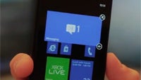
Microsoft gives us a closer look at the Windows Phone 7.8 start screen
Share:
Share:
23 Comments
1. pongkie posted on 25 Jun 2012, 22:10 14
They should also add lock tile so the most important tiles don't go away while you scroll
8. jove39 posted on 26 Jun 2012, 00:05 0
Write to MS about it...hope they include this feature in future update!
20. pongkie posted on 26 Jun 2012, 08:57 0
is there a suggestion site for wp8 like the forums for w8 coz i cant find it in thier site?
22. chipotsky posted on 26 Jun 2012, 11:37 0
Yes.
just do search for "windows phone feature suggestions". Sory phonearena wont allow me to use the URL. :(
It has been discussed already on their boards and is a great idea.
23. cepcamba posted on 26 Jun 2012, 14:57 0
Man come on! Don't just suggest it! Patent it, then suggest it! Filing for a patent is free! And they award patents even for concepts like yours.
9. kartik4u98 posted on 26 Jun 2012, 01:08 2
yes..write to microsoft about this great idea..good LucK !!
10. AppleConspiracy posted on 26 Jun 2012, 03:20 2
You mean something like docked icons on iOS? How would you solve this in Windows Phone LiveTile concept and configuration? I don't see the other way except introducing something like fixed dock, and that would be killing the basic idea of Metro Style in the first place...
19. pongkie posted on 26 Jun 2012, 08:36 0
not really there are other ways. like you can lock them on top, sides, or even in the middle. you dont have to sacrifice an entire row or column. if you lock a tile on a certian spot other tiles "give way" by resizing temporarilly or skip as you scroll. I wish I could explain better what i see in my mind but im poor in writing this visual stuff
21. poddey posted on 26 Jun 2012, 09:04 0
I don't know... that sounds kind of messy and confusing if you have tiles resizing themselves when scrolling. :p
If you are having to scroll a lot then I'd say you've put way too many tiles on, or at least a lot more than you would typically use day to day.
MS should have just implemented folders that opens up a larger tile above or below the folder tile when you tap it.
2. -box- posted on 25 Jun 2012, 22:27 1
Dunno what more personalization there needs to be, unless each tile or tile group got its own color. Any background image would mess with some Live Tiles' functionality (esp People Hub).
12. kanagadeepan posted on 26 Jun 2012, 04:45 0
So M$ has cheated their early adopters with just one eye-candy instead of many more useful features in WP8...
16. Santi_Santi posted on 26 Jun 2012, 07:41 0
Not necesarilly. in fact, they are looking for a more looking reaction so at the end, features can be solved by mere apps or updates.
13. AppleConspiracy posted on 26 Jun 2012, 05:24 1
Generally, I think Microsoft is making a mistake with enabling more customization options to the users.
Those users that actually need customization and freedom are very rare in comparison to users that only THINK they need it. Apple and iOS proves that - they are based on strong restrictions, and they won't let users mess with the carefully designed UI just to give "freedom" to make UI look the way we want.
Good product is based on strong visual and functional identity that comes served before the end user and stay that way. The "product" that don't have strong identity and is fully customizable, is not actually a product, but tool. And users generally don't want tools, they want products, something that has a design.
By abandoning the perfectly designed Metro UI in WP7/7.5 with two columns asymmetrically placed in relation to the screen surface, Microsoft is introducing mess and visually downgrades the best feature WP has - superiorly designed UI.
As a product designer, I must mention this, despite apparent illogic - beacuse we allways thin that good products means great freedom for user that gets what it wants, but this is only a Grand Fairy Tale of consumersim. Products actually must tell users how to use it and how to accept it, and that's the real and only true wish of the consumer, that he won't admit of course. But industrial designer musnt' fall in this trap and listen to the users. And Apple knows it very well.
14. PhoneArenaUser posted on 26 Jun 2012, 07:07 1
"And users generally don't want tools, they want products, something that has a design."
Not all.
18. poddey posted on 26 Jun 2012, 08:29 0
Although you could say a lack of customisation options in IOS hasn't hurt iPhone sales, the availability of a tonne of customisation options on Android hasn't hurt Android sales either. In fact, customisation is a differenting factor that Android has used to its advantage and very successfully at that.
Besides that though, all Microsoft has done with WP8 is widened the live tile grid an extra 2 spaces across and allowed the tiles to be resized. That's not a whole lot more than before on WP7 & 7.5. They haven't gone whole hog like Android. You still can't have wallpapers (not that they would be visible behind the tightly packed tiles) and any colour you choose will be rendered solidly all around with no option for even any gradients. I'd say WP8 retains the strong identity established by WP7.
Having said that, I do think the new wide grid is a bit too much. There is not enough "white space", which is a fundamental part of the Metro DNA if I'm not wrong. It's the white space that gave the original UI in WP7 it's elegance. Yet I always thought it looked slightly awkward being offset to the left just to include an arrow on the right. For my money, the dimensions the MS designers went for when zoomed out on the live tiles in customisation mode is what they should have gone with as the default.
15. AppleConspiracy posted on 26 Jun 2012, 07:31 0
@PhoneArenaUser
Well, I said "generally" for a reason. Furthermore, the "real" users (those who want maximum functionality and "openess") are very illusive, because you cannot pinpoint what exaclty they need in opposition to what they desire, and you certainly cannot reduce them to one homogenous mass because they are fundamentaly differentiated by what they want their smartphone to do.
Most users - and this "most" is the key word - are what makes all important stuff to smartphone manufacturers. Most users want to be told what they want. They want product for sure, not a tool. The real "user" in everyone of us is latent, hidden, neutral and transparent toward this "visible" dimension that is a true product. Making products invisible is therefore only an illusion, and leads to poor marketing.
Consumers are defined by their desire, but their desire is NOT defined by their actual needs. They need something else - an object of their desire, but with a catch - to look like they need something, becuse admiting that we are consumers and not "true users" is unacceptable for us.
Android user is a "true user", but doesn't look that way. iPhone is not a true user, but he looks that way. And this other scenario sells products, first - not so much.
17. Santi_Santi posted on 26 Jun 2012, 07:45 0
Looks great! but i have to share many things said here like lack of features and closed ecosystem. But i have to say MS is trying hard to get in the market. So lets wait. I guess this will be a hard battle


