This article may contain personal views and opinion from the author.
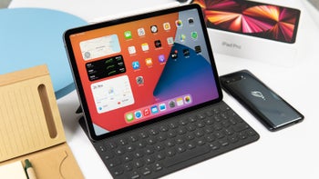
Like some of you, countless times have I attempted to use my iPad as a laptop, because it certainly looks like one if you splurge on one of Apple's iPad keyboards. And many arguments were had at the PhoneArena offices whether using an iPad as a computer is ultimately possible or not. Or whether such a comparison should even be made.
I've been kindling an optimistic dream of using a tablet for everything, since I first got to use a 2nd-gen iPad in the early 2010s.
Back then the iPad was basically just a large iPhone, with the exact same apps, looking and functioning the exact same way… but blown up onto a bigger touch screen.
And for the time, it made perfect sense. The early iPads were just a then-novel way to browse the web and watch movies on something that wasn't a heavy, thick, loud laptop with short battery life.
So it was very cool and space age to use an iPad for the first time. But yeah, a work machine it wasn't, by any means.
Enter iPadOS 13. Apple released this iPad software update in late 2019, and it brought us the now iconic, rounded-corner, centered taskbar, complimenting the familiar top bar, making everything look a tad more MacOS-like.
And now, (prepare to) enter 2024… Because apparently the next Windows 12 will copy all that.
Indeed, oddly enough, Microsoft's upcoming update of its immensely popular PC operating system is shaping up to look a lot like iPadOS. In fact, the current Windows 11 already took a not-so-subtle step towards Apple's tablet interface by introducing centered taskbar icons for the first time on Windows, clearly taking cues from iPadOS and MacOS.
Recommended Stories
Windows has been getting more beautiful, and suspiciously iPadOS and MacOS-like. Windows 11 got a centered taskbar for the first time, after 30+ years of existing as a distinctly visually-different MacOS rival…
Windows 12?
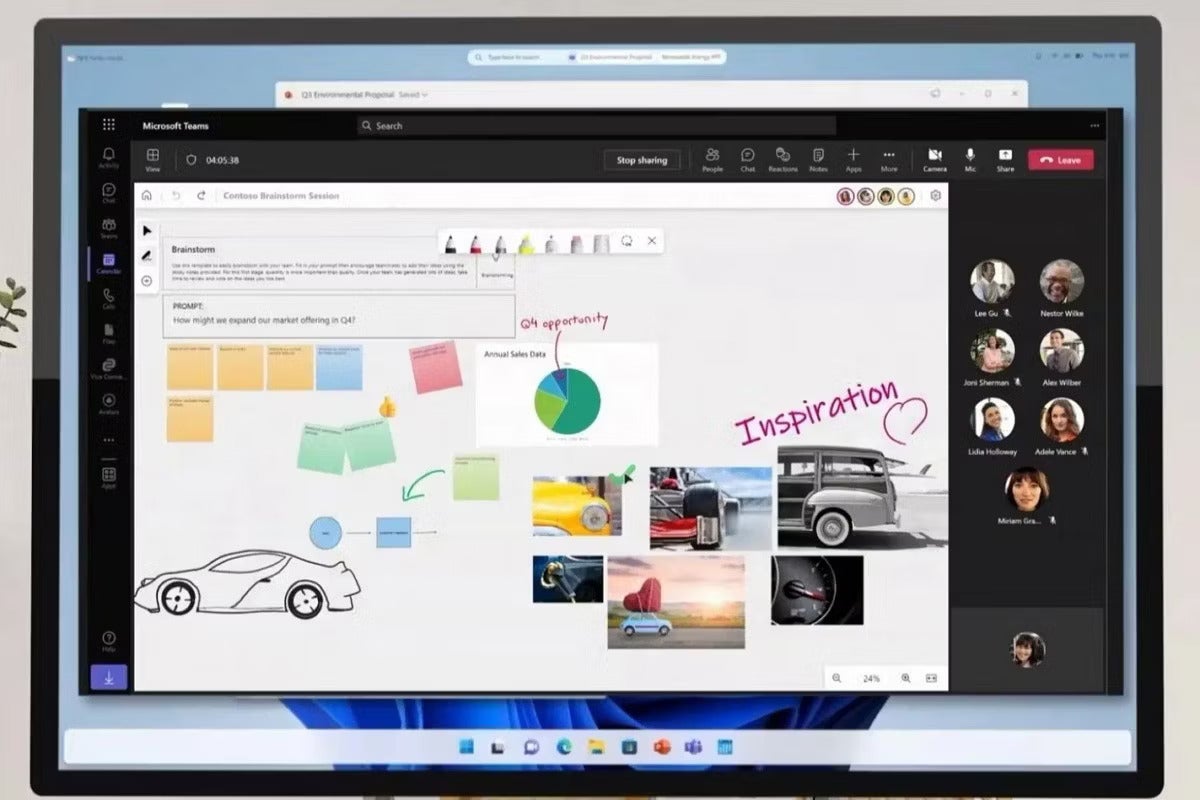
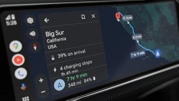
The image you see above is allegedly taken from a Microsoft showing at CES, courtesy of XDA Developers. It's not exactly the sharpest image, but it's showing us a lot nonetheless.
For the first time, Windows is apparently getting the kind of top bar iPads and Macs have always had, and just like them, it has the time and quick toggles (for volume, Bluetooth, WiFi, etc) to the top right.
Not only that, but the taskbar on the bottom there is now floating and has rounded corners, which, along with the aforementioned centered icons, makes it quite a bit different from prior Windows taskbars, and suspiciously a lot like the iPadOS taskbar.
Is Microsoft seeing iPadOS as the perfect tablet+PC interface? Looking towards Apple for UI design cues, just like it did with Windows 11?
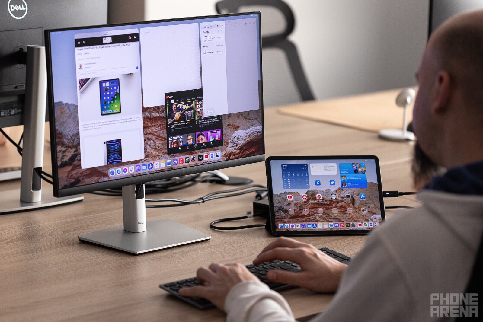
Using a modern iPad with an external display
It was back in 95 when the aptly-named Windows 95 first introduced the now iconic Windows taskbar with a start button on the bottom left, and app tabs next to it, also aligned to the left.
And since then (if we ignore a short oopsie called Windows 8.0) things have remained the same, and have become extremely familiar to generations of Windows users. So needless to say, making changes to the taskbar for the first time after several decades is a very, very major thing to do.
We could argue that Microsoft may be klepping that top bar idea from Linux as well, but let's face it – those changes to Microsoft's Windows operating system, that we've been seeing in the last few years, are pretty clearly inspired by either MacOS or iPadOS. As great as Linux can be for the right person, Microsoft is unlikely to view it as a true rival, and even less as the holy grail of visual design that appeals to the mainstream user.
So it begs the question – why has Microsoft seemingly decided to replace its iconic UI (user interface) with something so Apple-like? And why now, when iPad and Mac UIs have looked like this since their earliest years?
Could this be born out of the fact that Microsoft's attempts to rival the iPad with its own Surface tablets is going… not quite great? So Microsoft feels "encouraged" to reconsider the Windows UI? Make it as "best" as it can be for both PC users and tablet users? Make it as pretty and familiar as possible for both of those scenarios? Seems plausible.
And since Apple's iPad is the most popular tablet out there, vastly outselling all of the competition, its interface is obviously what most people recognize, and would probably like for others, like Microsoft Windows, to imitate.
I don't see this as bad, at all
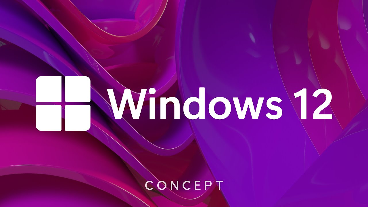
Don't get me wrong, I'm not complaining about where Microsoft is headed, even if I am nostalgic for the classic Windows look. The operating system has indeed gotten more pleasant-looking with the Windows 11 update, and if it becomes further iPad like, as the image above suggests (and the video below envisions) – even better!
Because I tried using a Microsoft Surface Go 2 tablet as my main laptop just last year, and while I liked the idea, I can confirm that the current Windows interface really isn't great for tablets just yet, and does need work in that aspect.
Not only am I happy that Microsoft is going the Apple route, but I encourage it. However, I'm pretty certain Windows purists won't be so happy to see the world's most powerful, mainstream PC operating system rapidly losing its identity, and copying its rival.
Is this admitting defeat? Or just keeping up with the times?
What do you think? Ultimately is this a good thing or a bad thing for your PC and Windows tablet? Or is Microsoft losing its identity by chasing the Apple look?
Windows 12 concept by YouTuber Avdan
Do you agree with Microsoft's apparent attempt to improve Windows for tablet users, or do you believe it should go back to, and stick with the traditional Windows interface – a start menu to the left, icons to the left, no top bars, no rounded corners, etc?
Rado, a tech enthusiast with a love for mobile devices, brings his passion for Android and iPadOS to PhoneArena. His tech journey began with MP3 players and has evolved to include tinkering with Android tablets and iPads, even running Linux and Windows 95 on them. Beyond tech, Rado is a published author, music producer, and PC game developer. His professional work on iPads, from producing songs to editing videos, showcases his belief in their capabilities. Rado looks forward to the future of mobile tech, particularly in augmented reality and multi-screen smartphones.
Recommended Stories
Loading Comments...
COMMENT
All comments need to comply with our
Community Guidelines
Phonearena comments rules
A discussion is a place, where people can voice their opinion, no matter if it
is positive, neutral or negative. However, when posting, one must stay true to the topic, and not just share some
random thoughts, which are not directly related to the matter.
Things that are NOT allowed:
Off-topic talk - you must stick to the subject of discussion
Offensive, hate speech - if you want to say something, say it politely
Spam/Advertisements - these posts are deleted
Multiple accounts - one person can have only one account
Impersonations and offensive nicknames - these accounts get banned
Moderation is done by humans. We try to be as objective as possible and moderate with zero bias. If you think a
post should be moderated - please, report it.
Have a question about the rules or why you have been moderated/limited/banned? Please,
contact us.


Things that are NOT allowed: