Samsung's head of interface design got on stage during its developer conference keynote in San Francisco a few weeks back and detailed what is perhaps the biggest interface overhaul in the phone brand's history. Dubbed One UI, this Android 9.0 Pie interface of Samsung can already be found on large troves of Galaxy flagships like the Galaxy Note 9, S9 and S9+, and is poised to soon grace the Galaxy Note 8, S8, and S8+ as well.
The kicker is, however, that Samsung has rethought navigation and display content from the ground up with today's big screens and its upcoming foldable phone in mind. Thus, the actionable content is situated in the bottom half of the usable screen canvas, with big, fat, juicy icons and switches, while the glanceable or readable one is at the top where your thumb can't reach anyway, especially on today's 6"+ phones.
This sounds like the Holy Grail of big-screen touch interfaces and is a totally different approach compared to current one-handed modes that simply shrink the content to manageable heights, making icons microscopic in the process. Let's take a look at how the first of the One UI interface that is coming soon to your S9 or Note 9, fares against Samsung's current Experience 9 edition.
One UI vs Experience UI navigation and new features
The two most noticeable new options that One UI brings to your oldie but goldie Galaxy are gesture-based navigation replacing the usual virtual key strip, and the system-wide Night Mode. That last one is a godsend, as you can see in the screenshots below, especially at night when you don't want blinding white backgrounds to pierce your eyeballs. We kept it on during the day as well, as black is gentler on battery life when it comes to OLED displays.
Recommended Stories
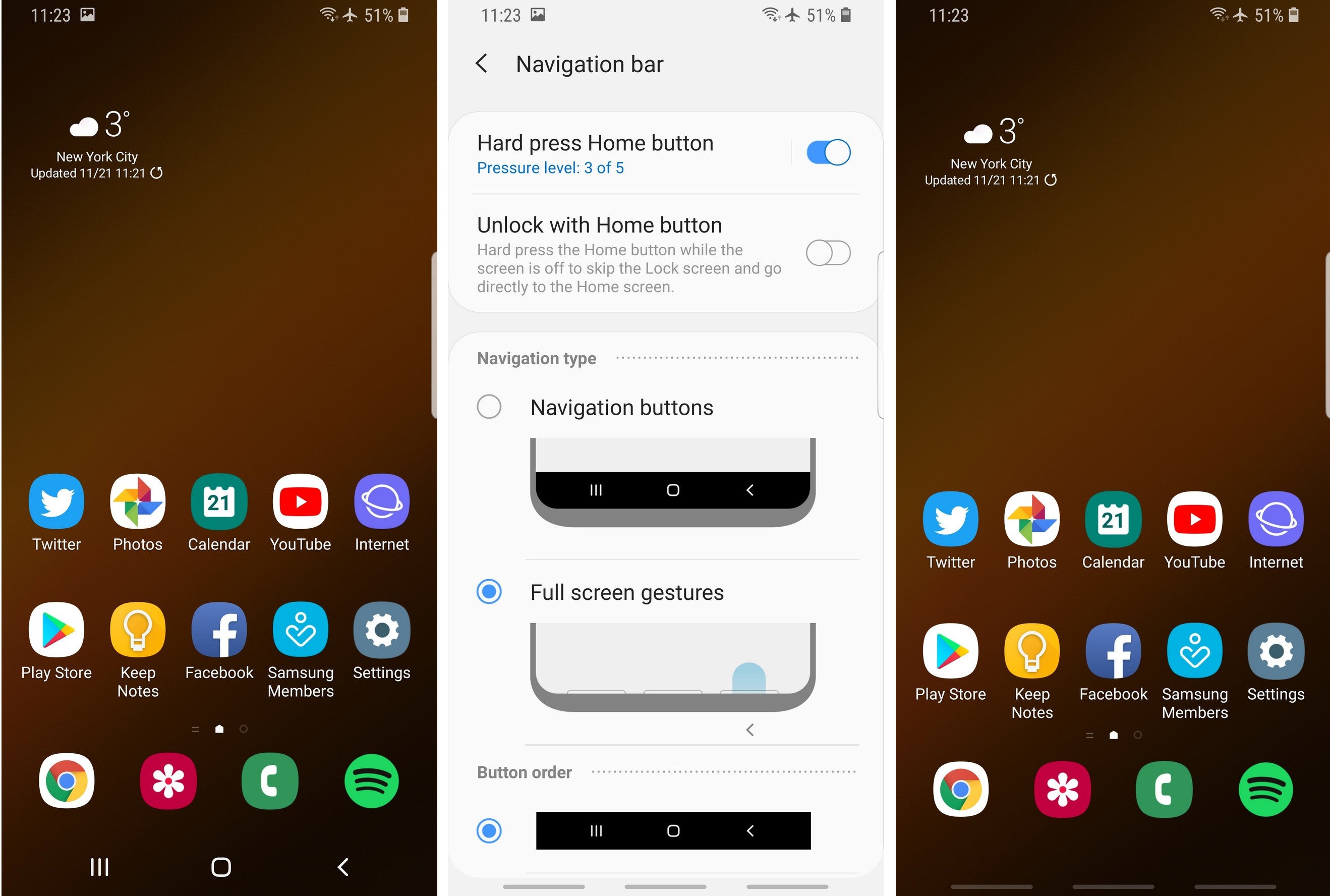
As far as the new navigational gestures are concerned, we are on the fence. Samsung is a bit handicapped when it comes to those, as the sides of its curved OLED displays are doing their People Edge or other duties, so busting a move from there is out of the question for now. It already has a pull-down and swipe-up gestures on an empty screen area to bring the notification shade from the clouds or open the app drawer, therefore the only side left to tinker with is the very bottom.
Samsung One UI navigation switch
That's exactly what the new One UI does - its gesture navigation option replaces the bottom strip with three even-spaced "pills" for home, back and recent apps, or you can hide those altogether and only swipe by muscle memory. Needless to say, except that they are aesthetically more pleasing than a strip, these gestures add no value to the navigational ergonomics, as you have to stretch even further down with your thumb for the action.
One UI vs Experience UI home screen, icons, status bar, and settings
The odd screenshots below are from One UI, the even ones are from the previous Experience interface, and you can clearly see how the move to fatter, juicier, more colorful icons that are easy to discern and tap on. In addition, everything actionable is moved under your non-stretching thumb at the middle of the display or below. Swipe down the notification shade and read the notification, swipe again and turn the bottom-feeding toggles on or off with a lazy thumb move instead of thumb yoga, we dig what we see so far.
The settings app has also been greatly overhauled with larger, more aesthetically pleasing visuals, and a thorough options purge has been carried out in the submenus that are now much more cleaned up than before. In there, new options like turning off animations to speed up the interface, or locking your home screen layout, have appeared, as well as a few other minor ones.
Note: Odd screenshots are from One UI, the even ones are from the previous Experience interface.
One UI vs Experience UI camera app interface
As usual, the camera app is living its own life when it comes to interface updates, as it has undergone a change of concept towards one-handed operation, too. The scene modes are moved towards the bottom, while the settings that are used less often, such as the flash and full view toggles, are moved towards the top. This way you can easily switch without stretching or having to use two hands, plus the tags and labels are larger.
One UI recap
Samsung is on the right path with this new interface, as it makes big-screen phones easier to use without having to resort to your other hand. The navigation gestures are a "me-too" moment as they are tucked even further down the bottom to execute than the current key strip.
The interface-wide Night Mode, though, is a godsend for OLED displays and for the darker hours, especially when you wake up and have to read something without burning your retinas.
In addition, Samsung has curated its submenu options to a great effect and offers neat tricks for speeding up the interface like turning off the transitional animations. Minimizing thumb yoga and making the interface nimbler and easier on the eyes? We'll take One UI as soon as Samsung can deliver the Android Pie update to its flagship lines.
Daniel, a devoted tech writer at PhoneArena since 2010, has been engrossed in mobile technology since the Windows Mobile era. His expertise spans mobile hardware, software, and carrier networks, and he's keenly interested in the future of digital health, car connectivity, and 5G. Beyond his professional pursuits, Daniel finds balance in travel, reading, and exploring new tech innovations, while contemplating the ethical and privacy implications of our digital future.
Recommended Stories
Loading Comments...
COMMENT
All comments need to comply with our
Community Guidelines
Phonearena comments rules
A discussion is a place, where people can voice their opinion, no matter if it
is positive, neutral or negative. However, when posting, one must stay true to the topic, and not just share some
random thoughts, which are not directly related to the matter.
Things that are NOT allowed:
Off-topic talk - you must stick to the subject of discussion
Offensive, hate speech - if you want to say something, say it politely
Spam/Advertisements - these posts are deleted
Multiple accounts - one person can have only one account
Impersonations and offensive nicknames - these accounts get banned
Moderation is done by humans. We try to be as objective as possible and moderate with zero bias. If you think a
post should be moderated - please, report it.
Have a question about the rules or why you have been moderated/limited/banned? Please,
contact us.


Things that are NOT allowed: