New Google Play in-app purchase UI is rolling out now
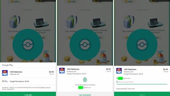
Image source: 9to5Google
Google has started rolling out a redesigned and more streamlined interface for in-app purchases, 9to5Google reports.
Up until now, initiating an in-app purchase would open a new window, smack-dab in the middle of the screen, where you would select payment options, input your password, or authenticate the transaction with your fingerprint. The updated UI, however, streamlines things by presenting users with a payment window that slides up from the bottom of the screen and is less obtrusive.
There is also a prominent, green “1-Tap Buy” button, which brings you to a screen where you can authenticate the purchase with either your password or an enrolled fingerprint.
source: 9to5Google
Popular stories


Latest News


Things that are NOT allowed: