Mind the notch! Pros and cons of the iPhone X interface vs iPhone 8 (apps, video, browsing)
The new iPhone X design brings on some interface contortions that may become a staple in future iPhones
Apple to devs: hide the X status bar "only in exchange for added value"
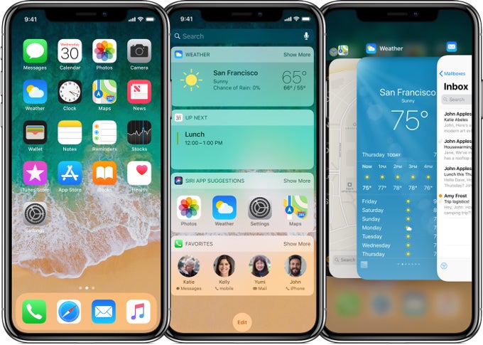
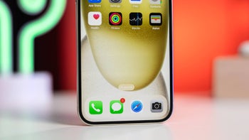
That's it, with a few little gestures, Apple negated the demand for a physical home button, got around the bezel "notch" at the top that is the only thing eating into the 5.85" display space, and at the same time avoided replicating Android's virtual navbar that's been around for a while. When it comes to actually displaying stuff on the iPhone X, though, developers are advised that their apps need to account for the new aspect ratio and the notch that eats into the actual display area. Here are the troubles and UI differences that native and third-party apps are supposed to adjust to on the "all-screen" iPhone X.Display area
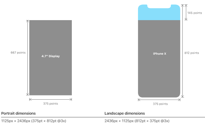
We know you are curious how does the new bezel design and aspect ratio of the iPhone X affect its actual viewable screen size when compared to the iPhone 8/Plus. Well, it offers about 20% extra vertical space than the iPhone 8, says Apple, but the screen area is a tad smaller than what the 8 Plus has - about 12.8 vs 13 square inches - on account of the difference in aspect ratios and the notch.
Video
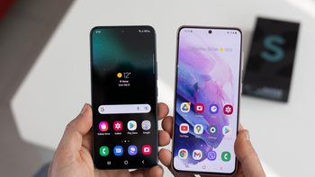
The iPhone X is wiggling into the trendy 2:1 Univisium aspect ratio that most new movies and TV series are being shot with. While it technically has 1125 x 2436 pixels resolution (2.17 aspect), taking into account the status bar around the notch, which Apple advises app developers not to cover unless it will contribute to the experience, the iPhone X covers the Univisium standard to the letter. Samsung does something similar with its 2.05 ratio on the S8/S8+/Note 8, while the LG V30 directly goes to 2:1 (1440x2880 resolution).
The 6.2" Galaxy S8+ fits about as much YouTube video as the 5.5" S7 edge, too
That's all fine and dandy, but how many movies and TV series are there recorded in 2:1? The answer is not that many, and for now the vast majority of content has been made with other standards, including YouTube clips. The result is that on all these new flagships, the iPhone X included, standard videos get cropped, letterboxed or stretched out of proprtion - pick your poison. How did Apple address this issue?
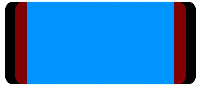
Well, it seems that regular vids show letterboxed, but double-tap on the screen, and they fill out the display completely, save for the notch area, of course. Some may find this distracting, but remember that the S8 or the V30 also crop, stretch or box, there's just no other way around it for now. Letterboxing will diminish the viewable area probably to around the size the video is on the iPhone 8, while stretching will bring you the notch eyesore while watching - again, pick your poison.

Letterboxed or notched-out, pick your poison on the new flagships' aspect ratio
Browsing
Reading and browsing is where the new aspect ratio shines on phones like the iPhone X, S8 or V30. Since we get a much larger vertical space compared to the 16:9 brethren, the iPhone X displays more of the page than the 8 Plus, despite having a similar screen area, not to mention the iPhone 8, where you will have to scroll much more to read the same amount of content.
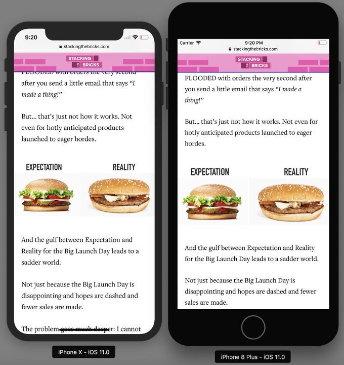
Reading is one area where the iPhone X shines compared to the 8 or 8 Plus
Apps
Well, here things get trickier. Apple is advising all developers to account for the notch, and not to cover the status bar area on its left and right unless it is necessary, and brings something meaningful to the interface of their app. This means that for the majority of apps, their display will end up to the notch, reducing the actual screen area from the official 5.85" screen diagonal. Moreover, Apple warns devs to be aware of the margins at the rounded display corners, and at the home bar indicator at the bottom, hiding it only in situations where it is needed, like watching vids or pics. Mind the gap, as the Brits would say.
Landscape mode
One thing is becoming increasingly clear - landscape mode on the iPhone X will present a bigger challenge, as even Safari appears with white bars on the sides, depending on the website background, and as a result the vertical space of the iPhone X in that position is said to be in the realm of iPhone 8. Check out all the ways that developers are battling with the new iPhone X interface in order to circumvent or incorporate the "bezel-less" design:
Takeaways
Long story short, the new aspect ratio of the iPhone X presents the same challenges as it does on other flagships with it like the S8 or V30, with the added trouble of working around the notch, as on the also-"bezel-less" Essential Phone. It does have disadvantages when watching "standard" video, but is better for reading or browsing, while if an app is designed well, the display outcome is neutral.
Given that such phones are now Apple's, Samsung's and LG's flagships, though, the trend is clear, and, when comparing the iPhone X interface to the iPhone 8, we may want to keep in mind that one is made to be futureproof, while the other is here to satisfy the legacy iOS crowd. It will be interesting to observe and mark when apps and media made with the new aspect ratio in mind will receive enough critical mass to make 16:9 handsets look strange in their turn. What do you think?
source: Apple

Popular stories


Latest News


 FCC OKs Cingular\'s purchase of AT&T Wireless
Things that are NOT allowed: