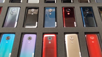
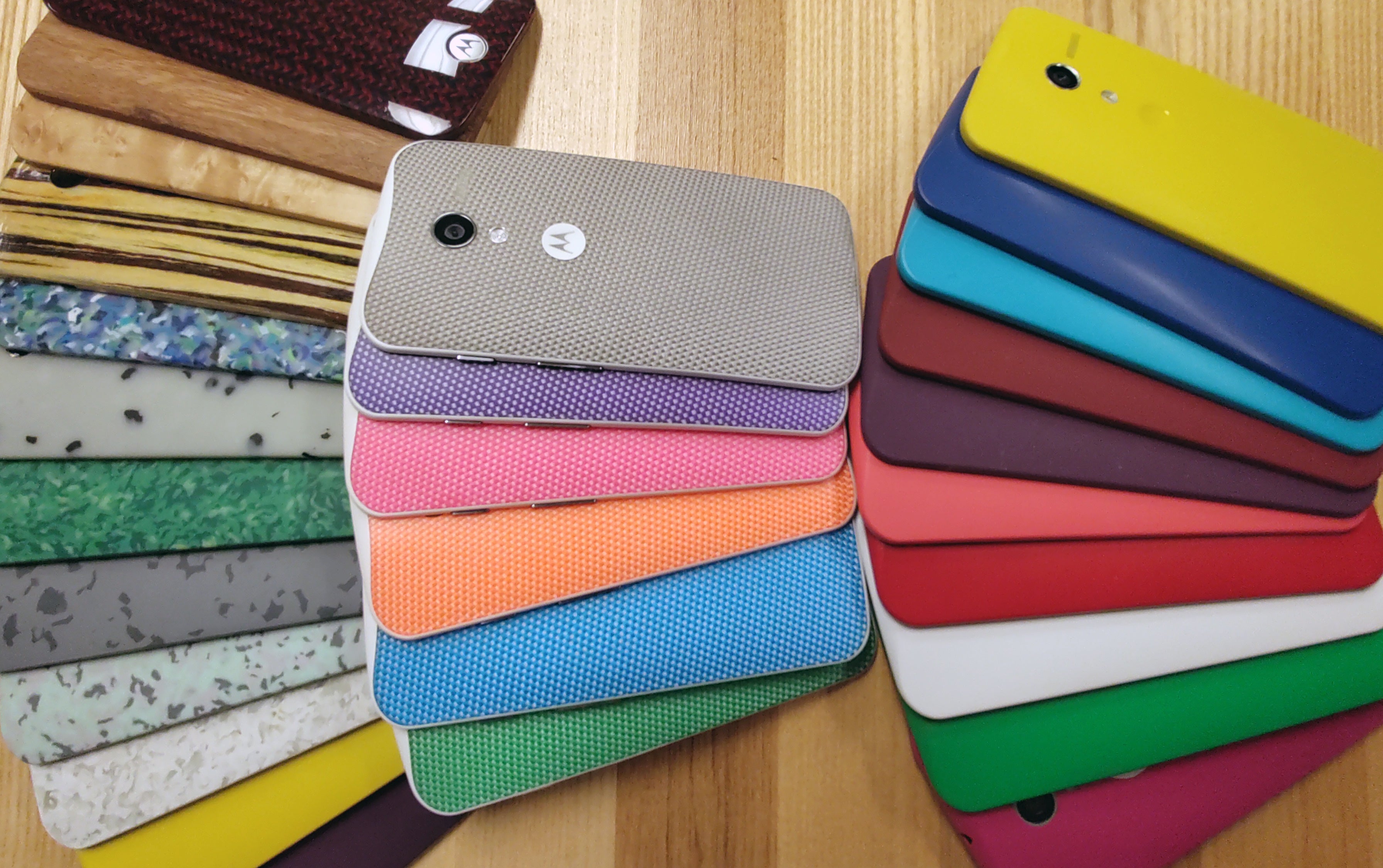
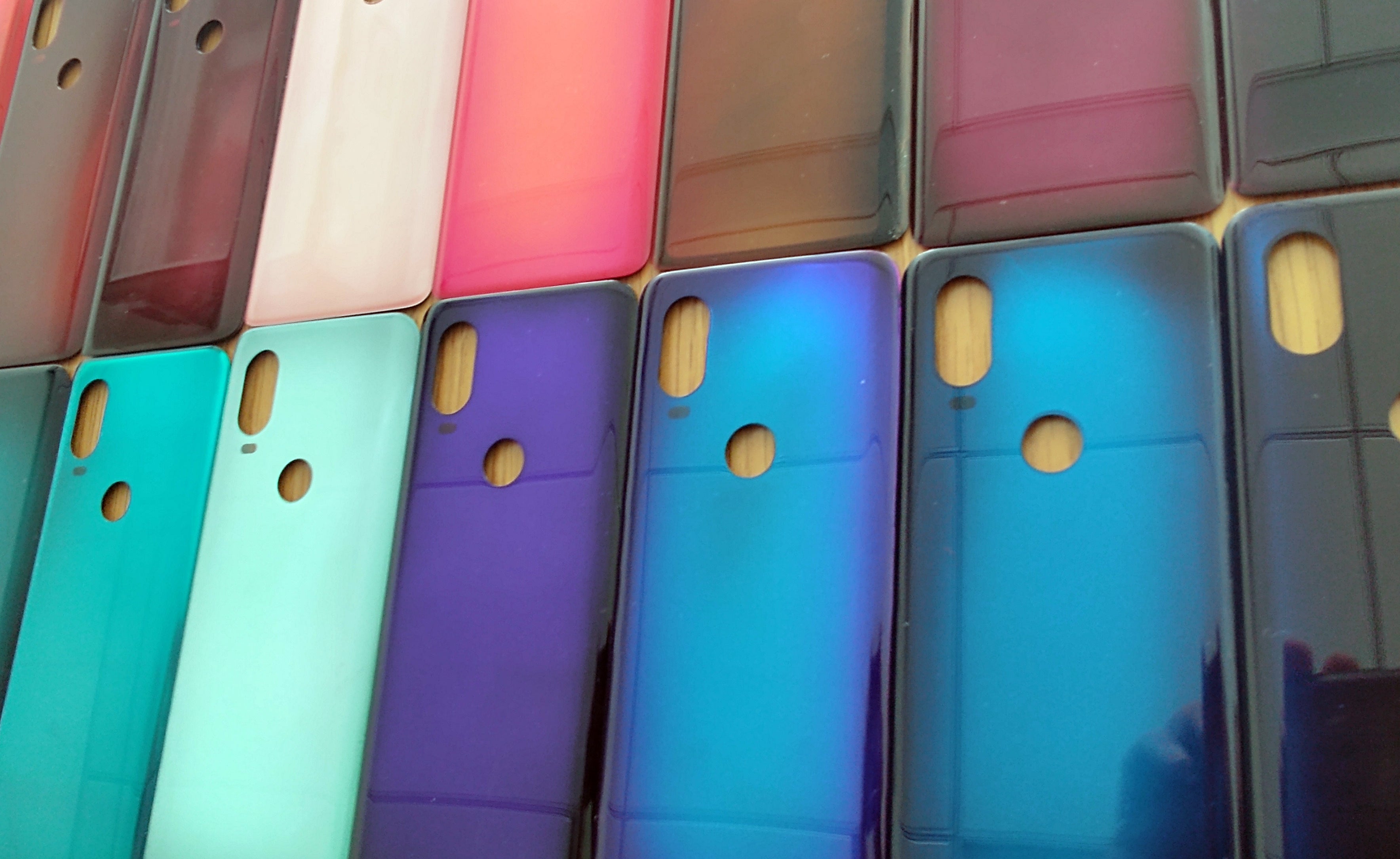
As the hardware of smartphones steadily becomes better across the board, companies are forced to search for new ways to entice customers to choose their phones over the competitors'. One result of that are the intricate color designs of modern smartphones. We've seen backs that reflect light to produce a rainbow effect, others that seem almost alive when you shift your phone around and some that offer a smooth gradient between two or even three colors.
We had the opportunity to get some insights about what's going on behind the scenes when companies make design decisions from Ruben Castano, the Vice President of Design at Motorola. Motorola has been on a hot streak recently with regular releases of new smartphones that focus on different aspects of photography and video capturing: Motorola One Action, Motorola One Zoom, Motorola One Macro to name a few.
But enough introductions, time to learn more about the intricacies of smartphone design!
PA: How do you determine which colors will be trendy when releasing a new smartphone? Do you look at the fashion industry?
Ruben:We look at a combination of historical trends, macro trends and consumer data to determine which colors would be most appealing to a consumer.
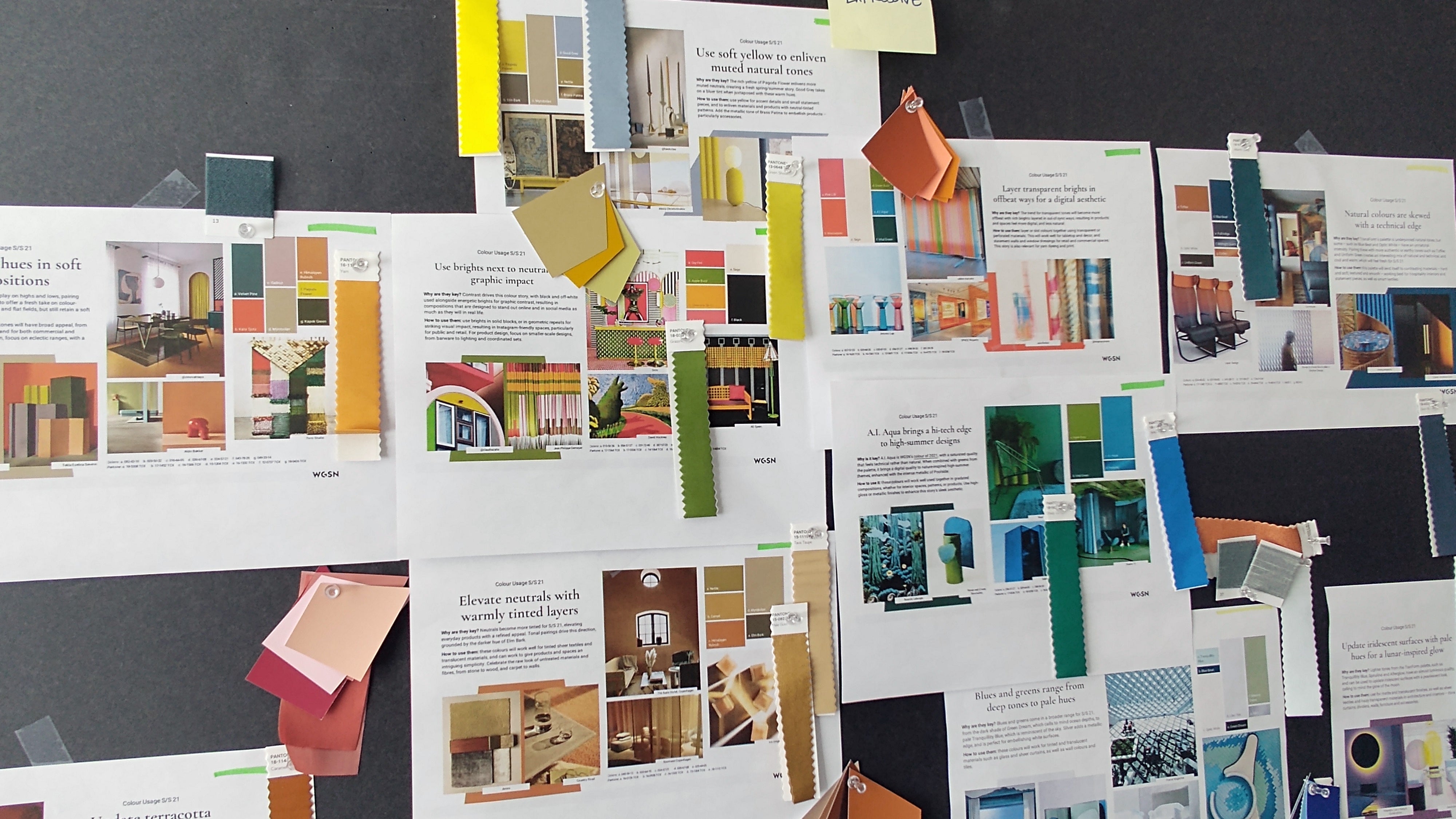
Global trend houses, such as Pantone, look at macro trends to draw conclusions about which colors will be popular in the coming years, which typically stem from social and environmental factors. For example, in the past, we’ve seen the societal trend that consumers want to detach from technology, therefore we’ve seen more neutral colors in our tech products. The majority of the time, these conclusions are drawn about a year ahead of the colors launching in market. The fashion industry has always been the quickest to respond to macro trends due to the fact that their product development cycle happens the fastest, so the tech industry can look to the fashion industry as a guide to which colors might be popular, and apply it to its product where applicable. That being said, color preferences and trends differ by country.
Design inspiration can come from anywhere
In addition to trends in the marketplace, we also look at data we collect from qualitative and quantitative consumer research on color preferences and purchasing habits. With this research, we usually see that there are two groups of people: a group of people who want something elegant and not too loud - dark blues or greens, and a group who are more expressive. That’s why a lot of the time you’ll see color options in our phones that lend themselves to both types of consumers.
Recommended Stories
Additionally, our team pays particular attention to how each color option of a single device will look next to each other at the point of sale or online. For example, with the Motorola One Zoom, we released the phone in three different colors - Cosmic Purple, Brushed Bronze and Electric Gray. Each of these alone was hand-picked to meet the needs of consumers and current trends. However, equally important, is how each color complements one another when placed side-by-side because this is how consumers will see them in-store and online.
Motorola One Zoom in Electric Gray
PA: Do you have any data on what percentage of users still prefer to go with neutral colors such as black or white rather than more extravagant ones like purple? When it comes to buying cars people often choose more “boring” colors because they take into account the potential resale value. Do you think these new attractive gradients might be too reliant on personal taste to become really popular?
Ruben:As consumers tried to detach from their technology, we saw the majority of products released in colors like white, gray or black. However, retailers are responding positively to expanded color selections, and are choosing more colorful devices when making purchase orders. Historically, retail partners took nearly 80% black devices, but now we’re seeing them select 60% black devices and 40% colored devices. In some cases, the divide might be 50/50. The colors we are seeing come to market are more sophisticated, whether that be dark neutrals, such as black or grey with a hint of color, or staple colors with a matte brushed finish.
Motorola has never been shy to experiment with colors and patterns
PA: Where do you think smartphone design is headed overall? With displays taking over a larger and larger portion of smartphones, are you worried there will be even fewer things to design? Are new form-factors going to be the saving grace?
Ruben: As smartphone technology evolves, so does design. Ultimately, the goal is to utilize design and technology to create a worry-free smartphone experience for consumers, where back-end components are hidden and the user can simply enjoy. One way we're seeing this materialize is in the integration of various components into or beneath the display. Under display fingerprint sensors are becoming more common, and as technology advances, we can expect more components like cameras and speakers to be integrated into the display for an all-screen experience.
Mobile devices will increase their capability to be aware of user needs and their environment, providing them the ability to learn and predict therefore becoming true personalassistants that we carry in our pockets. Now and in the future, Motorola design will continue to focus on transforming all this intelligence into meaningful and simple experiences for our consumers. Specific to color, I can imagine a future where we will have color shifting housings that change instantly according to personal preferences.
PA: Why are different colors, gradients and finishes suddenly in the center of attention when it comes to smartphone design? Does it have something to do with the fact that the front is taken up entirely by the display, leaving no space for creativity?
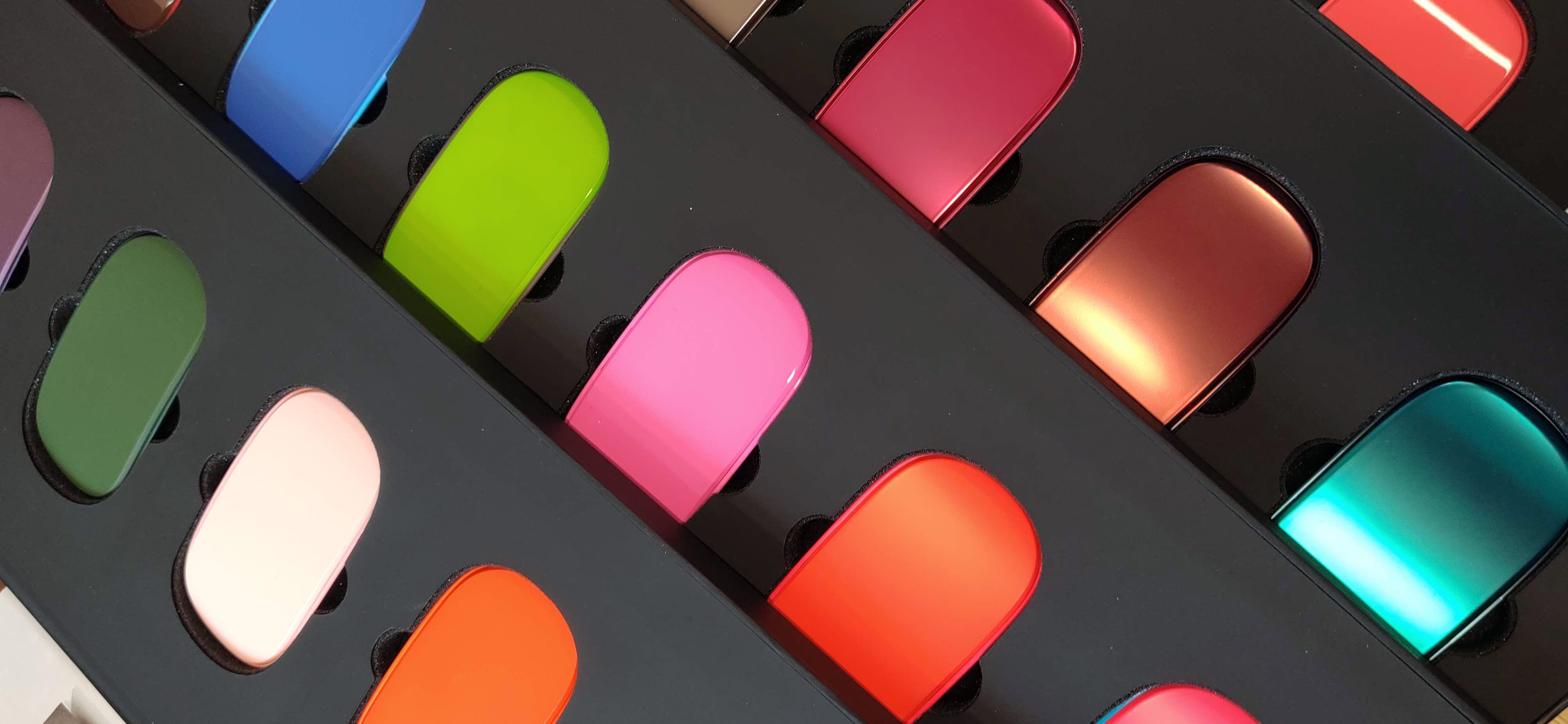
Ruben:Colors, materials and finishes are are equally important element alongside experiences and features when making a purchase decision for consumers. We believe they bring to life our brand values and create an emotional connection, we have been able over the years to develop tools that allow us to measure and quantify those reactions just like we are able to measure other more rational elements like fit in hand, ergonomics and weight. Today we have the ability to play with depth, translucency, gradients, patterns, gloss levels and so many more elements which we develop and test with our users to identify the perfect fit for specific product. Creativity is alive and kicking, our palette has actually gotten much richer in terms of what we do!
There are plenty of designs that never leave the studio
PA: Which Motorola smartphone from the current lineup are you most proud of when it comes to design?
Ruben:It is hard to pick just one device in our current lineup, mainly because the devices we are releasing are each unique. Thanks to our Motorola One franchise, which is non-generational, we have the flexibility to react to trends we are seeing in the market and respond to consumer desires. For example, as I mentioned, the Motorola One Zoom was released in a number of colors, and the most popular of which was the Cosmic Purple, which is a deep purple with a gradient finish. The phone also features a light-up Motorola logo to alert users of notifications. For Motorola One Action, the team decided to rotate the camera 90 degrees to allow users to film a horizontal video while holding the phone vertically, something that has never been done before. Simplicity, richness and surprise drive the design of each of our devices, so each device is able to be unique in its own way. Moving forward you’ll continue to see these elements of our philosophy drive decisions in the design of all of our devices — whether it be in the color and finish or the features and technology. PA: Do you think manufacturers should strive to make phones more durable even if that means they won’t look as fancy?
Ruben:There are ways to design and develop smartphones that look good without sacrificing durability and high-quality construction. A crucial piece to this is for designers to understand how the device is made from the inside out. By seeing how components are assembled and products are made, designers can understand what is possible of the device from both a durability and a design perspective.
PA: It seems like companies are spending a lot of time coming up with original names for their colors. Motorola as well, you have Royal Magenta, Cosmic Purple, Crystal Pink. What is your approach to color names, do you aim to just describe the color in a unique manner or are you trying to convey a certain message as well?
Ruben:Like with our approach to color selection, we also rely on consumer insights and market trends to determine which color name consumers prefer and would work best in the current market. Unique to Motorola, we actually have our own in-house research lab where we conduct various consumer research studies to gather insights on consumer preferences when it comes to colors, key features, and even how they integrate their phones into their everyday lives. By doing these studies in-house instead of through an agency, we’re able to see first-hand consumers’ verbal and non-verbal responses, which gives us access to richer, and more qualitative set of data. This research, paired with what trends we’re seeing in society and fashion, helps us to decide which names may be most appealing to a potential consumer.
It's really interesting to see that even something as simple as a color can require so much research and manpower to figure out how to do properly. We're already enjoying an amazing variety of finishes but that's just the beginning. Who knows what craziness we'll see in the years to come! Perhaps all will end once our whole phones are covered in displays. Until then, we'll enjoy the colorful goodness that's coming our way from every direction.
Recommended Stories
Loading Comments...
COMMENT
All comments need to comply with our
Community Guidelines
Phonearena comments rules
A discussion is a place, where people can voice their opinion, no matter if it
is positive, neutral or negative. However, when posting, one must stay true to the topic, and not just share some
random thoughts, which are not directly related to the matter.
Things that are NOT allowed:
Off-topic talk - you must stick to the subject of discussion
Offensive, hate speech - if you want to say something, say it politely
Spam/Advertisements - these posts are deleted
Multiple accounts - one person can have only one account
Impersonations and offensive nicknames - these accounts get banned
Moderation is done by humans. We try to be as objective as possible and moderate with zero bias. If you think a
post should be moderated - please, report it.
Have a question about the rules or why you have been moderated/limited/banned? Please,
contact us.

Things that are NOT allowed: