At last! Google makes its new UI for the Play Store official
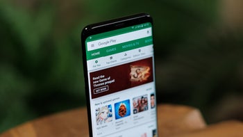
Back in May, and then again a few days ago, we told you that Google was pushing out a new UI for the Google Play Store. And today, Google made the changes official; in fact, we now see the new UI on our Pixel 2 XL running Android Q beta 6. The updated Google Play Store UI uses Material Design which includes the Google Sans font. But there are other important changes to the app.
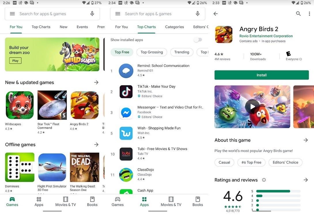
On mobile devices, Google has moved the navigation bar to the bottom of the screen. This makes it easier for users to reach on large screened handsets. On tablets and devices running Chrome OS, the navigation bar will be found on the left of the screen. Games and apps now have their own separate tabs which should make it easier to find a specific Play Store listing. Each listing now features more information near the top of the display including the number of reviews and average stars, the number of times the app/game has been installed, and the ESRB rating.
"The Google Play Store has over two billion monthly active users coming to find the right app, game, and other digital content. To improve the overall store experience, we’re excited to roll out a complete visual redesign. Aligning with Material design language, we’re introducing several user-facing updates to deliver a cleaner, more premium store that improves app discovery and accessibility for our diverse set of users."-Google
The new UI for the Google Play Store is now official
Even though the Google Play Store now uses Material Design, there is no dark mode and even with the system-wide Dark theme available with Android Q toggled on, the Play Store continues to appear in Light mode. Since this is a server-side update, there is nothing for you to do but sit back and wait for the new UI to hit your Android device.

Popular stories


Latest News

Things that are NOT allowed: