Google Play Store starts rolling out new design... violates its own Material Design guidelines

Google has started rolling out a new design for the Play Store... and it goes right against one of the fundamental principles of Material Design.
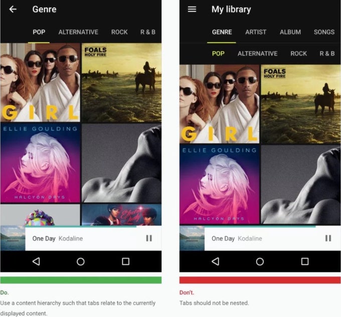
Namely, it uses nested tabs, a technique that Google explicitly says should not be used and instead recommends using content hierarchy in different forms.
So basically what you get now is a bunch of categories, and underneath another list of tabs, and in some cases even a third list of tabs with this new design of the Google Play Store.
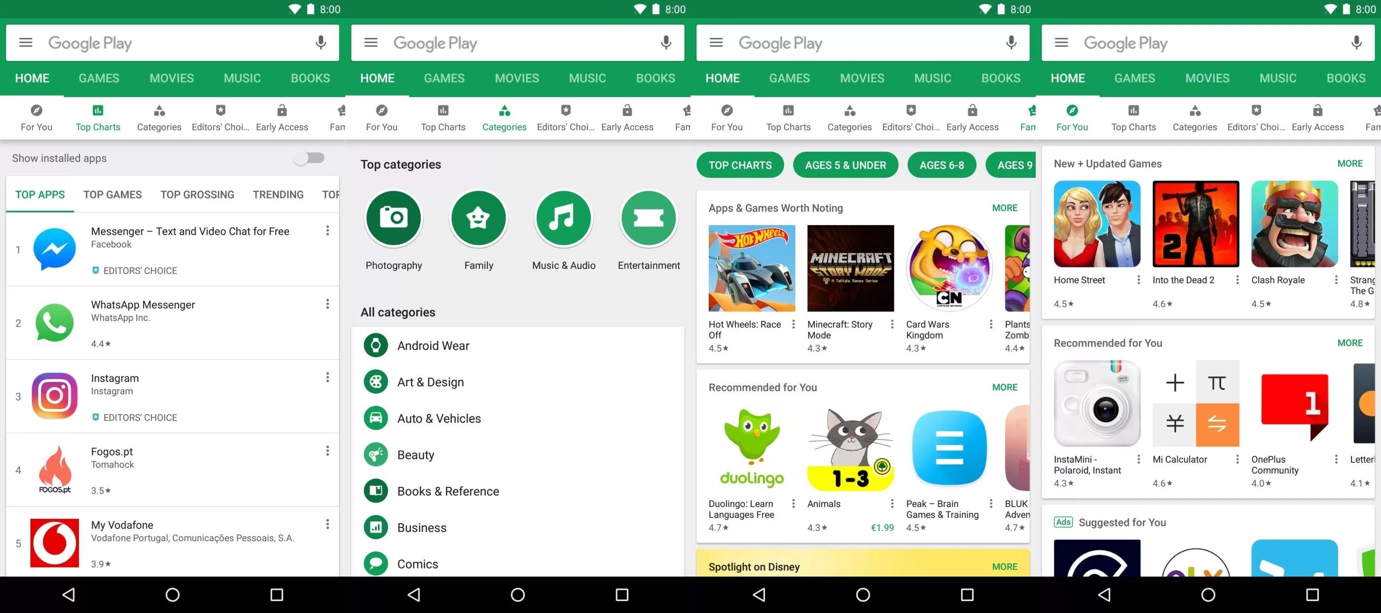
New Google Play Store design
Of course, this is not something major that will impact users in a big way, but it's strange that Google itself violates Material Design principles in such an obvious way. And here is a screenshot with Google's own instructions on how Material Design should actually be implemented.
source: 9to5Google

Popular stories


Latest News


Things that are NOT allowed: