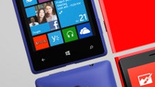
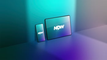
When you first take a look at a Windows Phone device you instantly get it - this is different. And it’s different mostly because of the Modern UI (or what Microsoft used to call Metro interface).
What is the Modern UI? Two things, mostly: Live Tiles and big typography.
Inspired by the design language used in the Seattle public transportation system, the interface is at the core of the Zune and later on the Windows experience.
Modern UI is all about the visual.
Zune failed, and Windows Phone so far has generated little momentum despite huge efforts from Microsoft, Nokia and a bunch of other partners. Windows Phone 8 has just been released, and we can’t help but wonder: will it succeed? And what is the reason for WP slow start so far?
Digging down to the core, we bump into the Modern interface. On one hand, it’s dynamic, with some Live Tiles changing on the go, but on the other the tiles seem just like icons, and a weird monochrome take on icons.
Next comes the funky typography. It’s fun, but nay-sayers accuse it of being impractical, leaving tons of unused spaces.
And the combination of the Tiles and typography that dominates the Windows Phone platform could be interpreted as both modern and plain. Apple and Android are hugely successful with fairly traditional interfaces, giving preference to practicality over those avant-garde looks. So help us out here - is the Modern UI what’s stopping Windows Phone from succeeding? Finally it all boils down to whether you like it or not. Have your say below.
Recommended Stories
Windows Phone Modern UI: do you like it?
Yes, Live Tiles are dynamic and more useful than icons, and the funky typography is nice.
82.03%
No, Live Tiles are awkward, traditional icons and widgets are more flexible. The new typography is not practical.
17.97%
Recommended Stories
Loading Comments...
COMMENT
All comments need to comply with our
Community Guidelines
Phonearena comments rules
A discussion is a place, where people can voice their opinion, no matter if it
is positive, neutral or negative. However, when posting, one must stay true to the topic, and not just share some
random thoughts, which are not directly related to the matter.
Things that are NOT allowed:
Off-topic talk - you must stick to the subject of discussion
Offensive, hate speech - if you want to say something, say it politely
Spam/Advertisements - these posts are deleted
Multiple accounts - one person can have only one account
Impersonations and offensive nicknames - these accounts get banned
Moderation is done by humans. We try to be as objective as possible and moderate with zero bias. If you think a
post should be moderated - please, report it.
Have a question about the rules or why you have been moderated/limited/banned? Please,
contact us.


Things that are NOT allowed: