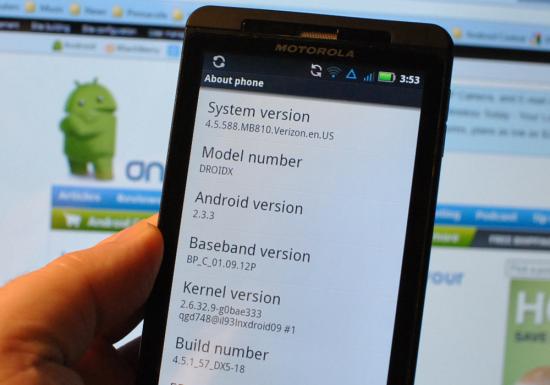
Motorola DROID X gets Android 2.3 OTA upgrade; is Netflix coming to the device?
Share:
More speculation centers around a .jar file that allegedly says the word Netflix in it. This could indicate that the video rental app will be coming soon to the device.
The Motorola DROID X might no longer be Verizon's flagship handset considering that the HTC ThunderBolt is now available with LTE on board. And the early word on the Droid X2 is that-as we reported- the phone will be sticking to 3G connectivity. But for those who don't care about the difference between 3G and 4G speeds, and for those who worry more about battery life-the Motorola DROID X still remains a beast. Add to that the upgrade to Android 2.3, and some of the problems that have been reported by ThunderBolt users and the DROID X remains a relevant phone even in this age of dual-core, 4G enabled handsets.
If you are one of the lucky Motorola DROID X owners who have received the OTA upgrade, let us hear about your experiences with Gingerbread by filling out one of the comment boxes below!
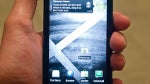
source: AndroidForums via Phandroid
Share:
74 Comments
21. protozeloz posted on 13 Apr 2011, 07:57 1 0
Verizon and moto said they will update too, I think they may follow since there was a Leak of the droid 2 gingerbread rom dunno about the incredible because its HTC
45. Thump3rDX17 posted on 13 Apr 2011, 11:43 0 0
oh i know there will be an update, i thought that downloading the leaked version would be kinda pointless being the update seemed so imminent. they SHOULD update it while they're updating the X.
58. celljrod posted on 14 Apr 2011, 08:47 1 0
UPDATE: HTC has confirmed Gingerbread to the Droid Incredible in the summer. Source Android Central. Not able to link right now, but it's there
3. roconnell35 posted on 12 Apr 2011, 23:45 0 0
I've been waiting all day and no update for me :(
4. roconnell35 posted on 12 Apr 2011, 23:55 0 0
i guess it was just another leak
http://blogs.computerworld.com/18122/verizon_droid_x_gingerb read_rollout
7. Sniggly posted on 13 Apr 2011, 01:11 2 0
Oh. Fuck. Yes. I have it. I have Gingerbread. Details on some of the new goodies to follow shortly. But it does exist and I have it. Had to download manually, but it was pretty simple. Here are the steps:
Find the download link (Wifi recommended, the package is 111 MB)
Once downloaded, find the package with a file manager (I used Astro), rename it "update.zip" and move it back from the "download" folder to "sdcard."
Shut off your phone.
Get your phone into recovery mode by holding home down and then holding the power button until the little green robot with the triangle shows up. Once there, press the search button.
Use the volume up/down key to scroll to "install update.zip" and use the camera shutter button to select it. If you've done everything right then the update should work automatically; it takes about four or five minutes. Once done you just select "reboot phone now." It does take a good amount of time (a couple of minutes for me) for the phone to boot from the pulsating Droid X eye screen. If the install was successful, though, the first thing you should notice is that the Motorola icon is now white on red instead of black on white. And once it loads, you'll immediately tell the difference...
(to be continued)
8. Sniggly posted on 13 Apr 2011, 02:22 1 0
First you'll notice that the color scheme is different. The notification tray is a dark blue, with notifications showing up as white.Your battery icon remains mostly the same. The "3G" is blockier and cooler looking. Your initial unlock screen remains the same (except much darker than before), but if you have pattern unlock enabled, the dots are two tone and the circle/line pattern is a cyan/light blue color.
Once to your main screen, you'll notice that it's much the same, except for one very important difference at the bottom. You now have your call/contact icon to the left, a dedicated contact icon to the right of it, your text messaging icon to the right of that, and your app launcher on the right side. Directly below them are seven little dark gray dots representing your screen panels, with the one you're on being highlighted blue. When switching between screens you no longer have the jump dots to use, but the upshot is that your sticky icons are always there. Furthermore, the sticky icons can be swapped out. So if you want to be able to launch your browser from any home screen, now you can.
Sliding the notification tray down brings some other small but awesome changes. The tray itself when expanded is mostly translucent, with notifications showing up on white backgrounds. The clear button seems larger, and it seems you can clear individual notifications.
Hitting the home button on the middle panel now brings up panel multiview, with you being able to select the panel you want to go to. Hitting the menu button from the home screen brings up two new, very important options: "manage apps" and "profiles." "Profiles allows you to set up customized sets of homescreen panels, labeled "Home," "Work," and "Weekend." One minor gripe about this is that switching profiles seems to reset your wallpaper to the default, even if you've switched it prior. No other issues have been discovered with this option though.
The app manager itself is much more robust, with the running apps being clearly displayed in their own tab, and the RAM usage and availability displayed at the bottom of the tab. Other tabs show overall memory usage (the SD card and Downloaded tabs show the amount of space left on the card and hard drive, respectively).
Moving on: Moving between the home screen panels ranges from "barely laggy" to "whatchoo talkin' bout, Willis? There ain't no lag here!" Whereas tapping on an individual widget before would bring up a mini window still on the homescreen, tapping on one now (like the social updates widget) brings up a full screen presentation, with a "cover flow" like 3D interface. Turning the phone sideways changes the format of the widgets to landscape, complete with a neat little "flipping" graphical effect.
9. Sniggly posted on 13 Apr 2011, 02:23 1 0
Let's focus on the Social Networking widget for a second: HOLY FUCK IT IS IMPROVED. One of my major complaints about the widget before was the inability to scroll through all updates at once unless you had already scrolled through them all one at a time. Now, once the widget is opened, there is a button in the bottom right hand corner that takes you to the full list of updates. Unfortunately, scrolling through them all at once still doesn't get rid of them on the miniview, but holy hell the improvements here still work.
Moving on: one of the gripes I had about the app tray was how I had to scroll down through the entire freaking list to get to whatever app I wanted, which sometimes I didn't want on the homescreen panel. Now, however, the app tray offers organizational options, allowing you to only view recent apps or to create app "groups." The app tray can now also display in landscape mode.
The Music app remains much the same, but has the same "flipping" effect now when switching between landscape and portrait. Also, everywhere, when scrolling and "hitting the bottom or top," there's a neat little translucent blue graphical effect instead of the whole list "bouncing off" the boundary.
Even though my phone doesn't need it, the settings include not only a battery manager, but a data manager as well. This may be another hint that eventually Verizon will drop unlimited data plans, but we'll see about that.
The keyboard itself, in every app, seems to be greatly improved. Instead of switching to the symbols board to enter in numbers (though that option still exists) you can now press and hold on any one of the top row of keys to insert the number you want. The keys now give vibrating feedback when tapped. Going to the keyboard settings reveals that this is optional, as well as the keyboard making sounds when tapped. The keys are better spaced while keeping the same general layout as the Froyo keyboard.
The dialer keypad also receives an update, with the ability to add the phone number you've just dialed as a contact right there, as well as the microphone icon for voice dialing. The Contacts app eliminates the quick scroll tab and instead substitutes jump icons for letters in your directory. There is now a search icon along with the group and add new contact icons up top. In the recent calls section, if the same number appears more than once in a row, it's collapsed into one listing with a number in parantheses saying how many times calls were made back and forth in a row to that number.
16. msa1988 posted on 13 Apr 2011, 06:58 1 2
You are aware that your comments are going to be removed because of your language right?
36. Sniggly posted on 13 Apr 2011, 09:01 0 0
I hope not. I've seen my posts edited before for language when most of what I was saying was harmless. I've only seen my posts totally removes when I wasn't saying much beside swearing.
62. ILikeBubbles posted on 15 Apr 2011, 19:43 0 0
btw, Sniggly you're my hero for this! i've been trying to get my boyfriend this update for a couple months! you said the link but you didn't give one.. which one is legit? where do i find it?
64. Sniggly posted on 20 Apr 2011, 12:40 0 0
The various Droid forums have download mirror links. If you google for one you can probably get it; try downloading it through the computer then transferring it to the phone through USB.
10. Sniggly posted on 13 Apr 2011, 02:33 1 0
As mentioned already, performance is also much improved. Running Quadrant got scores of 1649 and 1599. (the second was run as the phone was trying to reestablish a wifi connection). I tried out two of my most graphically challenging games, Gun Bros and Pocket Legends, and both not only were much smoother than before, but seemed clearer and crisper graphics wise.
There are probably far more changes that I haven’t even covered, and I’m sure I didn’t need to go into so much detail, but I was so excited at all of these changes that I just had to share. For those who’ve read this far, thanks, and I hope you all get to experience the new version of Android and Blur!


