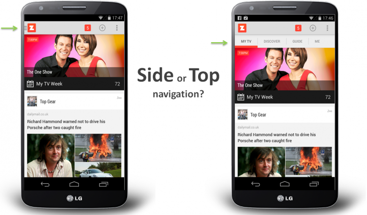
The current trend in mobile app design is to use a hamburger menu for extra options rather than using up precious on-screen real estate for the features. Unfortunately, at least one app, zeebox, has found that using a hamburger menu (aka side drawer) has absolutely killed user engagement within the app. It seems that users have something of an issue with "out of sight, out of mind".
The zeebox team apparently debated quite a bit whether to stick with the tabbed interface that had been used in the social network for TV app, or to shift those options to a hamburger menu. The team eventually decided on a cleaner UI, and the redesign got great reviews on both Android and iOS. But, the trouble was shown in the app's analytics, where the team found that user engagement had dropped almost in half, because they simply weren't seeing the same options on-screen.
Overall, users spent less time in the app, because what they saw on screen was all they interacted with. Ultimately, it seems that the only options that should be dropped into a side drawer are settings and other rarely-used options.
What do you guys think? Do you often go into hamburger menus?
A discussion is a place, where people can voice their opinion, no matter if it
is positive, neutral or negative. However, when posting, one must stay true to the topic, and not just share some
random thoughts, which are not directly related to the matter.
Things that are NOT allowed:
Off-topic talk - you must stick to the subject of discussion
Offensive, hate speech - if you want to say something, say it politely
Spam/Advertisements - these posts are deleted
Multiple accounts - one person can have only one account
Impersonations and offensive nicknames - these accounts get banned
Moderation is done by humans. We try to be as objective as possible and moderate with zero bias. If you think a
post should be moderated - please, report it.
Have a question about the rules or why you have been moderated/limited/banned? Please,
contact us.


Things that are NOT allowed: