This article may contain personal views and opinion from the author.
There are a lot of fights to be had in the mobile space. Given the opportunity (regardless of how slight the instigation may be) people will fight over what mobile platform is the best, which philosophy of mobile is best, what apps are best, what games are best, which carrier is best, and on and on. Even now in the comment thread, there is bound to be a number of readers pretending to be rational (though really ignoring each other in favor of repeating their preferred viewpoint) and "arguing" many of these points just because the phrase "iOS vs Android" is in the article title. Many may not have even noticed the word that preceded those words, because the activation phrase had already been let loose.
Of course, aside from mobile platform, there is often an argument about what manufacturer builds the best hardware. The strange thing about this argument is that it is very compartmentalized. By that we mean people will argue what Android manufacturer is best, or if Android handsets are nicer than say the new Lumia series phones from Nokia. But, the second Apple's name is mentioned, it is impossible to carry a conversation on the topic, because it will quickly devolve into a good vs evil fight between Apple and Google (or Google and Apple, depending on how you were raised.)
If at all possible, we'd like to buck that trend and have a conversation about something important, which actually unites Apple and Android users to an extent. Okay, we wouldn't be so foolish as to expect that, but at the very least, let's lump together Samsung and Apple, because those two companies wield a large amount of power in the mobile ecosystem. We know that when Samsung and Apple's names are mentioned together, the topic inevitably turns to the lawsuit battles (and by extension who is the victim and who is the bully), or to a simple Android vs iOS scrap, but we think this issue is bigger than those debates, at least for right this minute.
Recommended Stories
As we just learned yesterday that a surge by Samsung and Apple, and a sharp decline by Nokia in shipments over the last year now means that together Samsung and Apple are responsible for almost 55% of the smartphone hardware being shipped to stores. Regardless of what platform is being run on the devices - obviously iOS on Apple, but Samsung has Android, Windows Phone and bada devices on the market, though to be fair, the vast majority of Samsung handsets are Android - that is 55% of the hardware design controlled by two companies. And, beyond that, it is 55% of the hardware design compacted into relatively few high-end designs, because Apple has a limited number of handsets (only 2 different hardware designs for 3 handsets available for purchase), and Samsung commonly reuses chassis across platforms.
Forgettable design
This consolidation of hardware design power has had the troublesome aspect of marginalizing the impressive design chops of other manufacturers. Even Nokia had to make its newest phone cyan (a color never even considered for phone use before) in order to get attention in a world consumed by white (Apple) and black (Samsung). Other manufacturers struggle to be seen, and given the rise in dominance of Samsung and Apple, it's pretty clear that those manufacturers are failing in that endeavor.
HTC has a very specific aesthetic that is immediately recognizable as an HTC device, but there is nothing exceptionally bold or striking about an HTC phone. They all are white or grey, or a mixture of the two, with gently rounded edges, a standard bezel, and small, nondescript buttons. HTC has pleasant design, though nothing incredibly interesting, but at least we can say that HTC is trying. Motorola has functional design, and is trying to be somewhat bold with the new trend of making devices that are like rectangular octagons (any geometry people out there know of a proper term for that?). We're sure that some people like Motorola design, but it's hard to imagine someone loving it enough to defend it in conversation. And, aside from the odd "world's thinnest" phone that comes along, there's nothing all that striking about any other devices out there (although we do like the look of the upcoming Sony Xperia devices, but can't count them here, because they aren't on the market yet).
The only time that many manufacturers attempt a truly bold design option, it is often because they are specifically targeting a design-conscious group, like the various Prada or Dior phones, which are meant to be high-end fashion accessories rather than useful smartphones. Or, the most egregious offenders of gimmick design are all of the phones targeted towards women, like the HTC Rhyme (because who really wants to buy a plum colored phone?) There is a big difference between gimmicky design and quality design that will attract customers and brand your hardware.
Design branding
Love them or hate them, Apple and Samsung shoot for striking design (and remember, we're just talking high-end devices here, not the Samsung Dart). Apple always attempts for iconic design, but will settle for unique design, and often lands somewhere in the range of memorable design to possibly unique. You may not like the aesthetic, but you know an Apple device when you see it, and never confuse it for a different device. This is especially impressive because of how much Apple can change the look of devices.
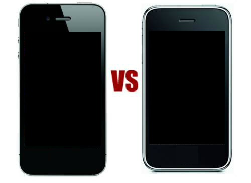
Apple achieves this by branding its devices with not only the Apple logo or the white headset wires (which are both a huge advantages for branding), but also with a distinctive feature on the front. No matter how much an iPod nano may change shape, you know it's an iPod because of the wheel on the front. Similarly, if the screens were off and you couldn't see the Apple on the back, you would still know that the iPhone 3G(s) and iPhone 4(S) are made by the same company because of the distinctive home button on the front. That allows you to recognize an Apple device regardless of what the device looks like. Strip away that Apple logo and home button, and why would anyone recognize the iPhone 3G(s) and iPhone 4(S) as being from the same manufacturer (as you can see on the right)?
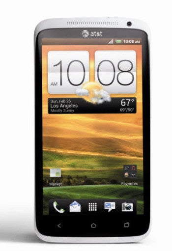
There are more subtle design choices as well, which don't so much serve to brand the device as give it just that extra bit of flair and recognizability. If you look at a white iPhone 3G(s) and an HTC One X, it looks almost like they could be cousins, except for the One X's anorexia (or the iPhone 3G(s)' baby fat, again depending on your upbringing), and a couple slight difference that shift a not-so-memorable design of the HTC, to something unmistakable with Apple. Apple always shoots for a clean face to its devices, so the only distinct visual cues will be the home button and iOS UI. So, iPhones have a clean black or white front, but that is separated from the rest by a pop of bright, shiny metal. HTC devices often have two-tone fronts, where there is separation between the screen and body, but the body front just blends into the back, which has the odd downside of making the screen seem just a bit smaller than it really is (at least in photos).
Samsung, intentionally or not, follows the same path as Apple to achieve memorable design. Sammy has already had to change the TouchWiz UI to make it look slightly less like iOS; but, as far as hardware, the company also relies on the same tricks as Apple to an extent. Sure, Samsung tries to use size as a distinguishing factor (Galaxy Note), or a niche accessory (the SPen), but more often it will rely on a large, distinctive home button (when the law allows) to brand its devices. Samsung has attempted to use the pop of metal to separate the front and back (Galaxy Note again), or have a distinctive camera housing on the back, but those aren't quite as successful, because Samsung doesn't use those types of features consistently enough on its hardware. Samsung could have shot for pseudo-branding by using the same distinctive rectangular camera housing on the back of its devices, but there's no real consistency.
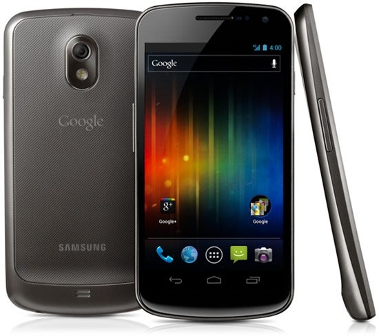
Rather, Samsung has been most successful with iconic design when teamed up with Google for the Nexus S and Galaxy Nexus, which were simple clean slates when turned off, and the lack of distinctive features became a distinctive feature in itself. That's why we would be more inclined to believe the latest leaked image of the supposed Samsung Galaxy S III design, because it combines the distinctive look of the Galaxy Nexus (and who can forget the first image of that clean black slate on the fur blanket?) with the clear branding of Samsung's home button (and name under the speaker grill, of course.)
Hardware differentiation
Essentially, we just want to see manufacturers put a bit more effort into hardware design, and a little less into things like OS customizations. Supposedly, Windows Phone manufacturers have been clamoring for Microsoft to allow more software customization to allow for differentiation, but none have done much to differentiate the hardware, except for Nokia. We said it before, and still think it's true: manufacturers want to promote themselves, not whatever 3rd party OS they use. This is why manufacturers want to be able to customize Windows Phone, and don't do a lot of marketing for WP devices. And, it's why they love Android.
In the Android ecosystem, manufacturers have all essentially honed their respective software customizations, and are finally looking at hardware design (and we mean real hardware design rather than "put a slider keyboard on it" design.) Sony, HTC, and Huawei are all really trying to push for more distinctive design, while other manufacturers are trying to improve design by banking on the familiar (does anyone else think that the LG L series phones look a bit too much like a Samsung device with hard corners on top?)
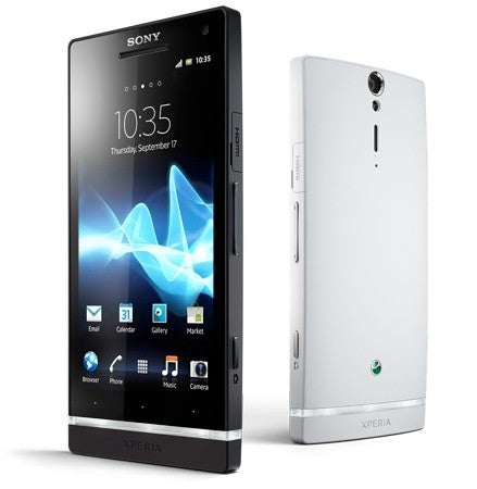
Sony is one of the few companies that can also leverage a logo in order to more effectively brand its hardware, but unfortunately, that logo is the distinctive Sony Ericsson logo, and it's unclear if Sony wants to use that since Ericsson has been absorbed. The logo has been spotted on the back of upcoming Xperia devices, but it is very small and arranged at the bottom of the device, which means it will be covered by a user's hand, where the Apple logo is higher, and can often be seen above a user's hand.
Still, we hope that moving forward we'll see more experimentation by manufacturers to come up with creative designs, and use more distinctive materials. We're not even asking for completely new and radical designs (although that would be nice to see here and there), but more time spent on the small details of design that can make quite a bit of difference. Manufacturers clearly need to do something to bring up their visibility on store shelves, because right now it seems like Apple and Samsung are dominating that space, and by extension, dominating the smartphone market.
A discussion is a place, where people can voice their opinion, no matter if it
is positive, neutral or negative. However, when posting, one must stay true to the topic, and not just share some
random thoughts, which are not directly related to the matter.
Things that are NOT allowed:
Off-topic talk - you must stick to the subject of discussion
Offensive, hate speech - if you want to say something, say it politely
Spam/Advertisements - these posts are deleted
Multiple accounts - one person can have only one account
Impersonations and offensive nicknames - these accounts get banned
Moderation is done by humans. We try to be as objective as possible and moderate with zero bias. If you think a
post should be moderated - please, report it.
Have a question about the rules or why you have been moderated/limited/banned? Please,
contact us.


Things that are NOT allowed: