Apple in numbers: Infographic
Share:
Apple's incredible rise to the most valuable company in the world by market cap has been the source for many wacky comparisons and parallels, from the GDP of which country its revenue equals, to how much its stores make per square foot.
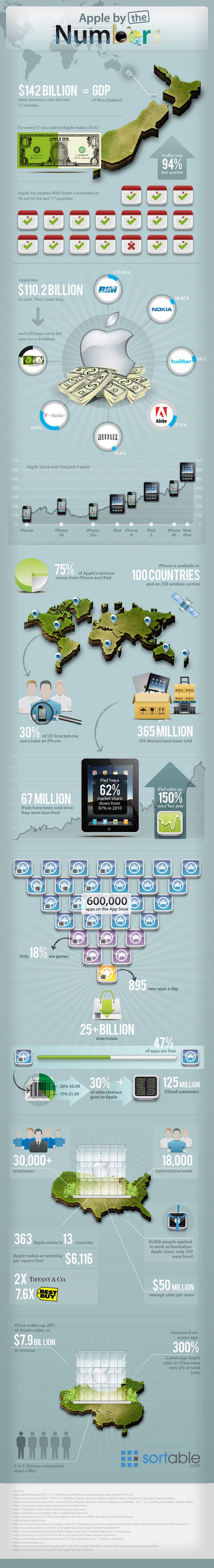
Well, now everything has been put together and displayed in a nice infographic, making the rise of the planet of Apple that much more breathtaking, considering it doesn't sell a necessity like oil.
It is also not a financial company with 1:30 leverage shuffling electronic paper around, but operates in the fickle consumer electronics business.
Our favorite stat is that the cash it has can buy Twitter, RIM, Nokia, Netflix, Adobe and add a carrier to it like T-Mobile, then still have money left over for its new dividend program for shareholders.
via IntoMobile
Share:
3 Comments
1. -box- posted on 15 May 2012, 10:51 0 0
Apple is a good business, as this shows. Awful company and morals, but good business. As others have shown though, those types of companies can fall fast and fall hard with just a few missteps
2. downphoenix posted on 15 May 2012, 13:10 0 0
Im sure Jobs has taught them well to stay the course, and the stockholders dont want any radical change in the company since its making money hand over fist. Maybe if the current strategy is no longer effective THEN they will change.


