Android 4.0 Ice Cream Sandwich Preview
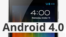
Android 4.0 Ice Cream Sandwich (ICS) has made its debut and it’s every bit as exciting as we thought it would be. It’s probably the biggest redesign of Android for smartphones after the platform saw the light of day on the first Android handset, the T-Mobile G1, three years ago. For phone interfaces this is a huge leap, but compare it with Honeycomb tablets, and you'll see a gradual evolution.
Let's also mention that ICS brings a single unified version of Android for both smartphones and tablets. Honeycomb was the "emergency landing" solution for tablets when it launched, only there to stop somewhat ridiculous attempts of tablet makers to put stretched out Froyo, which was made specifically for smaller screen, on the bigger tablet display. Now, we're back to a single solution for tablets and smartphones, but this time - it's optimized for both. Moreover, it's open sourced, so everyone will be able to lift the code.
What gives? This will probably lead to Chinese manufacturers busting out even more phone and tablets, this time stuffed with Android 4.0. Google has also urged developers to optimize their applications for both phones and tablets, or exclude certain devices from seeing the app in the code. Older phone apps are also likely to receive a facelift benefitting from the new interface, so it definitely seems like a well-thought out move from Google.
Tron-ified user interface:
To understand the changes in ICS, we have to first understand what lies beneath them and beneath them is a huge change in the design team. If anything in ICS bears resemblance to webOS, it’s because Matias Duarte, the design brain behind it, has now taken over at Google. Duarte’s works at webOS show his keen affection for simplicity and enthusiasm for gestures, and that’s the direction Android ICS is slowly moving to. Slowly, because Android has grown Titanic-huge and even the slightest change in route requires some time. And that whole route, Duarte says, has been thought over, focusing around three priorities: enchanting, easy and smart.
Borrowed straight from Honeycomb, but slightly humanized with warmer tones than the rigid robotic feel of the tablet platform, the new interface underwent some changes. It actually looks somewhat similar to the redesigned Google web apps in terms of cleanness and simplification, but there's more to it.
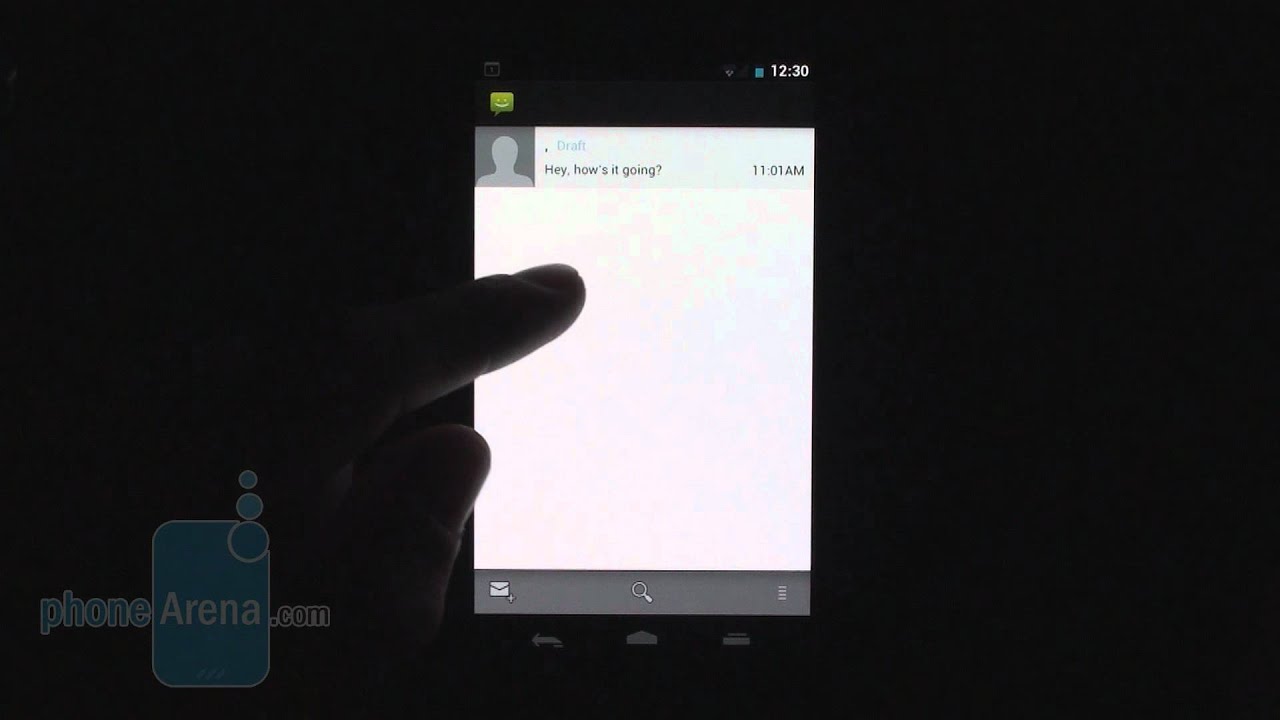
Navigation has been overhauled with the introduction of virtual buttons. There are three nearly omnipresent virtual buttons: the back, home and recent apps keys, which dim out only in certain apps like when watching movies or in the camera. Familiar on Honeycomb tablets, but unseen on Android phones up until now. Now this brings the question about what happens with the capacitive buttons on pre-Galaxy Nexus phones. Those capacitive buttons basically double in function with the new virtual buttons, so our guess is that those handsets will just have two sets of buttons. Not very pretty, as those new virtual buttons occupy space as well. We also guess newer Androids will look just like the Galaxy Nexus, e.g. no capacitive buttons on the bottom.
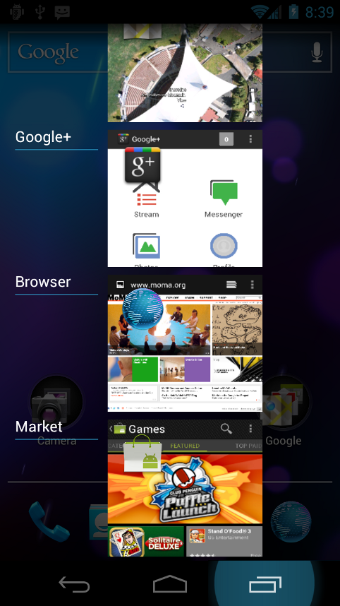
Visual multitasking
The notification dropdown has remained, but overall notifications have improved, as now they can be swiped away one at a time. They are also accessible from the lock screen. The virtual keyboard comes equipped with better error correction and spell checking.
The visuals are pumped up with nice animations added across the system. In addition, new homescreen folders are created in an iOS-like fashion by just dragging an icon onto another one.

Photo widget
All of those changes are united under the umbrella of the new Roboto font, which replaces the previously used Droid Sans. It’s much better looking than the old one, but also bears some resemblance to Helvetica.
Changes in basic functionality, improved apps:
The new People app
The Calendar has been swipe-enabled. You can now use gestures in the Calendar. Here, though, by swiping you switch between days, weeks and months. You can also pinch-to-zoom for a more detailed view of your agenda.
Gmail
Second comes an overhauled Browser. We could argue that the average user would spend as much if not more time in the smartphone browser rather than calling, and that's why the change here is of paramount importance The browser now includes a “Save for offline reading” option and redesigned tab switcher looking much like the vertical multitasking list.
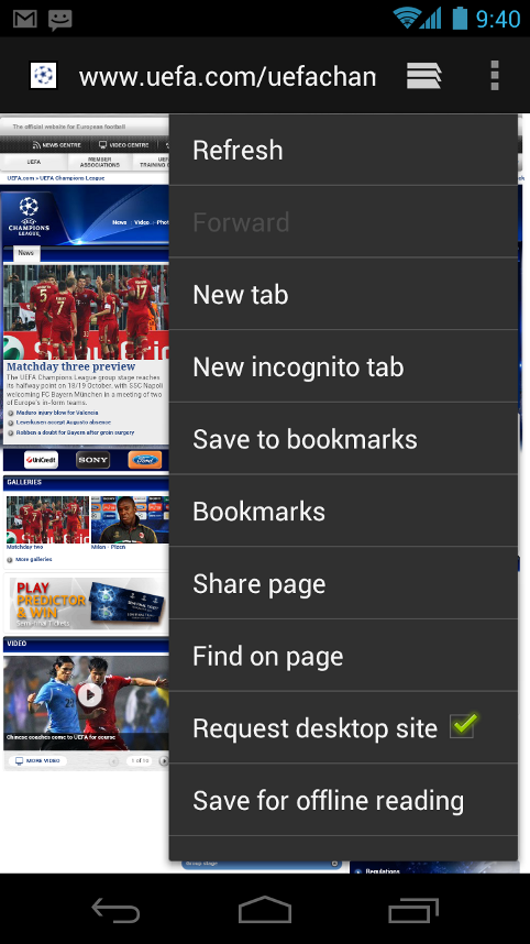
Improved Browser
The browser now also allows you to switch to desktop versions of websites instead of getting stuck in the mobile one. Oh, and it has Incognito mode. And Flash. You know why.
The Camera app stripped off shutter lag and comes with facial recognition and image editing. In addition, there’s a new panorama mode baked right in the application allowing you to take panoramic shots with a single motion. Live Effects are added to the video capture, so you can fool around with the Silly Face effect or change your background to a custom image.
The new Gallery
New features in Android ICS:
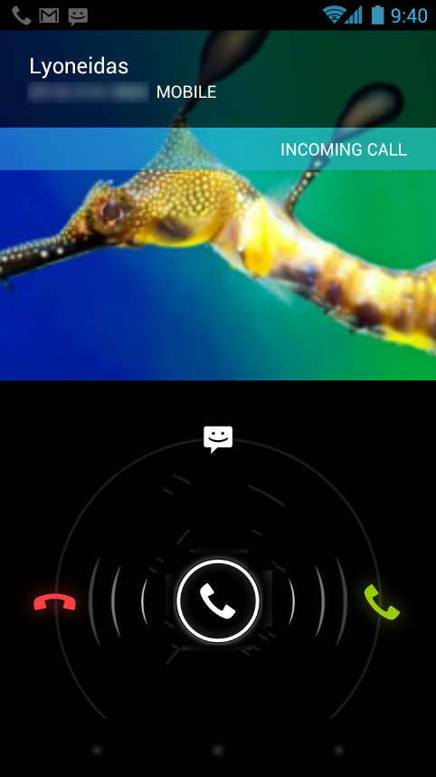
Incoming calls
You can now finally take screenshots without the need for additional apps, to the great joy of your fellow reviewers, but we can imagine users would also appreciate it. Face Unlock on the other hand will be widely appreciated by users. The name speaks for itself, you just need to look at the phone to unlock it.
After the Siri announcement on the iPhone 4S, Android's voice input system suddenly started looking a bit dated. No wonder - Siri uses 40 years of DARPA research, but we'd think Google will come with an answer. The first step to that is the new voice input engine in Android ICS. Hello, Siri, you might think. But it's rather: “Hello, long monologues,” as the new feature allows you to dictate text with longer pauses using not just English but other supported languages as well. No artificial intelligence or hot tempered answers.
When we speak about Siri we should also note that ICS comes with much better accessibility. You can navigate without looking as the system gives you audio feedback for everything you press on the screen if you enable the option in Settings. The browser can also read text and put you to sleep with robotic lullabies. It will only read them, though, if that's what you want.
Network data stats
Android 4.0 gets a big productivity boost as now you can actually control network data. ICS gives you all the tools pre-baked in the system. And that’s seriously useful when we start going massively into LTE territory where tiered data rules supreme and overage fees could make you cry. In the settings, you have access to data usage by network (mobile or Wi-Fi), but also by each app. Impressive.
Expectations:
Overall, there's a feeling of solidity with Ice Cream Sandwich. It's a big update not because it brings a lot of new features (it does come with a few, but many we've already seen on Honeycomb), but because it's a statement by Google that it wants to see tablet and phone looks unified. ICS brings clarity and a healthy sense of control by Google, after the somewhat chaotic bi-directional, unclear path taken with Gingerbread and Honeycomb. Moreover, the feeling of a raw, beta product is now almost gone. It fine tunes the elements that needed to be improved, and introduces important usability improvements.
One thing we're not so clear about is the way it will handle pre-Galaxy Nexus device updates. If it manages to live up to users' expectations for quick updates on a lot of devices, it will definitely gain traction. Hopefully, the newly announced DROID RAZR, and heavyweights like the Galaxy S II will get updates soon. But now it's back to you, do you like what you see in Ice Cream Sandwich? Chime in with your impressions in the comments below.


Popular stories


Latest News


Things that are NOT allowed:
To help keep our community safe and free from spam, we apply temporary limits to newly created accounts: